Nº 079 of 520
3D card flip trio
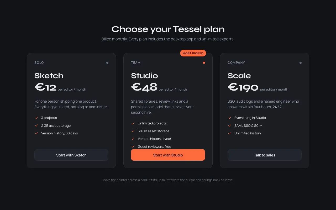
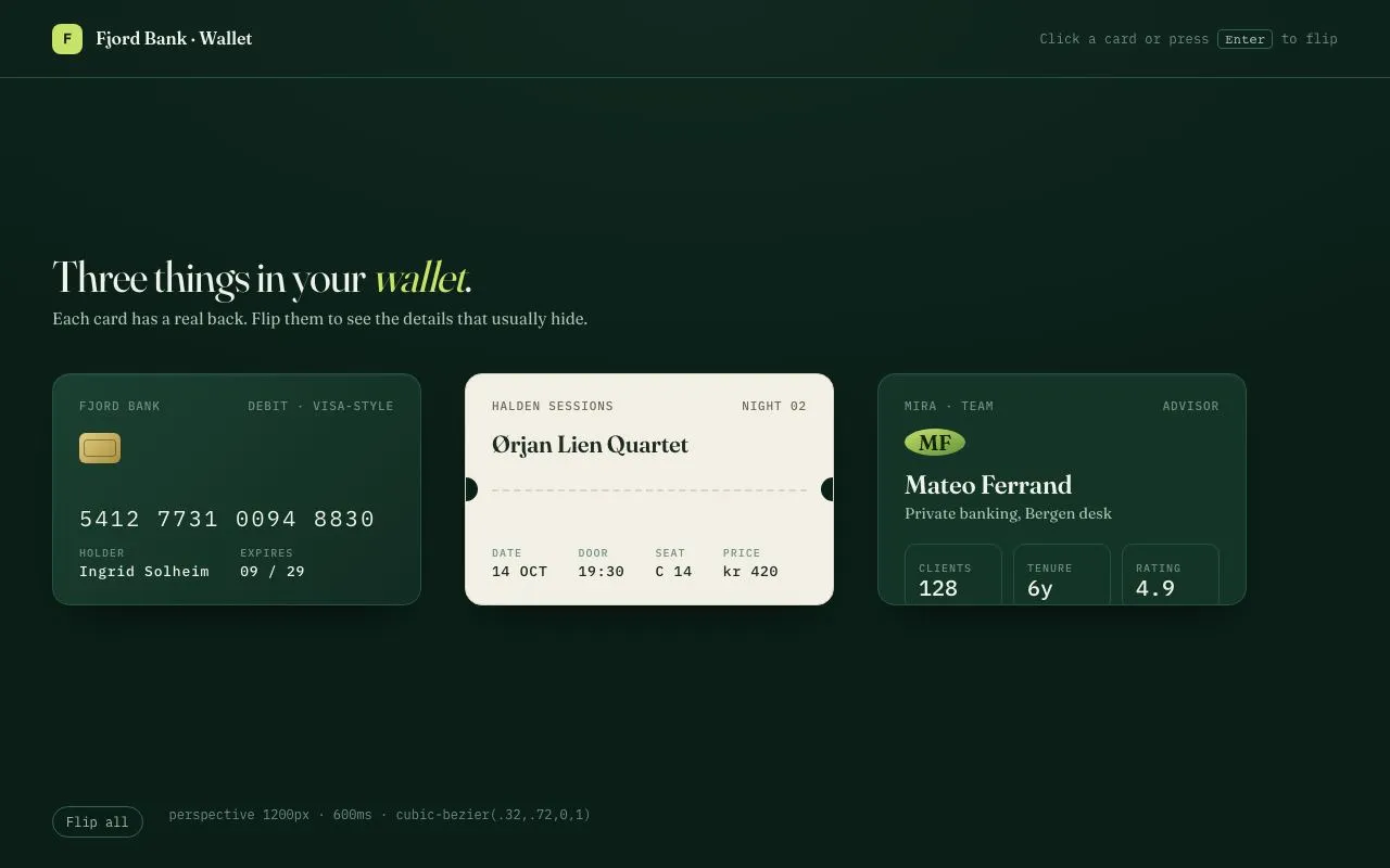
Three wallet cards (debit card, ticket, advisor profile) that flip on click or Enter with 1200px perspective, a 600ms rotate and a 14px mid-flip lift; every back face carries real content.
Preview
Use it
Free to use · credit appreciated1 Once, in your project
npx skills add SusanAcharya/Design-Lounge 2 Then ask
Using the Design Lounge skill, build "3D card flip trio" (piece card-flip-3d) in my stack. Match its brief; restyle it onto my product's theme.
No skill? Paste the brief instead. It carries the numbers, tokens and behaviour.
<!-- Design Lounge Nº 079 · "3D card flip trio" · designlounge.vercel.app -->

# 3D card flip trio

> **Build brief for a coding agent.** Rebuild this piece in the reader's stack. If they haven't said which stack, ask once, then default to semantic HTML + CSS + a little vanilla JS. Match the numbers below; don't "improve" them.

## What it is

A row of three 340×214px cards in a banking wallet: a debit card, a concert ticket and an advisor profile. Each card is a single `<button>` that rotates 180° around its vertical axis when clicked or activated with Enter/Space, revealing a back face with genuine content (magnetic stripe and CVV, entry code and gate, contact details). The flip runs 600ms inside a 1200px perspective and the card lifts 14px at the midpoint so it reads as picked up, not spun in place. Deep green surfaces, a lime accent used once per card, and tabular mono numerals for every number.

## Reference behaviour

1. Initial state: header bar (72px) with brand and a hint "Click a card or press Enter to flip"; heading "Three things in your *wallet*." with the italic word in `--accent`; three cards face-up, evenly spaced 40px apart, left-aligned under the heading.
2. Hover a card: shadow deepens from `--shadow` to `--shadow-lift` over 160ms. No transform on hover.
3. Click a card (or focus it and press Enter/Space): the card rotates `rotateY(0)` → `rotateY(180deg)` over 600ms with `cubic-bezier(.32,.72,0,1)`. During the same 600ms the card translates up 14px at 50% and back to 0 at 100%. The front face disappears at 90° and the back face appears (both faces have `backface-visibility: hidden`).
4. `aria-pressed` on the button flips `false` → `true`.
5. Click again: the card rotates back to 0° with the same timing and lift; `aria-pressed` returns to `false`.
6. Each back face is real: the debit card shows a 44px black stripe, a signature panel reading "CVV 417" and issuer fine print; the ticket shows a 120×120px code block and "Scan at Gate B"; the profile shows tel, mail, desk address and next appointment.
7. "Flip all" (footer pill button) flips every card that is not already in the majority state, staggered 80ms per card.
8. Keyboard focus on a card shows a two-ring lime focus ring drawn on the *visible* face.

## Structure

```
1280 × 800
┌──────────────────────────────────────────────────────────────────────┐
│ [F] Fjord Bank · Wallet                  Click a card or press Enter  │ 72
├──────────────────────────────────────────────────────────────────────┤
│                                                                      │
│  Three things in your wallet.                     (40px Fraunces)    │
│  Each card has a real back. …                                        │
│                                                                      │
│  ┌ 340×214 ────┐  40  ┌ 340×214 ────┐  40  ┌ 340×214 ────┐            │
│  │ FJORD  DEBIT│      │ HALDEN  N.02│      │ MIRA  ADVISR│            │
│  │ [chip]      │      │ Ørjan Lien  │      │ (MF)        │            │
│  │ 5412 7731 … │      │ - - - - - - │      │ Mateo Ferr. │            │
│  │ holder  exp │      │ date door…  │      │ 128  6y 4.9 │            │
│  └─────────────┘      └─────────────┘      └─────────────┘            │
│                                                                      │
│  (Flip all)   perspective 1200px · 600ms · …                         │

… 155 more lines. Copy or download for the full brief. Loading the source…Brief
195 linesBuild brief for a coding agent. Rebuild this piece in the reader’s stack. If they haven’t said which stack, ask once, then default to semantic HTML + CSS + a little vanilla JS. Match the numbers below; don’t “improve” them.
What it is
A row of three 340×214px cards in a banking wallet: a debit card, a concert ticket and an advisor profile. Each card is a single <button> that rotates 180° around its vertical axis when clicked or activated with Enter/Space, revealing a back face with genuine content (magnetic stripe and CVV, entry code and gate, contact details). The flip runs 600ms inside a 1200px perspective and the card lifts 14px at the midpoint so it reads as picked up, not spun in place. Deep green surfaces, a lime accent used once per card, and tabular mono numerals for every number.
Reference behaviour
- Initial state: header bar (72px) with brand and a hint “Click a card or press Enter to flip”; heading “Three things in your wallet.” with the italic word in
--accent; three cards face-up, evenly spaced 40px apart, left-aligned under the heading. - Hover a card: shadow deepens from
--shadowto--shadow-liftover 160ms. No transform on hover. - Click a card (or focus it and press Enter/Space): the card rotates
rotateY(0)→rotateY(180deg)over 600ms withcubic-bezier(.32,.72,0,1). During the same 600ms the card translates up 14px at 50% and back to 0 at 100%. The front face disappears at 90° and the back face appears (both faces havebackface-visibility: hidden). aria-pressedon the button flipsfalse→true.- Click again: the card rotates back to 0° with the same timing and lift;
aria-pressedreturns tofalse. - Each back face is real: the debit card shows a 44px black stripe, a signature panel reading “CVV 417” and issuer fine print; the ticket shows a 120×120px code block and “Scan at Gate B”; the profile shows tel, mail, desk address and next appointment.
- “Flip all” (footer pill button) flips every card that is not already in the majority state, staggered 80ms per card.
- Keyboard focus on a card shows a two-ring lime focus ring drawn on the visible face.
Structure
1280 × 800
┌──────────────────────────────────────────────────────────────────────┐
│ [F] Fjord Bank · Wallet                  Click a card or press Enter  │ 72
├──────────────────────────────────────────────────────────────────────┤
│                                                                      │
│  Three things in your wallet.                     (40px Fraunces)    │
│  Each card has a real back. …                                        │
│                                                                      │
│  ┌ 340×214 ────┐  40  ┌ 340×214 ────┐  40  ┌ 340×214 ────┐            │
│  │ FJORD  DEBIT│      │ HALDEN  N.02│      │ MIRA  ADVISR│            │
│  │ [chip]      │      │ Ørjan Lien  │      │ (MF)        │            │
│  │ 5412 7731 … │      │ - - - - - - │      │ Mateo Ferr. │            │
│  │ holder  exp │      │ date door…  │      │ 128  6y 4.9 │            │
│  └─────────────┘      └─────────────┘      └─────────────┘            │
│                                                                      │
│  (Flip all)   perspective 1200px · 600ms · …                         │
└──────────────────────────────────────────────────────────────────────┘<header>—.brand(28px lime square mark + name, 16/600) and.hint(mono 12px with<kbd>).<main>—<h1>,.sub, then.deck(grid-template-columns: repeat(3, 340px); gap: 40px)..scene— 340×214 wrapper carryingperspective: 1200px. One per card.<button class="card">—transform-style: preserve-3d; contains exactly two.facechildren:.frontand.back..face—position: absolute; inset: 0, padding 22px 24px, flex column,backface-visibility: hidden..backis pre-rotatedrotateY(180deg).<footer>— “Flip all” pill button and a mono caption.
Tokens
:root {
  /* colour — deep green, one lime accent, paper for the ticket */
  --bg: #0b1f18;          /* page */
  --bg-2: #10281f;        /* radial highlight at top */
  --surface: #153428;     /* card faces */
  --surface-2: #1b4032;   /* debit card gradient start */
  --line: #245244;        /* hairlines, card borders */
  --line-strong: #2f6656; /* pill button border */
  --ink: #eef3ea;         /* primary text */
  --ink-2: #a9c2b3;       /* secondary text */
  --ink-3: #6f8f7f;       /* mono meta, labels */
  --accent: #c9e26a;      /* italic word, mark, focus ring, avatar */
  --accent-ink: #13230a;  /* text on accent */
  --paper: #f2efe4;       /* ticket face, signature panel */
  --paper-ink: #1b2a22;   /* text on paper */
  --paper-2: #d9d4c2;     /* ticket border, perforation, panel lines */

  /* type */
  --serif: "Fraunces", Georgia, serif;
  --mono: "IBM Plex Mono", ui-monospace, monospace;

  /* layout */
  --card-w: 340px;
  --card-h: 214px;
  --r: 16px;              /* card radius */
  --persp: 1200px;

  /* motion */
  --t-flip: 600ms;
  --t-fast: 160ms;
  --ease: cubic-bezier(.2, .7, .2, 1);
  --ease-flip: cubic-bezier(.32, .72, 0, 1);

  /* elevation */
  --shadow: 0 20px 40px -18px rgba(0,0,0,.7), 0 2px 0 rgba(255,255,255,.04) inset;
  --shadow-lift: 0 36px 56px -20px rgba(0,0,0,.8);
}
Typography
| Role | Family | Size | Weight | Line-height | Tracking | Case |
|---|---|---|---|---|---|---|
| Page heading | Fraunces (opsz 144) | 40px | 400 | 1.1 | −0.02em | sentence, italic accent word |
| Subtitle | Fraunces | 15px | 400 | 1.45 | 0 | sentence |
| Card title (ticket/profile) | Fraunces (opsz 72) | 22–24px | 600 | 1.1 | −0.01em | title |
| Card meta strip | IBM Plex Mono | 11px | 500 | 1.3 | +0.08em | UPPERCASE |
| Field label | IBM Plex Mono | 10px | 500 | 1 | +0.10em | UPPERCASE |
| Field value | IBM Plex Mono | 13px | 500 | 1.3 | +0.06em | as written |
| Card number | IBM Plex Mono | 20px | 400 | 1 | +0.12em | numerals, tabular |
| Stat value | IBM Plex Mono | 20px | 500 | 1 | 0 | numerals, tabular |
| Fine print | IBM Plex Mono | 10px | 400 | 1.5 | 0 | sentence |
| Hint / footer | IBM Plex Mono | 12px | 400 | 1.4 | +0.02em | sentence |
Motion
| Element | Trigger | Property | From → To | Duration | Easing | Notes |
|---|---|---|---|---|---|---|
.card | click / Enter | transform | rotateY(0) ↔ rotateY(180deg) | 600ms | --ease-flip | transition, not keyframes |
.card.lift | same instant | translate | 0 → 0 −14px (50%) → 0 | 600ms | --ease-flip | keyframe animation restarted on every flip; class removed on animationend |
.face | hover | box-shadow | --shadow → --shadow-lift | 160ms | --ease | |
| footer button | hover | background, color | transparent → --accent | 160ms | --ease | |
| “Flip all” | click | — | stagger 80ms per card | — | — | setTimeout(i * 80) |
Reduced motion: .card { transition-duration: 1ms } and .card.lift { animation: none }. The faces still swap; aria-pressed still toggles.
States
- Default: front face visible,
aria-pressed="false". - Hover: deeper shadow only. Cursor pointer.
- Focus-visible:
outline: 0on the button; the currently visible.facegetsbox-shadow: var(--shadow), 0 0 0 2px var(--bg), 0 0 0 4px var(--accent). Because faces are absolutely positioned inside apreserve-3dbutton, an outline on the button itself would not follow the rotation; ring the face instead. - Flipped:
.flippedclass +aria-pressed="true", back face visible. - Mid-flip:
.liftpresent; card is 14px higher at t = 300ms. - Footer button hover: lime fill,
--accent-inktext.
Accessibility
- Each card is one
<button aria-pressed>with anaria-labelthat names the card and says “flip to see the back”. Do not nest interactive elements inside it. - Enter and Space activate via native button behaviour; no key handlers needed.
- Tab order: three cards left to right, then “Flip all”.
- The ticket’s code block is
role="img" aria-label="Entry code". - Both faces stay in the DOM; screen readers read the front and back text in order. If that is too verbose in your stack, set
aria-hiddenon the face that is currently turned away. - Contrast:
--ink-2on--surface8.1:1;--ink-3(labels only, 10–11px mono uppercase) 4.6:1;--paper-inkon--paper13:1. - Hit targets: cards 340×214; footer pill 30px tall (web, acceptable).
Responsive rules
- ≥ 1280: three cards in one row, 40px gaps, left-aligned under the heading.
- 1024–1279: cards stay 340px; gap drops to 24px; page padding 32px.
- 768–1023:
grid-template-columns: repeat(2, 340px); the third card wraps to a second row. - < 640: one column, cards scale with
width: min(340px, 100%)andaspect-ratio: 340 / 214; perspective stays 1200px; heading 32px.
Acceptance checklist
- Each card is exactly 340×214px with 16px radius at 1280 wide.
-
.scenecarriesperspective: 1200px; the button carriestransform-style: preserve-3d. - Flip is a
transformtransition of 600ms withcubic-bezier(.32,.72,0,1). - Card rises 14px at the flip midpoint and returns to 0 by the end; the lift replays on every flip, including flipping back.
- Both faces set
backface-visibility: hidden; no ghost of the front is visible through the back. - Back faces show real content (stripe + “CVV 417”, entry code + gate, contact rows).
- Clicking, Enter and Space all flip;
aria-pressedmirrors the state. - Focus ring is visible on whichever face is showing.
- “Flip all” staggers cards by 80ms and brings all to the same state.
- Hover changes shadow only; no scale or translate on hover.
- All numerals use IBM Plex Mono with
font-variant-numeric: tabular-nums. - With reduced motion, flipping is instant and complete.
Implementation notes
Flip and lift on separate properties. Rotate with transform (transition) and lift with the independent translate property (keyframes), so neither overwrites the other:
.scene { perspective: 1200px; width: 340px; height: 214px; }
.card  { position: relative; transform-style: preserve-3d;
         transition: transform 600ms cubic-bezier(.32,.72,0,1); }
.card.flipped { transform: rotateY(180deg); }
.card.lift { animation: lift 600ms cubic-bezier(.32,.72,0,1); }
@keyframes lift { 0%, 100% { translate: 0 0 } 50% { translate: 0 -14px } }
.face { position: absolute; inset: 0; backface-visibility: hidden; -webkit-backface-visibility: hidden; }
.back { transform: rotateY(180deg); }
Restart the lift every time. Removing and re-adding the class in the same frame does nothing; force a reflow between:
function flip(card) {
  const on = !card.classList.contains('flipped');
  card.classList.toggle('flipped', on);
  card.setAttribute('aria-pressed', String(on));
  card.classList.remove('lift'); void card.offsetWidth; card.classList.add('lift');
}
card.addEventListener('animationend', () => card.classList.remove('lift'));
Focus ring on the face, not the button. Put outline: 0 on the button and draw the ring with box-shadow on .face under .card:focus-visible, so it rotates with the card.
Common mistakes: putting perspective on the card instead of its parent (the flip looks flat); forgetting the -webkit- prefix on backface-visibility (Safari shows both faces); using overflow: hidden on the button (clips the lift); animating box-shadow for 600ms (janky, keep it at 160ms on hover only).
Details
- Palette
- Type
- Fraunces · IBM Plex Mono
- Motion
- Rich motion
- Build
- One session
- Tags
Studied
The F-ListMake the reveal the message. Bars lift off the text, and badges explain the list.
All sourcesOn the shelves