Nº 085 of 520
Magnetic buttons
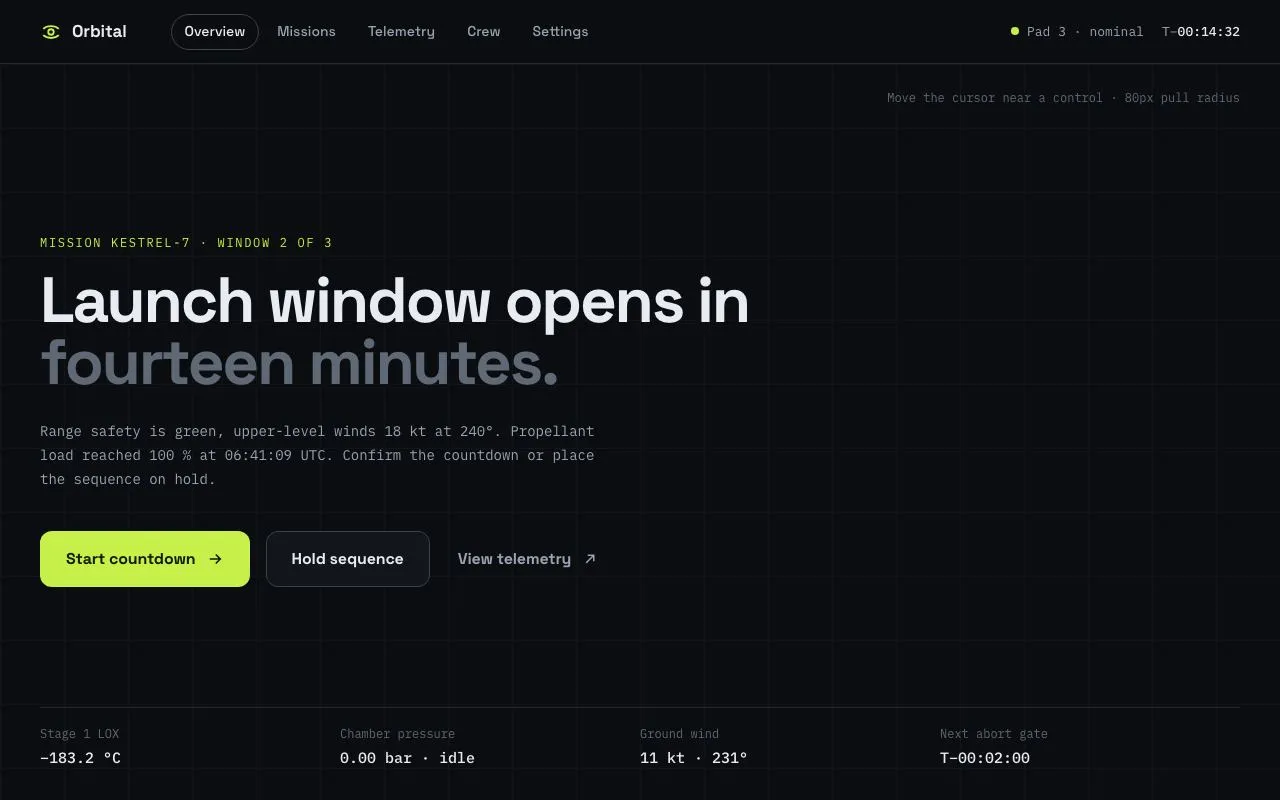
Three CTAs and a nav row whose outlines and labels are pulled toward the cursor inside an 80px radius (up to 10px) and spring back over 500ms; keyboard focus works without the effect.
Preview
Use it
Free to use · credit appreciated1 Once, in your project
npx skills add SusanAcharya/Design-Lounge 2 Then ask
Using the Design Lounge skill, build "Magnetic buttons" (piece magnetic-buttons) in my stack. Match its brief; restyle it onto my product's theme.
No skill? Paste the brief instead. It carries the numbers, tokens and behaviour.
<!-- Design Lounge Nº 085 · "Magnetic buttons" · designlounge.vercel.app -->

# Magnetic buttons

> **Build brief for a coding agent.** Rebuild this piece in the reader's stack. If they haven't said which stack, ask once, then default to semantic HTML + CSS + a little vanilla JS. Match the numbers below; don't "improve" them.

## What it is

A launch-control hero for a fictional mission-ops product ("Orbital") whose interactive controls are *magnetic*: when the pointer comes within 80px of a button or nav link, its outline (background/border layer) slides toward the cursor by up to 10px and its label slides 1.5× further, so the label appears to lead. When the pointer leaves the radius both layers spring back over 500ms with a small overshoot. The effect is pointer-only and cosmetic: keyboard focus shows a two-ring lime focus ring on the outline layer with no translation, and `pointer: coarse` or `prefers-reduced-motion` disables it entirely. Dark near-black surfaces, a faint 64px grid, one lime accent. The detail worth copying is the two-layer structure (`.outline` + `.label`) driven by two custom properties, which keeps the JS to a distance check.

## Reference behaviour

1. Initial state: 64px top bar with brand mark + "Orbital", five pill nav links ("Overview" is current, with a visible 1px border), and a right-aligned mono status ("Pad 3 · nominal", "T−00:14:32"). The main area is vertically centred: a lime mono kicker, a 64px two-tone headline, a mono sub-paragraph and three buttons; a four-column telemetry strip sits above the bottom edge.
2. Move the pointer toward any `.mag` element. When the distance from the pointer to the nearest edge of the element's box is < 80px, the element gets class `near`: its `.outline` layer translates toward the pointer (max 10px on each axis, proportional to the pointer's offset from the element centre) and its `.label` translates 1.5× that. While `near`, transforms track the pointer with a 120ms standard-ease transition (throttled to one `requestAnimationFrame` per `pointermove`).
3. Hovering also changes surfaces: nav pills gain a `--panel` fill and `--line` border and their text brightens to `--ink`; the primary button lightens to `#d6f866`; the secondary border brightens to `--ink-2`; the ghost button shows a dashed `--line-2` border and its text brightens.
4. Move the pointer outside the 80px radius: `near` is removed, both custom properties are reset to `0px`, and the layers return over 500ms with `cubic-bezier(.34,1.56,.64,1)` (visible overshoot of ~2px).
5. When the pointer leaves the document, every `near` element is released the same way.
6. Tab through the page: each `.mag` shows a focus ring (`0 0 0 2px var(--bg), 0 0 0 4px var(--accent)`) on its `.outline`; nothing translates.
7. Clicking a nav link moves `aria-current="page"` to it (the border follows). Buttons are inert beyond hover/press styling.
8. With a coarse pointer or `prefers-reduced-motion: reduce`, the script exits early; CSS forces `transform: none` on both layers, so the page is fully usable with hover colours only.

## Structure

```
1280 × 800
┌──────────────────────────────────────────────────────────────────────┐
│ top 64  ◎ Orbital  (Overview)(Missions)(Telemetry)(Crew)(Settings)   │
│                                     · Pad 3 · nominal   T−00:14:32   │
├──────────────────────────────────────────────────────────────────────┤
│                                  hint: Move the cursor near a control│
│  MISSION KESTREL-7 · WINDOW 2 OF 3                                   │
│  Launch window opens in                                              │
│  fourteen minutes.                          (h1 64px, max 820px)     │
│  sub-paragraph mono, max 560px                                       │
│  ┌ Start countdown → ┐ ┌ Hold sequence ┐  View telemetry ↗           │
│  └───────────────────┘ └───────────────┘   (56px tall, 16px gap)     │
│                                                                      │
│  ── telemetry strip: 4 cols, mono, 1px top rule ── bottom 32px ───   │
└──────────────────────────────────────────────────────────────────────┘
   each .mag:   ┌─ .outline (absolute, inset 0, moves --ox/--oy) ─┐

… 170 more lines. Copy or download for the full brief. Loading the source…Brief
210 linesBuild brief for a coding agent. Rebuild this piece in the reader’s stack. If they haven’t said which stack, ask once, then default to semantic HTML + CSS + a little vanilla JS. Match the numbers below; don’t “improve” them.
What it is
A launch-control hero for a fictional mission-ops product (“Orbital”) whose interactive controls are magnetic: when the pointer comes within 80px of a button or nav link, its outline (background/border layer) slides toward the cursor by up to 10px and its label slides 1.5× further, so the label appears to lead. When the pointer leaves the radius both layers spring back over 500ms with a small overshoot. The effect is pointer-only and cosmetic: keyboard focus shows a two-ring lime focus ring on the outline layer with no translation, and pointer: coarse or prefers-reduced-motion disables it entirely. Dark near-black surfaces, a faint 64px grid, one lime accent. The detail worth copying is the two-layer structure (.outline + .label) driven by two custom properties, which keeps the JS to a distance check.
Reference behaviour
- Initial state: 64px top bar with brand mark + “Orbital”, five pill nav links (“Overview” is current, with a visible 1px border), and a right-aligned mono status (“Pad 3 · nominal”, “T−00:14:32”). The main area is vertically centred: a lime mono kicker, a 64px two-tone headline, a mono sub-paragraph and three buttons; a four-column telemetry strip sits above the bottom edge.
- Move the pointer toward any
.magelement. When the distance from the pointer to the nearest edge of the element’s box is < 80px, the element gets classnear: its.outlinelayer translates toward the pointer (max 10px on each axis, proportional to the pointer’s offset from the element centre) and its.labeltranslates 1.5× that. Whilenear, transforms track the pointer with a 120ms standard-ease transition (throttled to onerequestAnimationFrameperpointermove). - Hovering also changes surfaces: nav pills gain a
--panelfill and--lineborder and their text brightens to--ink; the primary button lightens to#d6f866; the secondary border brightens to--ink-2; the ghost button shows a dashed--line-2border and its text brightens. - Move the pointer outside the 80px radius:
nearis removed, both custom properties are reset to0px, and the layers return over 500ms withcubic-bezier(.34,1.56,.64,1)(visible overshoot of ~2px). - When the pointer leaves the document, every
nearelement is released the same way. - Tab through the page: each
.magshows a focus ring (0 0 0 2px var(--bg), 0 0 0 4px var(--accent)) on its.outline; nothing translates. - Clicking a nav link moves
aria-current="page"to it (the border follows). Buttons are inert beyond hover/press styling. - With a coarse pointer or
prefers-reduced-motion: reduce, the script exits early; CSS forcestransform: noneon both layers, so the page is fully usable with hover colours only.
Structure
1280 × 800
┌──────────────────────────────────────────────────────────────────────┐
│ top 64  ◎ Orbital  (Overview)(Missions)(Telemetry)(Crew)(Settings)   │
│                                     · Pad 3 · nominal   T−00:14:32   │
├──────────────────────────────────────────────────────────────────────┤
│                                  hint: Move the cursor near a control│
│  MISSION KESTREL-7 · WINDOW 2 OF 3                                   │
│  Launch window opens in                                              │
│  fourteen minutes.                          (h1 64px, max 820px)     │
│  sub-paragraph mono, max 560px                                       │
│  ┌ Start countdown → ┐ ┌ Hold sequence ┐  View telemetry ↗           │
│  └───────────────────┘ └───────────────┘   (56px tall, 16px gap)     │
│                                                                      │
│  ── telemetry strip: 4 cols, mono, 1px top rule ── bottom 32px ───   │
└──────────────────────────────────────────────────────────────────────┘
   each .mag:   ┌─ .outline (absolute, inset 0, moves --ox/--oy) ─┐
                │      .label (relative, moves 1.5 × --ox/--oy)   │
                └─────────────────────────────────────────────────┘
<header class="top">—.brand(22px SVG orbit glyph + name),<nav class="nav" aria-label="Primary">of<a class="mag">,.statuswithmargin-left: auto.<main>— flex column,justify-content: center, padding0 40px 40px; contains.hint(absolute, top-right),p.kicker,h1(second clause in a<span>at--ink-3),p.sub,.actions(flex, 16px gap) and.tele(absolute, 32px from the bottom).- Every magnetic control is
<button class="mag btn …">or<a class="mag">containing exactly<span class="outline"></span><span class="label">…</span>. The control itself has no background or border — the.outlinespan carries them and inheritsborder-radius. - A fixed
body::beforedraws the 64px grid with twolinear-gradients at 28 % opacity.
Tokens
:root {
  /* colour — cool near-black, one lime accent */
  --bg: #0b0d10;          /* page */
  --panel: #12151a;       /* secondary button, nav hover fill */
  --line: #232830;        /* grid, hairlines, nav hover border */
  --line-2: #3a4250;      /* secondary border, current nav border */
  --ink: #e8ebf0;         /* primary text */
  --ink-2: #9aa3b2;       /* nav, sub copy, ghost label */
  --ink-3: #5f6875;       /* h1 second clause, hint, telemetry labels */
  --accent: #c8f04a;      /* primary fill, kicker, status dot, focus ring */
  --accent-hover: #d6f866;
  --accent-ink: #131a02;  /* text on accent */

  /* type */
  --sans: "Space Grotesk", system-ui, sans-serif;
  --mono: "IBM Plex Mono", ui-monospace, monospace;

  /* layout */
  --top-h: 64px;
  --pad-x: 40px;
  --btn-h: 56px;  --btn-px: 26px;
  --nav-h: 36px;  --nav-px: 14px;
  --grid: 64px;
  --r-btn: 12px;
  --r-pill: 999px;

  /* magnet */
  --radius: 80px;        /* activation distance from the box edge */
  --pull: 10px;          /* max outline translation per axis */
  --pull-label: 1.5;     /* label multiplier → max 15px */

  /* motion */
  --t-track: 120ms;      /* while near: follows pointer */
  --t-return: 500ms;     /* spring back */
  --t-micro: 160ms;      /* colour changes */
  --ease: cubic-bezier(.2, .7, .2, 1);
  --spring: cubic-bezier(.34, 1.56, .64, 1);
  --ring: 0 0 0 2px var(--bg), 0 0 0 4px var(--accent);
}
Typography
| Role | Family | Size | Weight | Line-height | Tracking | Case |
|---|---|---|---|---|---|---|
| Body | Space Grotesk | 15px | 500 | 1.5 | 0 | sentence |
| Brand | Space Grotesk | 17px | 700 | 1 | −0.01em | sentence |
| Nav link | Space Grotesk | 14px | 500 | 1 | 0 | sentence |
| Status | IBM Plex Mono | 13px | 400 (value 500) | 1 | 0 | numerals |
| Kicker | IBM Plex Mono | 12px | 400 | 1 | +0.14em | UPPERCASE |
| Headline | Space Grotesk | 64px | 700 | 0.98 | −0.035em | sentence |
| Sub copy | IBM Plex Mono | 14px | 400 | 1.7 | 0 | sentence |
| Button label | Space Grotesk | 16px | 700 | 1 | −0.01em | sentence |
| Telemetry label | IBM Plex Mono | 12px | 400 | 1.4 | 0 | sentence |
| Telemetry value | IBM Plex Mono | 15px | 500 | 1.4 | 0 | numerals |
| Hint | IBM Plex Mono | 12px | 400 | 1 | 0 | sentence |
Motion
| Element | Trigger | Property | From → To | Duration | Easing |
|---|---|---|---|---|---|
.mag .outline | pointer enters 80px | transform | translate(0,0) → translate(—ox,—oy), each ≤ 10px | 120ms (tracking) | --ease |
.mag .label | pointer enters 80px | transform | 0 → 1.5 × (—ox,—oy), each ≤ 15px | 120ms | --ease |
.mag .outline/.label | pointer leaves radius | transform | current → translate(0,0) | 500ms | --spring (overshoot) |
nav .outline | hover / near | background, border-color | transparent → --panel, --line | 160ms | --ease |
primary .outline | hover / near | background | --accent → --accent-hover | 160ms | --ease |
secondary .outline | hover / near | border-color | --line-2 → --ink-2 | 160ms | --ease |
ghost .outline | hover / near | border-color | transparent → --line-2 (dashed) | 160ms | --ease |
| labels | hover / near | color | --ink-2 → --ink | 160ms | --ease |
The pull is proportional, not binary: ox = (pointerX − centreX) / (width/2 + 80) × 10, so a pointer sitting exactly at the radius edge produces the full 10px and one at the centre produces 0. Reduced motion: the script returns early and CSS sets transform: none !important with 1ms transitions on both layers; hover colours remain.
States
- Rest: control has no visible box of its own;
.outlinecarries fill/border. Primary:--accentfill,--accent-inklabel. Secondary:--panelfill, 1px--line-2border. Ghost: transparent, 1px dashed transparent border, label--ink-2. Nav: transparent, label--ink-2. - Near / hover: see Motion table; class
nearand:hovershare the same colour rules so the pointer entering the radius reads as hover before the pointer reaches the box. - Focus-visible:
outline: 0on the control;.outlinegetsbox-shadow: var(--ring). No translation. - Current nav:
aria-current="page", label--ink,.outlineborder--line-2. - Active (press): none beyond hover; add
transform: scale(.98)on.labelin your system if you need press feedback. - Coarse pointer / reduced motion: JS never attaches; only colour states apply.
Accessibility
- Nav links are
<a>inside<nav aria-label="Primary">; actions are<button type="button">. The decorative.outlinespan is empty and has no role. - Keyboard: Tab order is brand → five nav links → three buttons. Enter/Space activate as native. The magnet never moves a focused control, so focus rings stay aligned with the hit area.
- The activation logic runs only when
matchMedia('(pointer: fine)')matches, so touch devices get a plain UI. - Contrast:
--ink-2on--bg7.4:1;--ink-3(5.6px+ mono meta, h1 clause) 4.6:1;--accent-inkon--accent13:1. - Hit targets: buttons 56px tall; nav pills 36px tall with 14px side padding. The translated outline never moves more than 10px, so the hit target (the untransformed control) stays under the visual.
- Status dot is decorative; the text “Pad 3 · nominal” carries the meaning.
Responsive rules
- ≥ 1280: as specified.
- 1024–1279: headline 56px; telemetry strip stays 4 columns.
- 768–1023: headline 48px; nav hides “Crew” and “Settings” behind a “More” pill; telemetry becomes 2 × 2.
- < 640: headline 36px; actions stack vertically at full width (56px tall each); magnet disabled (coarse pointer); telemetry strip becomes a single column and is no longer absolutely positioned.
Acceptance checklist
- Every magnetic control is
.mag > .outline + .label, and the control itself has no background or border. - A pointer within 80px of a control’s box edge (not its centre) sets class
nearand translates.outlineby ≤ 10px per axis toward the pointer. -
.labeltranslates 1.5× the outline (≤ 15px) in the same direction. - Pull magnitude is proportional to pointer offset from the control centre, divided by
(half-size + 80). - While
near, transforms follow the pointer with a 120ms transition, updated at most once per animation frame. - On leaving the radius, both layers return over 500ms with
cubic-bezier(.34,1.56,.64,1)and a visible overshoot. - Pointer leaving the document releases every
nearcontrol. - Focus-visible shows the two-ring lime box-shadow on
.outlinewith zero translation. - With
(pointer: coarse)orprefers-reduced-motion: reduce, no listeners attach and both layers havetransform: none. - Nav click moves
aria-current="page"; the current pill shows a--line-2border. - Primary/secondary/ghost hover colours match the tokens and use 160ms transitions.
- No console errors when the pointer moves rapidly across all eight controls.
Implementation notes
Distance to the box, not the centre. Clamp the pointer to the rect to find the nearest point, then measure. This makes wide buttons and small pills feel equally responsive:
const R = 80, MAX = 10;
for (const el of mags) {
  const r = el.getBoundingClientRect();
  const nx = Math.max(r.left, Math.min(px, r.right)), ny = Math.max(r.top, Math.min(py, r.bottom));
  const d = Math.hypot(px - nx, py - ny);
  if (d < R) {
    const cx = r.left + r.width / 2, cy = r.top + r.height / 2;
    el.style.setProperty('--ox', ((px - cx) / (r.width / 2 + R) * MAX).toFixed(2) + 'px');
    el.style.setProperty('--oy', ((py - cy) / (r.height / 2 + R) * MAX).toFixed(2) + 'px');
    el.classList.add('near');
  } else if (el.classList.contains('near')) {
    el.classList.remove('near'); el.style.setProperty('--ox', '0px'); el.style.setProperty('--oy', '0px');
  }
}
Two clocks on one transition. The return spring is the default; the near class shortens it for tracking so the layers never lag the pointer:
.mag { --ox: 0px; --oy: 0px; position: relative; }
.mag .outline { position: absolute; inset: 0; border-radius: inherit;
  transform: translate(var(--ox), var(--oy)); transition: transform 500ms cubic-bezier(.34,1.56,.64,1); }
.mag .label { position: relative; transform: translate(calc(var(--ox) * 1.5), calc(var(--oy) * 1.5));
  transition: transform 500ms cubic-bezier(.34,1.56,.64,1); }
.mag.near .outline, .mag.near .label { transition-duration: 120ms; transition-timing-function: cubic-bezier(.2,.7,.2,1); }
Throttle with rAF and read rects inside it:
let px = -1e4, py = -1e4, raf = 0;
document.addEventListener('pointermove', e => { px = e.clientX; py = e.clientY; if (!raf) raf = requestAnimationFrame(update); });
document.addEventListener('pointerleave', () => { px = py = -1e4; if (!raf) raf = requestAnimationFrame(update); });
Common mistakes: putting the transform on the control itself (the hit area moves out from under the cursor and focus rings drift); using mouseenter on the element instead of a document-level distance check (the pull must start before hover); forgetting to reset --ox/--oy when removing near; measuring rects on every pointermove without rAF throttling.
Details
- Palette
- Type
- Space Grotesk · IBM Plex Mono
- Motion
- Rich motion
- Build
- Quick build
- Tags
On the shelves