Nº 502 of 520
M3 settings list
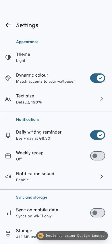
An Android Material 3 settings screen: flat list with primary section headers, 72dp two-line rows, M3 switches with check handles and a radio theme dialog.
Preview
Use it
Free to use · credit appreciated1 Once, in your project
npx skills add SusanAcharya/Design-Lounge 2 Then ask
Using the Design Lounge skill, build "M3 settings list" (piece m3-settings-list) in my stack. Match its brief; restyle it onto my product's theme.
No skill? Paste the brief instead. It carries the numbers, tokens and behaviour.
<!-- Design Lounge Nº 502 · "M3 settings list" · designlounge.vercel.app -->

# M3 settings list

> **Build brief for a coding agent.** Rebuild this piece in the reader's stack. If they haven't said which stack, ask once, then default to semantic HTML + CSS + a little vanilla JS. Match the numbers below; don't "improve" them. This is the Android counterpart of `ios-grouped-settings`: use it when the product speaks Material 3, not iOS.

## What it is

The **Settings** screen of "Larchway", a journaling app, in Material 3 on a cool blue-grey light scheme. A small top app bar (back arrow and "Settings") sits over a **flat** list: no grouped cards, no inset rounded sections. Four sections (Appearance, Notifications, Sync and storage, About) are introduced by 14px primary-coloured headers aligned to the text column and separated by full-bleed hairlines. Every row is a 72dp two-line list item with a 24px leading icon, a title, a line of supporting text, and either an M3 switch, a chevron, or nothing. Tapping **Theme** opens an M3 single-choice dialog with radio buttons, and choosing Dark or System default really re-themes the screen. Each press draws a ripple from the touch point. Two details make it worth copying. The switch handle grows from 16px to 24px and shows a check icon when it turns on. The supporting text under a switch rewrites itself to say what the setting now does, so the row never just repeats "On".

Language: Material 3 (not Expressive). Tonal surfaces, no shadows on the list, a 28px-radius dialog, M3 type scale.

## Reference behaviour

1. **Initial state (hero).** Light theme. The top app bar is 54px safe-area clearance plus a 64px row: a 48px round back button, then "Settings" (22/28, Outfit 400). Below it, a scrolling list starts with the **Appearance** header. Dynamic colour and Daily writing reminder are on. Weekly recap and Sync on mobile data are off.
2. **Scroll the list.** As soon as `scrollTop > 0`, the app bar background moves from `--surface` to `--surface-c` over 200ms. Scroll back to the top and it returns to `--surface`. This is M3's "on scroll" container colour; no shadow is used.
3. **Hover a row** (pointer devices). A state layer in `currentColor` fades to 8% opacity over 150ms.
4. **Press a row.** A circular ripple starts at the pointer position and grows to cover the row (diameter = 2 × the distance to the farthest corner) over 450ms. It holds at 12% opacity while the pointer is down, then fades out over 300ms on release. With the keyboard (Enter or Space), the ripple starts at the row centre and releases after 160ms.
5. **Toggle a switch row.** The whole 72dp row is the control (`role="switch"`). On: the track fills `--primary`, the handle moves from x 14px to x 34px (centre), grows from 16px to 24px, turns `--on-primary`, and a 16px check icon in `--primary` scales from 0.4 to 1 and fades in. Off reverses this. All of it runs over 250ms `cubic-bezier(.2,0,0,1)`. While the row is pressed, the handle grows to 28px.
6. **Supporting text follows the state:**
   - Daily writing reminder: "Every day at 08:30" when on, "Off" when off.
   - Weekly recap: "Sundays at 18:00, a recap of your week" when on, "Off" when off.
   - Sync on mobile data: "Photos and entries sync anywhere" when on, "Syncs on Wi-Fi only" when off.
   - Dynamic colour keeps "Match accents to your wallpaper" in both states.
7. **Tap Theme.** A modal dialog opens. The scrim fades to `rgba(0,0,0,.32)` and the dialog drops in from `translateY(-16px) scaleY(.85)` and opacity 0 over 400ms `cubic-bezier(.05,.7,.1,1)`, with its origin at the top centre. Focus lands on the checked radio.
8. **Dialog content.** The headline "Theme" (24/32), a supporting line "System default follows your phone's dark theme schedule.", a hairline, three 56dp radio rows (Light, Dark, System default), a hairline, then the right-aligned text buttons "Cancel" and "OK".
9. **Pick an option.** The radio's 10px inner dot scales from 0 to 1 over 200ms and its ring turns `--primary`. Nothing is applied yet.
10. **OK** applies the choice. Light sets the light scheme. Dark sets the dark scheme. System default follows `prefers-color-scheme` and keeps following it live. The Theme row's supporting text becomes "Light", "Dark" or "System default". Background and text colours cross-fade over 300ms.
11. **Cancel, Esc, or a tap on the scrim** closes without applying. Any close plays the exit: opacity to 0 and `translateY(-8px) scaleY(.95)` over 150ms `cubic-bezier(.3,0,.8,.15)`, with the scrim fading over the same 150ms. Focus returns to the Theme row.
12. **Enter on a focused radio** acts as OK.
13. Chevron rows (Text size, Notification sound, Storage, Export entries, Privacy) would push a sub-screen in a real app. In the demo they only ripple. The Version row is static text and does not react.

## Structure

```
390 × 844
┌────────────────────────────────────┐
│ (54px safe-area clearance)         │  .bar  surface → surface-c on scroll
│ [←]  Settings                      │  64px row, 48px icon button at x 4
├────────────────────────────────────┤

… 258 more lines. Copy or download for the full brief. Loading the source…Brief
298 linesBuild brief for a coding agent. Rebuild this piece in the reader’s stack. If they haven’t said which stack, ask once, then default to semantic HTML + CSS + a little vanilla JS. Match the numbers below; don’t “improve” them. This is the Android counterpart of
ios-grouped-settings: use it when the product speaks Material 3, not iOS.
What it is
The Settings screen of “Larchway”, a journaling app, in Material 3 on a cool blue-grey light scheme. A small top app bar (back arrow and “Settings”) sits over a flat list: no grouped cards, no inset rounded sections. Four sections (Appearance, Notifications, Sync and storage, About) are introduced by 14px primary-coloured headers aligned to the text column and separated by full-bleed hairlines. Every row is a 72dp two-line list item with a 24px leading icon, a title, a line of supporting text, and either an M3 switch, a chevron, or nothing. Tapping Theme opens an M3 single-choice dialog with radio buttons, and choosing Dark or System default really re-themes the screen. Each press draws a ripple from the touch point. Two details make it worth copying. The switch handle grows from 16px to 24px and shows a check icon when it turns on. The supporting text under a switch rewrites itself to say what the setting now does, so the row never just repeats “On”.
Language: Material 3 (not Expressive). Tonal surfaces, no shadows on the list, a 28px-radius dialog, M3 type scale.
Reference behaviour
- Initial state (hero). Light theme. The top app bar is 54px safe-area clearance plus a 64px row: a 48px round back button, then “Settings” (22/28, Outfit 400). Below it, a scrolling list starts with the Appearance header. Dynamic colour and Daily writing reminder are on. Weekly recap and Sync on mobile data are off.
- Scroll the list. As soon as
scrollTop > 0, the app bar background moves from--surfaceto--surface-cover 200ms. Scroll back to the top and it returns to--surface. This is M3’s “on scroll” container colour; no shadow is used. - Hover a row (pointer devices). A state layer in
currentColorfades to 8% opacity over 150ms. - Press a row. A circular ripple starts at the pointer position and grows to cover the row (diameter = 2 × the distance to the farthest corner) over 450ms. It holds at 12% opacity while the pointer is down, then fades out over 300ms on release. With the keyboard (Enter or Space), the ripple starts at the row centre and releases after 160ms.
- Toggle a switch row. The whole 72dp row is the control (
role="switch"). On: the track fills--primary, the handle moves from x 14px to x 34px (centre), grows from 16px to 24px, turns--on-primary, and a 16px check icon in--primaryscales from 0.4 to 1 and fades in. Off reverses this. All of it runs over 250mscubic-bezier(.2,0,0,1). While the row is pressed, the handle grows to 28px. - Supporting text follows the state:
- Daily writing reminder: “Every day at 08:30” when on, “Off” when off.
- Weekly recap: “Sundays at 18:00, a recap of your week” when on, “Off” when off.
- Sync on mobile data: “Photos and entries sync anywhere” when on, “Syncs on Wi-Fi only” when off.
- Dynamic colour keeps “Match accents to your wallpaper” in both states.
- Tap Theme. A modal dialog opens. The scrim fades to
rgba(0,0,0,.32)and the dialog drops in fromtranslateY(-16px) scaleY(.85)and opacity 0 over 400mscubic-bezier(.05,.7,.1,1), with its origin at the top centre. Focus lands on the checked radio. - Dialog content. The headline “Theme” (24/32), a supporting line “System default follows your phone’s dark theme schedule.”, a hairline, three 56dp radio rows (Light, Dark, System default), a hairline, then the right-aligned text buttons “Cancel” and “OK”.
- Pick an option. The radio’s 10px inner dot scales from 0 to 1 over 200ms and its ring turns
--primary. Nothing is applied yet. - OK applies the choice. Light sets the light scheme. Dark sets the dark scheme. System default follows
prefers-color-schemeand keeps following it live. The Theme row’s supporting text becomes “Light”, “Dark” or “System default”. Background and text colours cross-fade over 300ms. - Cancel, Esc, or a tap on the scrim closes without applying. Any close plays the exit: opacity to 0 and
translateY(-8px) scaleY(.95)over 150mscubic-bezier(.3,0,.8,.15), with the scrim fading over the same 150ms. Focus returns to the Theme row. - Enter on a focused radio acts as OK.
- Chevron rows (Text size, Notification sound, Storage, Export entries, Privacy) would push a sub-screen in a real app. In the demo they only ripple. The Version row is static text and does not react.
Structure
390 × 844
┌────────────────────────────────────┐
│ (54px safe-area clearance)         │  .bar  surface → surface-c on scroll
│ [←]  Settings                      │  64px row, 48px icon button at x 4
├────────────────────────────────────┤
│       Appearance                   │  header 14/20 primary, padding 16 24 8 56
│ ◐    Theme                         │  72dp row
│      Light                         │
│ ◍    Dynamic colour        (●═══✓) │  switch 52×32
│      Match accents to your…        │
│ Aa   Text size                  >  │  chevron 24px
│      Default, 100%                 │
│────────────────────────────────────│  1px outline-v, full bleed, 8px above
│       Notifications                │
│ △    Daily writing reminder (═══✓) │
│ ▦    Weekly recap           (○═══) │
│ ◁)   Notification sound         >  │
│────────────────────────────────────│
│       Sync and storage             │
│ ▮▮   Sync on mobile data    (○═══) │
│ ◎    Storage                    >  │
│ ⇧    Export entries             >  │
│────────────────────────────────────│
│       About                        │
│ ⛉    Privacy                    >  │
│ ⓘ    Version                       │  static
│ (50px bottom padding)              │
└────────────────────────────────────┘

Dialog (centred, width min(312px, 100% − 48px))
╭──────────────────────────────╮
│ Theme                        │  24/32, padding 24 24 16
│ System default follows your  │  14/20 on-surface-v, padding 0 24 12
│ phone's dark theme schedule. │
├──────────────────────────────┤
│ (◉) Light                    │  56dp rows, radio 20px, gap 16
│ ( ) Dark                     │
│ ( ) System default           │
├──────────────────────────────┤
│               Cancel    OK   │  48px text buttons, gap 8, padding 20 24
╰──────────────────────────────╯  radius 28, surface-high
<header class="bar">holds a<button aria-label="Navigate up">and an<h1>.<main>is the scroller (height: calc(100% - 118px); overflow-y: auto). It contains four<section aria-labelledby>, each with an<h2>and a<ul>of<li>.- Switch rows:
<button class="row" role="switch" aria-checked aria-labelledby="title-id" aria-describedby="supporting-id">. The visual switch is anaria-hiddenspan inside it. - Navigation rows:
<button class="row">with a trailing chevron SVG. The Theme row addsaria-haspopup="dialog". - Static row: a
<div class="row static">. - Dialog: native
<dialog aria-labelledby>opened withshowModal(). Userole="radiogroup"on the options wrapper, with<label class="opt"><input type="radio" name="theme">rows inside it.
Content (title, then supporting text, then trailing):
| Section | Title | Supporting | Trailing |
|---|---|---|---|
| Appearance | Theme | Light | none (opens dialog) |
| Appearance | Dynamic colour | Match accents to your wallpaper | switch, on |
| Appearance | Text size | Default, 100% | chevron |
| Notifications | Daily writing reminder | Every day at 08:30 | switch, on |
| Notifications | Weekly recap | Off | switch, off |
| Notifications | Notification sound | Pebble | chevron |
| Sync and storage | Sync on mobile data | Syncs on Wi-Fi only | switch, off |
| Sync and storage | Storage | 412 MB used on this phone | chevron |
| Sync and storage | Export entries | Markdown or PDF, 1,284 entries | chevron |
| About | Privacy | Lock with fingerprint, analytics off | chevron |
| About | Version | Larchway 3.8.2 (build 3820) | none, static |
Tokens
:root {
  /* primary: blue-grey, seed #2B638B */
  --primary: #2b638b;          /* switch track on, headers, radio, text buttons */
  --on-primary: #ffffff;       /* switch handle on */
  --primary-c: #cbe6ff;
  --on-primary-c: #001e31;

  /* surfaces, cool bias */
  --surface: #f7f9ff;          /* page, app bar at rest */
  --surface-low: #f1f4fa;
  --surface-c: #ebeef4;        /* app bar when scrolled */
  --surface-high: #e5e8ee;     /* dialog */
  --surface-highest: #dfe3e8;  /* switch track off */
  --on-surface: #181c20;
  --on-surface-v: #41474d;     /* icons, supporting text, radio ring */
  --outline: #72787e;          /* switch border + handle off */
  --outline-v: #c1c7ce;        /* section and dialog hairlines */
  --scrim: rgba(0, 0, 0, .32);

  /* type */
  --f-head: "Outfit", system-ui, sans-serif;               /* app bar, headers, dialog, buttons */
  --f-body: "Atkinson Hyperlegible", system-ui, sans-serif; /* rows */

  /* shape */
  --r-dialog: 28px;
  --r-full: 999px;
  --switch-w: 52px; --switch-h: 32px;
  --handle-off: 16px; --handle-on: 24px; --handle-press: 28px;

  /* spacing (4dp grid) */
  --row-min: 72px;
  --row-pad: 12px 24px 12px 16px;
  --row-gap: 16px;
  --text-col: 56px;            /* 16 pad + 24 icon + 16 gap */

  /* motion */
  --ease-std: cubic-bezier(.2, 0, 0, 1);
  --ease-decel: cubic-bezier(.05, .7, .1, 1);
  --ease-accel: cubic-bezier(.3, 0, .8, .15);
  --t-switch: 250ms;
  --t-enter: 400ms;
  --t-exit: 150ms;
  --t-ripple: 450ms;
}
[data-theme="dark"] {
  --primary: #98cdf9; --on-primary: #00344f; --primary-c: #0a4b71; --on-primary-c: #cbe6ff;
  --surface: #101418; --surface-low: #181c20; --surface-c: #1c2024;
  --surface-high: #262a2f; --surface-highest: #31353a;
  --on-surface: #e0e2e8; --on-surface-v: #c1c7ce; --outline: #8b9198; --outline-v: #41474d;
}
Typography
| Role | Family | Size / line | Weight | Tracking | Case |
|---|---|---|---|---|---|
| App bar title (title-large) | Outfit | 22 / 28 | 400 | 0 | sentence |
| Section header (title-small) | Outfit | 14 / 20 | 500 | 0.1px | sentence |
| Row title (body-large) | Atkinson Hyperlegible | 16 / 24 | 400 | 0.2px | sentence |
| Row supporting (body-medium) | Atkinson Hyperlegible | 14 / 20 | 400 | 0.2px | sentence |
| Dialog headline (headline-small) | Outfit | 24 / 32 | 400 | 0 | sentence |
| Dialog supporting | Atkinson Hyperlegible | 14 / 20 | 400 | 0 | sentence |
| Radio label | Atkinson Hyperlegible | 16 / 24 | 400 | 0 | sentence |
| Text button (label-large) | Outfit | 14 / 20 | 500 | 0.1px | sentence |
Atkinson Hyperlegible is chosen on purpose for a settings screen: its distinct 0, 1, l and I shapes keep values like “08:30” and “3820” unambiguous. Outfit gives the headings a geometric voice without competing with it.
Motion
| Element | Trigger | Property | From → To | Duration | Easing |
|---|---|---|---|---|---|
| App bar | scrollTop > 0 toggles | background-color | surface ↔ surface-c | 200ms | --ease-std |
| Row state layer | hover / focus | opacity | 0 → .08 / .10 | 150ms | linear |
| Ripple | pointerdown | transform scale | 0 → 1 | 450ms | --ease-std |
| Ripple | pointerup | opacity | .12 → 0 | 300ms | linear |
| Switch track | toggle | background, border | surface-highest/outline ↔ primary | 250ms | --ease-std |
| Switch handle | toggle | left, size, colour | 14px/16px/outline ↔ 34px/24px/on-primary | 250ms | --ease-std |
| Switch check | toggle on | opacity, scale | 0, .4 → 1, 1 | 150ms / 250ms | linear / --ease-std |
| Switch handle | row :active | size | current → 28px | 250ms | --ease-std |
| Dialog | open | opacity, translateY, scaleY | 0, −16px, .85 → 1, 0, 1 | 400ms | --ease-decel |
| Dialog | close | opacity, translateY, scaleY | 1 → 0, −8px, .95 | 150ms | --ease-accel |
| Scrim | open / close | opacity | 0 ↔ 1 | 400ms / 150ms | std / accel |
| Radio dot | check | scale | 0 → 1 | 200ms | --ease-std |
| Theme change | OK | background, colour | old → new scheme | 300ms | --ease-std |
Reduced motion: every duration becomes 1ms. Ripples don’t scale; they appear at full size at 10% opacity and still fade on release, so press feedback remains. The dialog closes immediately, without waiting for animationend.
States
- Row rest: transparent, icons and supporting text
--on-surface-v, title--on-surface. - Row hover: 8%
currentColorstate layer. - Row focus-visible: 10% state layer plus a 2px
--primaryoutline inset by 2px (outline-offset: -2px), so the ring isn’t clipped by the scroller. - Row pressed: ripple at 12%; on switch rows the handle grows to 28px.
- Switch off: track
--surface-highest, 2px--outlineborder, 16px--outlinehandle centred at x 14px. - Switch on: track and border
--primary, 24px--on-primaryhandle centred at x 34px, check icon visible. - App bar scrolled:
--surface-c. - Dialog open: page behind it is inert (native
showModal), scrim 32% black. - Radio checked: ring and 10px dot
--primary. Unchecked: 2px--on-surface-vring. - Radio row focus-visible: 2px
--primaryoutline inset on the whole row (:has(input:focus-visible)), plus a 10% state layer. - Static row (Version): no state layer, default cursor.
- Dark theme: the token swap in the
[data-theme="dark"]block. Nothing else changes. - Empty or error: not applicable. A real app should show a snackbar if a setting fails to save and revert the switch.
Accessibility
- Switch rows are single tab stops:
role="switch",aria-checkedmirrors the state,aria-labelledbypoints at the title andaria-describedbyat the supporting text, so the updated description is read after toggling. - The Theme row has
aria-haspopup="dialog". The dialog is a native<dialog>witharia-labelledbypointing at “Theme”.showModal()traps focus and makes the page inert. - Inside the dialog, native radios give Arrow Up and Arrow Down to move and select, and Tab to reach Cancel and OK. Enter on a radio applies (OK). Esc cancels (intercept the
cancelevent,preventDefault, and run the animated close). Focus returns to the Theme row. - Back button:
aria-label="Navigate up"(Android’s wording). - Section
<h2>s label their<section>s, which gives screen reader users heading navigation. - Contrast, light theme: title on surface 16.3:1; supporting text 8.9:1; primary header on surface 6.1:1; primary text button on the dialog surface 5.2:1; white handle on primary track 6.4:1. Dark theme: supporting text 10.9:1; primary 11.0:1. The off-switch outline on its track is 3.5:1, above the 3:1 needed for non-text UI.
- Hit targets: rows are at least 72dp tall and full width; the back button is 48 × 48; dialog radio rows are 56dp tall; text buttons are 48px tall and at least 64px wide.
Responsive rules
- 360 wide: unchanged. Rows are flexible, and long supporting text wraps to a second line.
- Largest text size (200%): rows grow because they use
min-height: 72px, not a fixed height. Titles and supporting text wrap; icons and switches stay vertically centred. The switch never shrinks (flex: none). The dialog’s radio rows grow past 56dp, and the dialog scrolls internally once it passes100vh − 48px. - Tablet or foldable (≥ 600 wide): cap the list at 640px and centre it, or move to a two-pane layout with sections on the left. The dialog stays at 312px wide (max 560).
- Dark: tokens only; spacing and type are unchanged.
Acceptance checklist
Always
- List is flat. Sections are separated by a full-bleed 1px
--outline-vhairline, with no cards or inset rounded groups. - Section headers are 14/20 weight 500 in
--primary, left-aligned to the text column at 56px. - Every interactive row is at least 72px tall, and the whole row is the hit target.
- Switch is 52×32. The handle is 16px when off and 24px with a check when on, 28px while pressed, with a 250ms
cubic-bezier(.2,0,0,1)transition. - Switch rows expose
role="switch"and updatearia-checked. Supporting text updates to describe the new state. - Ripple originates at the pointer (centre for keyboard), grows over 450ms and fades over 300ms after release.
- App bar container turns
--surface-cwhen the list scrolls and back to--surfaceat the top. - Dialog is modal: 28px radius,
--surface-high, scrim 32% black, enter 400ms decelerate, exit 150ms accelerate. - Choosing a radio doesn’t apply until OK. Cancel, Esc and a scrim tap revert. Focus returns to the opener.
- Reduced motion keeps the press feedback and removes movement.
This demo
- Brand “Larchway”, title “Settings”, four sections: Appearance, Notifications, Sync and storage, About.
- Theme options are Light, Dark and System default, and applying one really re-themes the screen.
- Hero state: light theme, with Dynamic colour and Daily writing reminder on, and Weekly recap and Sync on mobile data off.
- Primary is
#2B638Blight and#98CDF9dark. Fonts are Outfit and Atkinson Hyperlegible.
Implementation notes
The M3 switch with a growing handle. Animate left, width, height and the negative margins together, so the handle stays centred on its track position while it grows:
.sw { position:relative; width:52px; height:32px; border-radius:16px;
  background:var(--surface-highest); border:2px solid var(--outline);
  transition: background-color 250ms var(--ease-std), border-color 250ms var(--ease-std); }
.sw i { position:absolute; top:50%; left:14px; width:16px; height:16px; margin:-8px 0 0 -8px;
  border-radius:50%; background:var(--outline); display:grid; place-items:center;
  transition: left 250ms var(--ease-std), width 250ms var(--ease-std), height 250ms var(--ease-std),
              margin 250ms var(--ease-std), background-color 250ms var(--ease-std); }
[aria-checked="true"] .sw { background:var(--primary); border-color:var(--primary); }
[aria-checked="true"] .sw i { left:34px; width:24px; height:24px; margin:-12px 0 0 -12px; background:var(--on-primary); }
.row:active .sw i { width:28px; height:28px; margin:-14px 0 0 -14px; }
The 14px and 34px centres are measured inside the 2px border: 48px of inner width, minus 16px, divided by 2, gives the off centre at 14.
Ripple from the touch point. The diameter must reach the farthest corner, or the ripple visibly stops short on wide rows:
function ripple(el, x, y) {
  const r = el.getBoundingClientRect();
  if (x == null) { x = r.left + r.width / 2; y = r.top + r.height / 2; }
  const s = 2 * Math.hypot(Math.max(x - r.left, r.right - x), Math.max(y - r.top, r.bottom - y));
  const d = document.createElement('span'); d.className = 'rpl';
  d.style.cssText = `width:${s}px;height:${s}px;left:${x - r.left - s/2}px;top:${y - r.top - s/2}px`;
  el.appendChild(d);
  return () => { d.classList.add('out'); setTimeout(() => d.remove(), 320); };
}
Give the host position:relative; overflow:hidden; isolation:isolate and the ripple z-index:-1, so it paints under the text but above the row background.
Animated close for a native dialog. dialog.close() is instant, so play the exit animation first and close on animationend. Esc fires cancel, which you must intercept:
function close(commit) {
  if (commit) apply(dlg.querySelector('input:checked').value);
  dlg.classList.add('closing');
  dlg.addEventListener('animationend', () => {
    dlg.classList.remove('closing'); dlg.close(); themeRow.focus();
  }, { once: true });
}
dlg.addEventListener('cancel', e => { e.preventDefault(); close(false); });
Common mistakes: building iOS-style grouped cards (this is Android, so keep the list flat); making only the switch clickable instead of the whole row; applying the theme on radio change instead of on OK; and forgetting that System default must keep listening to prefers-color-scheme changes.
Details
- Palette
- Type
- Outfit · Atkinson Hyperlegible
- Motion
- Subtle motion
- Build
- One session
- Tags
On the shelves