Nº 032 of 520
M3 modal navigation drawer
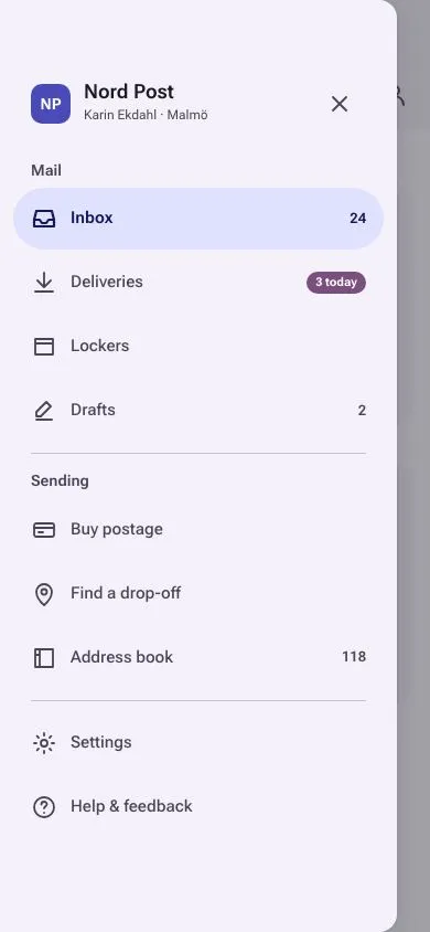
A 360px Material 3 Expressive modal drawer that slides in under a scrim from a top-app-bar hamburger, with full-width tonal pill for the active item, section headers, dividers and badges.
Preview
Use it
Free to use · credit appreciated1 Once, in your project
npx skills add SusanAcharya/Design-Lounge 2 Then ask
Using the Design Lounge skill, build "M3 modal navigation drawer" (piece m3-navigation-drawer) in my stack. Match its brief; restyle it onto my product's theme.
No skill? Paste the brief instead. It carries the numbers, tokens and behaviour.
<!-- Design Lounge Nº 032 · "M3 modal navigation drawer" · designlounge.vercel.app -->

# M3 modal navigation drawer

> **Build brief for a coding agent.** Rebuild this piece in the reader's stack. If they haven't said which stack, ask once, then default to semantic HTML + CSS + a little vanilla JS. Match the numbers below; don't "improve" them.

## What it is

A **modal navigation drawer** for "Nord Post", a parcel-and-mail app, in Material 3 Expressive on a cool light scheme. A hamburger in the top app bar slides a 360px drawer in from the left over a 40% scrim. The drawer holds a product header, two labelled sections divided by hairlines, nine destinations, count badges and one tertiary "3 today" pill. The active destination is a full-width 56px pill in the secondary container colour — a wide, tonal shape rather than an indicator line. The detail worth copying is the asymmetric timing: 400ms emphasized in, 250ms accelerated out, with focus trapped inside while open and returned to the hamburger on close.

## Reference behaviour

1. Initial state (hero): the drawer is **already open** (`body.open` in the markup, hamburger `aria-expanded="true"`) over the inbox: top app bar (surface-low, 118px including the 54px status clearance) with hamburger, "Inbox" title (22px), search and account icons; grouped rows of deliveries and letters with 40px badge tiles behind the scrim. No focus is moved on load.
2. After closing it (step 6), tap the hamburger (48px round icon button): `body.open` is set, `aria-expanded` becomes true. Scrim fades in to `rgba(27,27,34,.4)` and the drawer translates from −100% to 0 over 400ms `cubic-bezier(.2,0,0,1)`, gaining a soft shadow. Focus moves to the current-page link.
3. The drawer: 360px wide, rounded 16px on its right corners only, 54px top padding, 34px bottom padding, scrolls internally if needed. Header row: 36px indigo mark "NP", product name (18px/600), user line (12px), and a close icon button. Then `h2` "Mail" with four links, a divider, `h2` "Sending" with three links, a divider, two utility links.
4. Hover a link: a 6% `--on-surface` state layer appears; pressing raises it to 12%.
5. Tap a link: it becomes `aria-current="page"` (pill fill `--secondary-c`, text `--on-secondary-c`, weight 600, icon stroke 2.2); the app bar title changes to the link's label; the drawer closes; a dark snackbar "Opened Deliveries" rises at the bottom for 1.6s.
6. Tap the scrim, the drawer's close button or press Esc: drawer translates back to −100% over 250ms `cubic-bezier(.3,0,.8,.15)`, scrim fades on the same clock, focus returns to the element that opened it.
7. Tab and Shift+Tab cycle only through the close button and the nine links while open.

## Structure

```
390 × 844
┌────────────────────────────────────┐
│ (54px clearance)                   │
│ ≡   Inbox                 ○   ○    │  app bar 64px + 54, surface-low
│ TODAY                              │
│ ┌────────────────────────────────┐ │
│ │[PKG] Parcel from Halden…  09:12│ │  rows in a 20px-radius group
│ │[LTR] Skatteverket         08:30│ │
│ │[PKG] Return label…        07:55│ │
│ └────────────────────────────────┘ │
│ YESTERDAY                          │
│ ┌────────────────────────────────┐ │
│ │ ...                            │ │
│ └────────────────────────────────┘ │
└────────────────────────────────────┘

open state (drawer 360 over a scrim, 30px of scrim visible on the right)

… 202 more lines. Copy or download for the full brief. Loading the source…Brief
242 linesBuild brief for a coding agent. Rebuild this piece in the reader’s stack. If they haven’t said which stack, ask once, then default to semantic HTML + CSS + a little vanilla JS. Match the numbers below; don’t “improve” them.
What it is
A modal navigation drawer for “Nord Post”, a parcel-and-mail app, in Material 3 Expressive on a cool light scheme. A hamburger in the top app bar slides a 360px drawer in from the left over a 40% scrim. The drawer holds a product header, two labelled sections divided by hairlines, nine destinations, count badges and one tertiary “3 today” pill. The active destination is a full-width 56px pill in the secondary container colour — a wide, tonal shape rather than an indicator line. The detail worth copying is the asymmetric timing: 400ms emphasized in, 250ms accelerated out, with focus trapped inside while open and returned to the hamburger on close.
Reference behaviour
- Initial state (hero): the drawer is already open (
body.openin the markup, hamburgeraria-expanded="true") over the inbox: top app bar (surface-low, 118px including the 54px status clearance) with hamburger, “Inbox” title (22px), search and account icons; grouped rows of deliveries and letters with 40px badge tiles behind the scrim. No focus is moved on load. - After closing it (step 6), tap the hamburger (48px round icon button):
body.openis set,aria-expandedbecomes true. Scrim fades in torgba(27,27,34,.4)and the drawer translates from −100% to 0 over 400mscubic-bezier(.2,0,0,1), gaining a soft shadow. Focus moves to the current-page link. - The drawer: 360px wide, rounded 16px on its right corners only, 54px top padding, 34px bottom padding, scrolls internally if needed. Header row: 36px indigo mark “NP”, product name (18px/600), user line (12px), and a close icon button. Then
h2“Mail” with four links, a divider,h2“Sending” with three links, a divider, two utility links. - Hover a link: a 6%
--on-surfacestate layer appears; pressing raises it to 12%. - Tap a link: it becomes
aria-current="page"(pill fill--secondary-c, text--on-secondary-c, weight 600, icon stroke 2.2); the app bar title changes to the link’s label; the drawer closes; a dark snackbar “Opened Deliveries” rises at the bottom for 1.6s. - Tap the scrim, the drawer’s close button or press Esc: drawer translates back to −100% over 250ms
cubic-bezier(.3,0,.8,.15), scrim fades on the same clock, focus returns to the element that opened it. - Tab and Shift+Tab cycle only through the close button and the nine links while open.
Structure
390 × 844
┌────────────────────────────────────┐
│ (54px clearance)                   │
│ ≡   Inbox                 ○   ○    │  app bar 64px + 54, surface-low
│ TODAY                              │
│ ┌────────────────────────────────┐ │
│ │[PKG] Parcel from Halden…  09:12│ │  rows in a 20px-radius group
│ │[LTR] Skatteverket         08:30│ │
│ │[PKG] Return label…        07:55│ │
│ └────────────────────────────────┘ │
│ YESTERDAY                          │
│ ┌────────────────────────────────┐ │
│ │ ...                            │ │
│ └────────────────────────────────┘ │
└────────────────────────────────────┘

open state (drawer 360 over a scrim, 30px of scrim visible on the right)
┌───────────────────────────────────╮░┐
│ (54px)                            │░│
│ [NP] Nord Post               ×    │░│  header
│      Karin Ekdahl · Malmö         │░│
│ Mail                              │░│  h2
│ ╭───────────────────────────────╮ │░│
│ │ ▣ Inbox                    24 │ │░│  active: full-width pill 56px
│ ╰───────────────────────────────╯ │░│
│   ⇩ Deliveries          (3 today) │░│  tertiary pill badge
│   ▭ Lockers                       │░│
│   ✎ Drafts                      2 │░│
│ ───────────────────────────────── │░│  divider
│ Sending                           │░│
│   ▭ Buy postage                   │░│
│   ⌖ Find a drop-off               │░│
│   ▤ Address book              118 │░│
│ ───────────────────────────────── │░│
│   ⚙ Settings                      │░│
│   ? Help & feedback               │░│
└───────────────────────────────────╯░┘
<header class="appbar">— hamburger<button aria-expanded aria-controls="drawer">,<h1>, two icon buttons.<main>—.eyebrowlabels and.rowsgroups of<button class="row">(badge tile, title/subtitle, time).<button class="scrim" tabindex="-1">—inset:0.<nav class="drawer" id="drawer" aria-label="Main">—.head, thenh2+<ul>of<a>per section,<hr>dividers. Each<a>: 24px SVG, label text, optional.ncount or.pillbadge.<div class="pop" role="status" aria-live="polite">— snackbar.
Tokens
:root {
  /* tonal surfaces — cool lavender bias */
  --surface: #fbf8ff;
  --surface-low: #f4f1fb;        /* app bar, drawer, row groups */
  --surface-c: #ede9f6;
  --surface-high: #e7e3f0;       /* hover on rows and icon buttons */
  --surface-highest: #e1ddea;
  --on-surface: #1b1b22;
  --on-surface-v: #484556;       /* drawer link text, section headers */
  --outline: #787487;            /* timestamps */
  --outline-v: #c8c4d5;          /* dividers */

  /* primary / secondary / tertiary */
  --primary: #4a4ab8;            /* mark, focus rings */
  --on-primary: #ffffff;
  --secondary-c: #dfe1ff;        /* active pill, PKG badge tile */
  --on-secondary-c: #121a5c;
  --tertiary: #7a4f7d;           /* "3 today" pill */
  --tertiary-c: #fed6ff;         /* LTR badge tile */
  --on-tertiary-c: #3d1a42;

  --scrim: rgba(27, 27, 34, .4);
  --state-hover: .06;            /* opacity of --on-surface layer */
  --state-press: .12;

  /* type */
  --font: "Roboto Flex", system-ui, sans-serif;
  --fs-title: 22px; --fs-brand: 18px; --fs-body: 15px; --fs-h2: 14px; --fs-count: 13px; --fs-meta: 12px; --fs-pill: 11px;

  /* layout / shape */
  --drawer-w: 360px;
  --r-drawer: 0 16px 16px 0;
  --r-item: 999px;
  --item-h: 56px;
  --r-group: 20px;
  --r-row: 14px;
  --r-tile: 12px;
  --r-snack: 12px;

  /* spacing */
  --s-1: 4px; --s-2: 8px; --s-3: 12px; --s-4: 16px;

  /* elevation */
  --shadow-1: 0 1px 3px rgba(27,27,34,.12), 0 6px 24px rgba(27,27,34,.10);

  /* motion */
  --t-micro: 160ms;
  --t-open: 400ms;
  --t-close: 250ms;
  --t-snack: 1600ms;
  --ease-emph: cubic-bezier(.2, 0, 0, 1);
  --ease-exit: cubic-bezier(.3, 0, .8, .15);
}
Typography
| Role | Family | Size | Weight | Line-height | Tracking | Case |
|---|---|---|---|---|---|---|
| App bar title | Roboto Flex | 22px | 500 | 1.2 | −0.01em | sentence |
| Drawer brand | Roboto Flex | 18px | 600 | 1.1 | 0 | sentence |
| Drawer user line | Roboto Flex | 12px | 400 | 1.4 | 0 | sentence |
| Section header | Roboto Flex | 14px | 600 | 1.3 | 0 | sentence |
| Drawer link | Roboto Flex | 15px | 500 (active 600) | 1 | 0 | sentence |
| Count badge | Roboto Flex | 13px | 600 | 1 | 0 | numerals |
| Tertiary pill | Roboto Flex | 11px | 700 | 1.4 | 0 | sentence |
| List eyebrow | Roboto Flex | 12px | 600 | 1.3 | +0.08em | UPPERCASE |
| Row title | Roboto Flex | 15px | 500 | 1.35 | 0 | sentence |
| Row subtitle | Roboto Flex | 13px | 400 | 1.4 | 0 | sentence |
| Badge tile | Roboto Flex | 11px | 700 | 1 | +0.04em | UPPERCASE |
| Snackbar | Roboto Flex | 14px | 500 | 1.4 | 0 | sentence |
Motion
| Element | Trigger | Property | From → To | Duration | Easing | Notes |
|---|---|---|---|---|---|---|
.drawer | open | translateX | −100% → 0 | 400ms | --ease-emph | shadow appears at the same time |
.drawer | close | translateX | 0 → −100% | 250ms | --ease-exit | |
.scrim | open | opacity | 0 → 1 | 400ms | --ease-emph | |
.scrim | close | opacity | 1 → 0 | 250ms | --ease-exit | |
| link state layer | hover / press | opacity | 0 → .06 / .12 | 160ms | linear | ::before pseudo |
| active pill | select | background, color | transparent → secondary-c | 160ms | linear | no movement |
.pop | select | opacity, translateY | 0, 12px → 1, 0 | 160ms | --ease-emph | auto-hides after 1600ms |
.icon | hover | background | transparent → surface-high | 160ms | linear |
Reduced motion: all transitions 1ms. The drawer appears and disappears instantly; the scrim still shows.
States
- Closed: drawer
visibility:hidden; transform:translateX(-100%); scrimopacity:0; pointer-events:none. - Open:
body.open; drawer visible with--shadow-1; scrim interactive; hamburgeraria-expanded="true". - Link hover: 6% on-surface layer. Link pressed: 12%.
- Link current:
aria-current="page", pill--secondary-c, text--on-secondary-c, weight 600, icon stroke 2.2px, count badge takes the same text colour. - Focus-visible (all controls): 3px
--primaryoutline, −3px offset (inside the pill so it isn’t clipped byoverflow:hidden). - Row hover: background
--surface-high. - Snackbar showing:
.pop.on.
Accessibility
- Hamburger:
<button aria-label="Open navigation" aria-expanded aria-controls="drawer">. - Drawer:
<nav aria-label="Main">; sections use<h2>headings; destinations are<a>witharia-current="page"on the active one. - Focus trap while open: Tab from the last link wraps to the close button; Shift+Tab from the close button wraps to the last link. Esc closes. On open, focus goes to the current link; on close it returns to whatever opened the drawer.
- The scrim button has
tabindex="-1"and anaria-label, so pointer users can close it without adding a tab stop. - Snackbar is
role="status" aria-live="polite". - Contrast:
--on-surface-von--surface-low9.1:1;--on-secondary-con--secondary-c11.7:1; white on--tertiary6.4:1. - Hit targets: icon buttons 48px, drawer links 56px, rows ≥ 64px.
Responsive rules
- 390 wide: drawer 360px, 30px of scrim visible.
- 360 wide: drawer becomes
min(360px, 100% - 24px)= 336px so the scrim edge stays tappable. - ≥ 840 wide: switch to a standard (non-modal) drawer: no scrim, no translate,
position:static, 360px column beside the content, hamburger hidden. - Short viewports: the drawer scrolls internally (
overflow-y:auto); header stays at the top of the scroll content, not sticky.
Acceptance checklist
- Drawer is exactly 360px wide with
border-radius: 0 16px 16px 0and#F4F1FBbackground. - Opening translates from −100% to 0 over 400ms
cubic-bezier(.2,0,0,1); closing takes 250mscubic-bezier(.3,0,.8,.15). - Scrim is
rgba(27,27,34,.4)and closes the drawer on tap. - Active item is a full-width 56px pill filled
#DFE1FFwith#121A5Ctext at weight 600. - Two
<h2>section headers and two 1px#C8C4D5dividers separate the groups. - Count badges (“24”, “2”, “118”) right-align at 13px/600; “3 today” is a
#7A4F7Dpill with white 11px/700 text. - Hamburger
aria-expandedmirrors the state; Esc closes; focus returns to the hamburger on close. - Tab is trapped to the close button + nine links while open.
- Selecting a destination updates the app bar title, closes the drawer and shows a snackbar for 1.6s.
- Hover shows a 6% state layer, press 12%, on drawer links.
- No fixed control sits within the top 54px; drawer content starts below it.
- The first frame shows the drawer open; closing and reopening replays the slide.
- Reduced motion collapses all transitions to 1ms.
Implementation notes
Slide with transform and keep it out of the tab order when closed. visibility toggles on the same transition so the closed drawer isn’t focusable, but the slide still renders:
.drawer { position:absolute; top:0; bottom:0; left:0; width:360px;
  transform:translateX(-100%); visibility:hidden;
  transition: transform 250ms var(--ease-exit), visibility 0s linear 250ms; }
.open .drawer { transform:none; visibility:visible; box-shadow:var(--shadow-1);
  transition: transform 400ms var(--ease-emph), visibility 0s; }
State layers as a pseudo-element so hover/press never change the pill’s own colour:
.drawer a { position:relative; overflow:hidden; border-radius:999px; height:56px; }
.drawer a::before { content:""; position:absolute; inset:0; background:var(--on-surface); opacity:0; transition:opacity 160ms; }
.drawer a:hover::before  { opacity:.06 }
.drawer a:active::before { opacity:.12 }
.drawer a[aria-current="page"] { background:var(--secondary-c); color:var(--on-secondary-c); font-weight:600; }
Minimal focus trap — only the close button and the links are focusable inside:
addEventListener('keydown', (e) => {
  if (!body.classList.contains('open')) return;
  if (e.key === 'Escape') { e.preventDefault(); setOpen(false); return; }
  if (e.key !== 'Tab') return;
  const f = [closeBtn, ...links], i = f.indexOf(document.activeElement);
  if (e.shiftKey && i <= 0) { e.preventDefault(); f[f.length - 1].focus(); }
  else if (!e.shiftKey && i === f.length - 1) { e.preventDefault(); f[0].focus(); }
});
Common mistakes: animating left instead of transform; giving the drawer full-height rounded corners on the left (only the right edge rounds); using an inset indicator bar for the active item (M3 Expressive uses a full-width tonal pill); forgetting outline-offset:-3px so the focus ring is clipped by the pill’s overflow:hidden.
Details
- Palette
- Type
- Roboto Flex
- Motion
- Subtle motion
- Build
- One session
- Tags
On the shelves