Nº 045 of 520
Onboarding checklist card
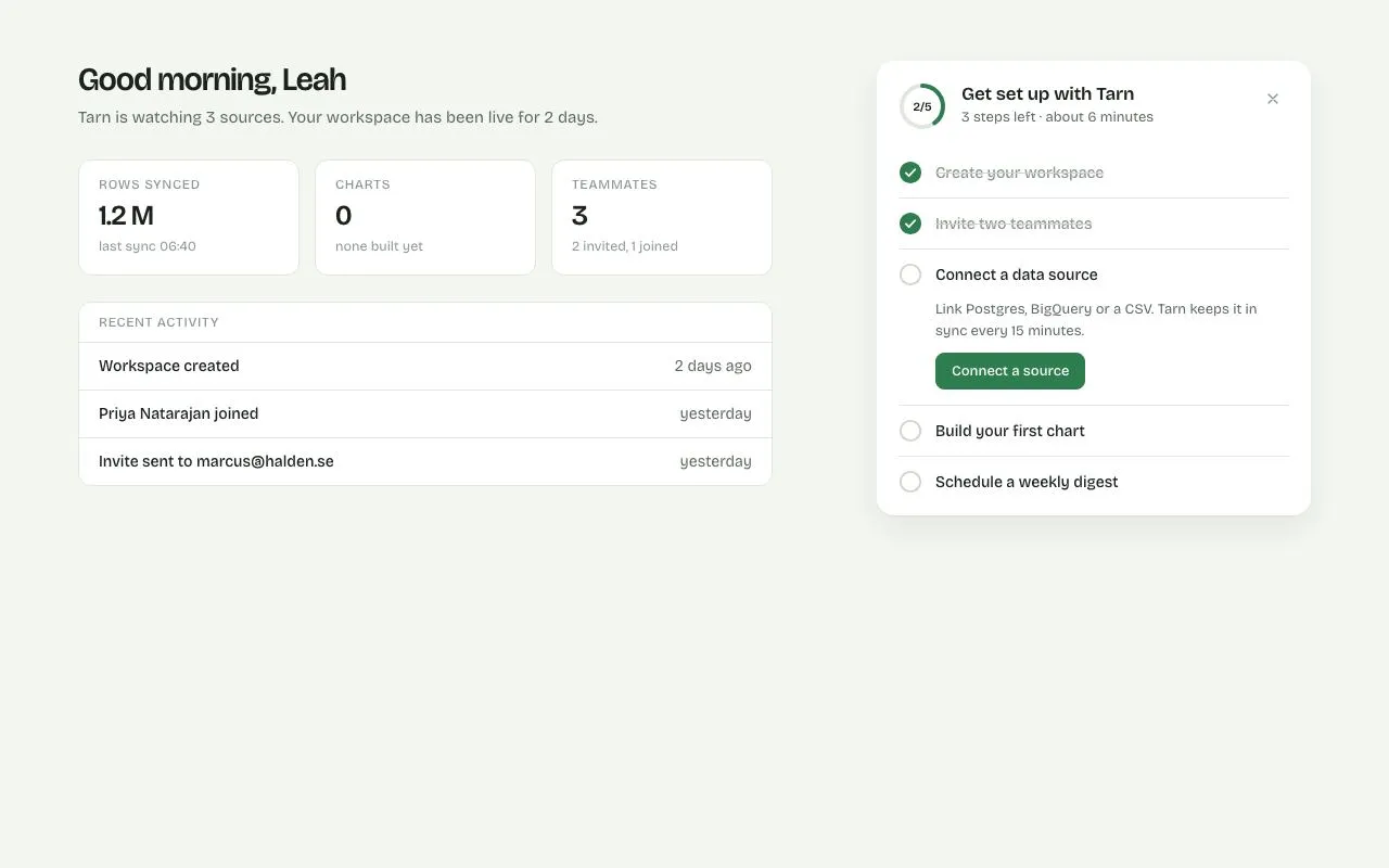
A 400px setup card with a 44px progress ring and five tasks; completing one draws a tick and collapses it, 100% dissolves into a calm 'You're set' state, and the card is dismissable.
Preview
Use it
Free to use · credit appreciated1 Once, in your project
npx skills add SusanAcharya/Design-Lounge 2 Then ask
Using the Design Lounge skill, build "Onboarding checklist card" (piece onboarding-checklist) in my stack. Match its brief; restyle it onto my product's theme.
No skill? Paste the brief instead. It carries the numbers, tokens and behaviour.
<!-- Design Lounge Nº 045 · "Onboarding checklist card" · designlounge.vercel.app -->

# Onboarding checklist card

> **Build brief for a coding agent.** Rebuild this piece in the reader's stack. If they haven't said which stack, ask once, then default to semantic HTML + CSS + a little vanilla JS. Match the numbers below; don't "improve" them.

## What it is

A "get set up" card that sits in the right column of a product's home page ("Tarn", an analytics tool). It lists five activation tasks with a 44px progress ring in the header. Only one task is expanded at a time (the next incomplete one), showing a sentence and an action button; completing it fills its circle, draws a tick over 280ms, strikes the title, collapses its body and expands the next. When all five are done the list and header fade out and a quiet "You're set" panel fades in with a 64px tinted circle whose check draws itself. No confetti. The card can be dismissed from the X or the final button. The detail worth copying is the single-source-of-truth `update()`: task classes, the ring, the copy and the celebration are all derived from a count of `.done` rows.

## Reference behaviour

1. Initial state: left column shows a greeting, three stat tiles and a recent-activity list. Right column shows the card with the ring at 40 % (label "2/5"), title "Get set up with Tarn", subtitle "3 steps left · about 6 minutes", an X button. Tasks 1–2 are done (filled accent circle with a white tick, struck-through grey title, no body). Task 3 is open (description + "Connect a source" button). Tasks 4–5 are collapsed to their 46px title rows with empty circles.
2. Hover the action button: `--accent-hover`. Hover the X: `--card-2` background, `--ink` icon.
3. Click the open task's button: its circle fills `--accent` and the tick draws (stroke-dashoffset 1 → 0 over 280ms, 80ms after the fill). 300ms after the click, `update()` runs: the body collapses (`grid-template-rows: 1fr → 0fr` + opacity, 320ms), the title turns `--ink-3` with a line-through, the next task's body expands over 320ms, the ring animates to the new fraction over 480ms, the label reads "3/5" and the subtitle recomputes ("2 steps left · about 4 minutes").
4. Repeat for tasks 4 and 5. Minutes per task: 2, 3, 1 for tasks 3–5.
5. When the fifth task completes: 320ms after the tick, the card gets `.complete`. The header and task list fade to 0 over 320ms; the "You're set" layer (absolutely covering the card) fades in and rises 6px → 0 over 520ms after a 320ms delay; its 30px check draws over 360ms starting at 520ms. Copy: "You're set" (24px), "Tarn is connected, charting and reporting. This card won't show again.", ghost button "Go to my dashboard".
6. Clicking the X at any time, or "Go to my dashboard" at the end: the card fades and drops (`opacity 0; translateY(8px) scale(.98)`, 320ms) and a small "bring the checklist back" text link appears beneath it.
7. Clicking that link restores the initial state (tasks 1–2 done, ring 40 %) and re-arms the tick animations.
8. The ring is `role="progressbar"` with `aria-valuenow` updated on every change; the done layer is `aria-live="polite"`.

## Structure

```
1280 × 800   (grid: 1fr 400px, gap 48, padding 56 72)
┌──────────────────────────────────────────────────────────────────────────┐
│ Good morning, Leah (30px)                       ┌ card 400 ───────────┐  │
│ Tarn is watching 3 sources…                     │ (◔2/5) Get set up    ×│  │
│ ┌ tile ─┐ ┌ tile ─┐ ┌ tile ─┐                   │        3 steps left… │  │
│ │1.2 M  │ │ 0     │ │ 3     │                   │ ─────────────────────│  │
│ └───────┘ └───────┘ └───────┘                   │ ● Create your works… │  │ done 46
│ ┌ recent activity ──────────────┐               │ ● Invite two teamm…  │  │ done
│ │ Workspace created   2 days ago│               │ ○ Connect a data so… │  │ open
│ │ Priya … joined      yesterday │               │   Link Postgres, Big…│  │
│ │ Invite sent to …    yesterday │               │   [Connect a source] │  │
│ └───────────────────────────────┘               │ ○ Build your first…  │  │ next
│                                                 │ ○ Schedule a weekly… │  │ next
│                                                 └──────────────────────┘  │
└──────────────────────────────────────────────────────────────────────────┘
```

… 163 more lines. Copy or download for the full brief. Loading the source…Brief
203 linesBuild brief for a coding agent. Rebuild this piece in the reader’s stack. If they haven’t said which stack, ask once, then default to semantic HTML + CSS + a little vanilla JS. Match the numbers below; don’t “improve” them.
What it is
A “get set up” card that sits in the right column of a product’s home page (“Tarn”, an analytics tool). It lists five activation tasks with a 44px progress ring in the header. Only one task is expanded at a time (the next incomplete one), showing a sentence and an action button; completing it fills its circle, draws a tick over 280ms, strikes the title, collapses its body and expands the next. When all five are done the list and header fade out and a quiet “You’re set” panel fades in with a 64px tinted circle whose check draws itself. No confetti. The card can be dismissed from the X or the final button. The detail worth copying is the single-source-of-truth update(): task classes, the ring, the copy and the celebration are all derived from a count of .done rows.
Reference behaviour
- Initial state: left column shows a greeting, three stat tiles and a recent-activity list. Right column shows the card with the ring at 40 % (label “2/5”), title “Get set up with Tarn”, subtitle “3 steps left · about 6 minutes”, an X button. Tasks 1–2 are done (filled accent circle with a white tick, struck-through grey title, no body). Task 3 is open (description + “Connect a source” button). Tasks 4–5 are collapsed to their 46px title rows with empty circles.
- Hover the action button:
--accent-hover. Hover the X:--card-2background,--inkicon. - Click the open task’s button: its circle fills
--accentand the tick draws (stroke-dashoffset 1 → 0 over 280ms, 80ms after the fill). 300ms after the click,update()runs: the body collapses (grid-template-rows: 1fr → 0fr+ opacity, 320ms), the title turns--ink-3with a line-through, the next task’s body expands over 320ms, the ring animates to the new fraction over 480ms, the label reads “3/5” and the subtitle recomputes (“2 steps left · about 4 minutes”). - Repeat for tasks 4 and 5. Minutes per task: 2, 3, 1 for tasks 3–5.
- When the fifth task completes: 320ms after the tick, the card gets
.complete. The header and task list fade to 0 over 320ms; the “You’re set” layer (absolutely covering the card) fades in and rises 6px → 0 over 520ms after a 320ms delay; its 30px check draws over 360ms starting at 520ms. Copy: “You’re set” (24px), “Tarn is connected, charting and reporting. This card won’t show again.”, ghost button “Go to my dashboard”. - Clicking the X at any time, or “Go to my dashboard” at the end: the card fades and drops (
opacity 0; translateY(8px) scale(.98), 320ms) and a small “bring the checklist back” text link appears beneath it. - Clicking that link restores the initial state (tasks 1–2 done, ring 40 %) and re-arms the tick animations.
- The ring is
role="progressbar"witharia-valuenowupdated on every change; the done layer isaria-live="polite".
Structure
1280 × 800   (grid: 1fr 400px, gap 48, padding 56 72)
┌──────────────────────────────────────────────────────────────────────────┐
│ Good morning, Leah (30px)                       ┌ card 400 ───────────┐  │
│ Tarn is watching 3 sources…                     │ (◔2/5) Get set up    ×│  │
│ ┌ tile ─┐ ┌ tile ─┐ ┌ tile ─┐                   │        3 steps left… │  │
│ │1.2 M  │ │ 0     │ │ 3     │                   │ ─────────────────────│  │
│ └───────┘ └───────┘ └───────┘                   │ ● Create your works… │  │ done 46
│ ┌ recent activity ──────────────┐               │ ● Invite two teamm…  │  │ done
│ │ Workspace created   2 days ago│               │ ○ Connect a data so… │  │ open
│ │ Priya … joined      yesterday │               │   Link Postgres, Big…│  │
│ │ Invite sent to …    yesterday │               │   [Connect a source] │  │
│ └───────────────────────────────┘               │ ○ Build your first…  │  │ next
│                                                 │ ○ Schedule a weekly… │  │ next
│                                                 └──────────────────────┘  │
└──────────────────────────────────────────────────────────────────────────┘
<main class="home">→<h1>,<p>,.tiles(3 ×.tile),.recent.<aside>→<section class="card" aria-labelledby>:.head→.ring[role=progressbar](SVG track + progress circle withpathLength="1",<b>label over it) →<h2>+<p>→<button class="x">.<ol class="tasks">→<li class="task done|open|next">each with.trow(22px.chkSVG: circle + tick pathpathLength="1",.title) and.body(display:gridcollapse wrapper → inner<div>→<p>+<button class="btn" data-done>)..done-state[aria-live=polite]absolutely positioned over the card:.bigcircle with check SVG,<h2>,<p>, ghost button.<p class="replay" hidden>under the card with a text button.
Tokens
:root {
  /* colour — cool-green tinted neutrals, one green accent */
  --bg: #f4f6f2;
  --card: #ffffff;
  --card-2: #f7f9f5;        /* hover surface */
  --line: #e1e6de;          /* hairlines, ring track */
  --line-2: #cdd5ca;        /* empty check circle, strike colour */
  --ink: #1c231d;
  --ink-2: #5e6a60;         /* descriptions, subtitle */
  --ink-3: #8d978f;         /* tile labels, done titles, X */
  --accent: #2e7d4f;
  --accent-hover: #256841;
  --accent-soft: #e3f0e7;   /* done-state circle, ghost hover */
  --on-accent: #ffffff;

  /* type — one variable family at two optical sizes */
  --font: "Bricolage Grotesque", system-ui, sans-serif;

  /* layout */
  --card-w: 400px;
  --ring: 44px;
  --ring-w: 4px;
  --ring-r: 19px;           /* in a 44 viewBox */
  --chk: 22px;
  --row-h: 46px;
  --btn-h: 34px;
  --r: 8px;
  --r-lg: 16px;
  --shadow: 0 1px 2px rgba(28, 35, 29, .06), 0 12px 32px rgba(28, 35, 29, .08);

  /* motion */
  --t-micro: 160ms;
  --t-tick: 280ms;
  --t-collapse: 320ms;
  --t-ring: 480ms;
  --t-celebrate: 520ms;
  --ease: cubic-bezier(.2, .7, .2, 1);
  --ease-out: cubic-bezier(.16, 1, .3, 1);
}
Typography
| Role | Family | Size | Weight | Line-height | Tracking | Notes |
|---|---|---|---|---|---|---|
| Body | Bricolage Grotesque | 14px | 400 | 1.5 | 0 | opsz auto |
| Page greeting | Bricolage Grotesque | 30px | 600 | 1.15 | −0.02em | font-variation-settings: "opsz" 96 |
| Tile label | Bricolage Grotesque | 12px | 500 | 1 | +0.06em | UPPERCASE --ink-3 |
| Tile value | Bricolage Grotesque | 26px | 600 | 1 | −0.02em | opsz 96 |
| Card title | Bricolage Grotesque | 17px | 600 | 1.2 | −0.01em | |
| Card subtitle | Bricolage Grotesque | 13px | 400 | 1.5 | 0 | --ink-2 |
| Ring label | Bricolage Grotesque | 11px | 600 | 1 | 0 | “2/5” |
| Task title | Bricolage Grotesque | 14px | 500 | 1.5 | 0 | done: --ink-3 + line-through |
| Task description | Bricolage Grotesque | 13px | 400 | 1.5 | 0 | --ink-2 |
| Button | Bricolage Grotesque | 13px | 500 | 1 | 0 | |
| Done heading | Bricolage Grotesque | 24px | 600 | 1.15 | −0.02em | opsz 96 |
Motion
| Element | Trigger | Property | From → To | Duration | Easing | Delay |
|---|---|---|---|---|---|---|
.chk .c circle | task done | fill, stroke | none/--line-2 → --accent | 160ms | --ease | 0 |
.chk .t tick | task done | stroke-dashoffset | 1 → 0 | 280ms | --ease-out | 80ms |
.task .title | task done | color | --ink → --ink-3 | 160ms | --ease | 0 (line-through is instant) |
.body | done / next / open | grid-template-rows, opacity | 1fr,1 ↔ 0fr,0 | 320ms | --ease | 300ms after click (JS) |
.ring .pr | update | stroke-dashoffset | 1 − old → 1 − new | 480ms | --ease-out | 0 |
.head, .tasks | complete | opacity | 1 → 0 | 320ms | --ease | 0 |
.done-state | complete | opacity, translateY | 0, 6px → 1, 0 | 520ms | --ease-out | 320ms |
.done-state .big svg | complete | stroke-dashoffset | 1 → 0 | 360ms | --ease-out | 520ms |
.card | dismiss | opacity, transform | 1, none → 0, translateY(8px) scale(.98) | 320ms | --ease | 0 |
.btn | hover / active | background / translateY | — / 0 → 1px | 160ms | --ease | 0 |
Reduced motion: tick and check animations 1ms with no delay; all transitions 1ms with no delay. Completion still shows the done layer.
States
- Task done:
.done— filled accent circle, white tick, struck title in--ink-3, body collapsed. - Task open:
.open— empty circle, title--ink, body expanded with description + button. Exactly one at a time. - Task next:
.next— empty circle, body collapsed; the title row is still 46px so the list never jumps. - Button hover/active/focus-visible:
--accent-hover/translateY(1px)/ 2px accent outline at 2px offset. - Ghost button: transparent with accent text; hover
--accent-soft. - X hover / focus-visible:
--card-2background / 2px accent outline. - Card complete:
.complete— header and list at opacity 0, done layer interactive. - Card gone:
.gone— faded and non-interactive; replay link visible. - Ring:
--pcustom property 0–1 drivesstroke-dashoffset: calc(1 − var(--p)).
Accessibility
- The card is a
<section aria-labelledby="ct">; tasks are an<ol>because order matters. - Ring:
role="progressbar" aria-valuemin="0" aria-valuemax="5" aria-valuenow+aria-label="Setup progress". The check SVGs inside rows arearia-hidden; completion is conveyed by the struck title and by the progress value. If your screen-reader policy needs it, add visually-hidden “Done:” text before done titles. - The done layer is
aria-live="polite"so “You’re set” is announced when it appears. - Keyboard: Tab order is X → the open task’s button → (after completion) the ghost button → replay link. Enter/Space activate. Collapsed bodies use
grid-template-rows: 0fr+overflow:hidden, so their buttons are not reachable; in production also setvisibility:hiddenon collapsed bodies after the transition orinerton the wrapper. - Contrast:
--ink-2on white 5.9:1;--accenton white 5.0:1;--on-accenton--accent5.0:1;--ink-3only for labels ≥ 12px and struck (completed) titles. - Hit targets: buttons 34px tall; X 30×30 inside a 20px-padded header (≥ 40px effective); task rows 46px.
Responsive rules
- ≥ 1280: as specified.
- 1024–1279: padding 40px; tiles remain 3 columns; card 360px.
- 768–1023: single column; the card moves above the tiles at full width up to 480px; ring and rows unchanged.
- < 640: padding 20px; tiles stack; the card is full width; the done-state padding 24px; the greeting 24px.
Acceptance checklist
- Card is 400px wide with a 16px radius and the two-layer shadow; ring is 44px with a 4px stroke and
pathLength="1". - Initial state shows 2/5 done (ring at 40 %), task 3 open, tasks 4–5 collapsed.
- Completing a task fills its circle and draws the tick over 280ms (80ms after the fill).
- The completed body collapses and the next body expands over 320ms using
grid-template-rows(no fixed heights). - The ring animates to the new fraction over 480ms and
aria-valuenowupdates. - The subtitle recomputes steps left and minutes (2/3/1 for tasks 3–5).
- Only one task is ever open.
- At 5/5 the header and list fade out and the “You’re set” layer fades in with a 320ms delay and its own drawn check; no confetti or particles.
- X and the final button dismiss the card over 320ms and reveal the replay link.
- The replay link restores the initial state including re-armed tick animations.
- Focus rings are visible on X, task buttons, the ghost button and the replay link.
- Reduced motion: no delays; ticks and checks appear immediately.
Implementation notes
Height-free collapse. Animate the grid row track instead of height:auto:
.body { display: grid; grid-template-rows: 1fr; opacity: 1;
  transition: grid-template-rows var(--t-collapse) var(--ease), opacity var(--t-collapse) var(--ease); }
.body > div { overflow: hidden; }
.task.done .body, .task.next .body { grid-template-rows: 0fr; opacity: 0; }
Ring driven by one custom property. With pathLength="1" on the progress circle, the fraction maps directly:
.ring .pr { stroke-dasharray: 1; stroke-dashoffset: calc(1 - var(--p)); transition: stroke-dashoffset var(--t-ring) var(--ease-out); }function update() {
const done = tasks.filter(t => t.classList.contains('done')).length;
ring.style.setProperty('--p', done / tasks.length);
ring.setAttribute('aria-valuenow', done);
const next = tasks.find(t => !t.classList.contains('done'));
tasks.forEach(t => { t.classList.toggle('open', t === next); t.classList.toggle('next', t !== next && !t.classList.contains('done')); });
if (!next) setTimeout(() => card.classList.add('complete'), 320);
}Re-arming keyframes on reset. A forwards-filled animation won’t replay just by removing .done; clear and restore animation with a reflow between: p.style.animation = 'none'; void p.offsetWidth; p.style.animation = '';.
Common mistakes: animating max-height (jumpy timing); letting the tick and the collapse start on the same frame (the user never sees the tick); making the celebration loud (this pattern is about closure, not reward); leaving collapsed buttons focusable.
Details
- Palette
- Type
- Bricolage Grotesque
- Motion
- Subtle motion
- Build
- One session
- Tags
On the shelves