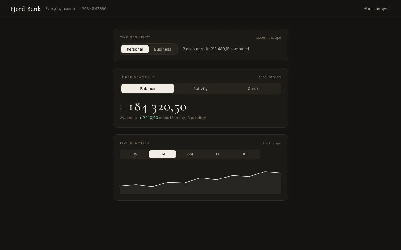
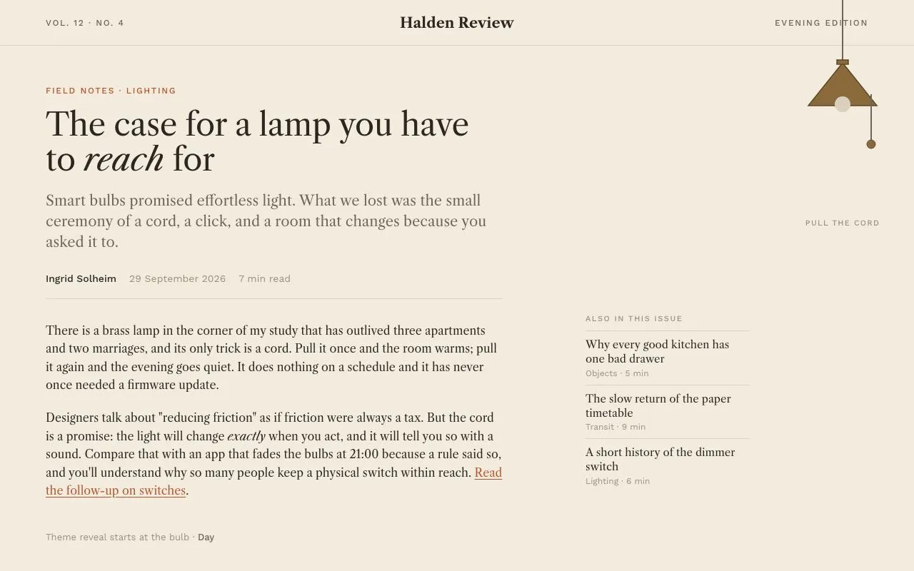
Nº 157 of 520
Toggle switch set
Six toggle temperaments (classic, icon thumb, day/night, squish, labelled, segmented) in a smart-home preferences card with a live status index.
Preview
Use it
Free to use · credit appreciated1 Once, in your project
npx skills add SusanAcharya/Design-Lounge 2 Then ask
Using the Design Lounge skill, build "Toggle switch set" (piece toggle-switch-set) in my stack. Match its brief; restyle it onto my product's theme.
No skill? Paste the brief instead. It carries the numbers, tokens and behaviour.
<!-- Design Lounge Nº 157 · "Toggle switch set" · designlounge.vercel.app -->

# Toggle switch set

> **Build brief for a coding agent.** Rebuild this piece in the reader's stack. If they haven't said which stack, ask once, then default to semantic HTML + CSS + a little vanilla JS. Match the numbers below; don't "improve" them.

## What it is

A preferences card for a fictional smart-home app, Nook, where each of six rows uses a different toggle switch style: classic pill, Material-style icon thumb, day/night scene switch, squish-on-press, labelled ON/OFF, and a three-way segmented control. To the left, a 128px display headline ("Tune your home.") sits over a mono index that reads back every switch's live value. The feeling is warm, tactile and a little cheeky: peach paper, tomato accent, springy thumbs. The detail worth copying is that every switch is a real `role="switch"` button whose look is driven entirely by `aria-checked`, so state, styling and accessibility can never drift apart.

## Reference behaviour

1. Initial state: Away mode ON, Doorbell alerts ON, Evening scene NIGHT, Child lock OFF, Eco heating ON, Hallway motion AUTO. The index on the left mirrors these six values; ON-ish values are tomato, OFF/DAY are muted.
2. Click (or Space/Enter on) any switch: `aria-checked` flips, the switch animates to its new state, the matching index row updates its value, and the card footer reads "Saved HH:MM · <Row name> <value>" with the text flashing tomato for 900ms.
3. **01 Classic** (52×32): white 28px thumb slides 20px with a slight overshoot; track fills tomato.
4. **02 Icon thumb** (52×32, 2px outline): a 24px thumb shows an × when off (taupe thumb on outlined track) and a check when on (white thumb on a tomato track). Icons cross-fade with a 45° counter-rotation. While pressed, a 8px tomato halo (16% alpha) rings the thumb.
5. **03 Day / night** (76×36): day is a sky gradient with a cloud and a sun thumb with two soft halo rings; night cross-fades to a navy sky with four star dots while the thumb springs 40px right, turns bone and reveals three craters. The cloud sinks 20px and fades.
6. **04 Squish** (58×32): pressing stretches the thumb 10px toward its destination; releasing springs it across. Track goes ink when on.
7. **05 Labelled** (84×34, 9px radius, 1.5px ink border): off shows a dark 38×25 thumb on the left and "OFF" on the right; on fills the track tomato, the thumb turns white and slides 38px right, and "ON" appears on the left in white.
8. **06 Segmented** (Off / Auto / On, 3×64px): a white pill slides under the chosen option with an overshoot spring; choosing On turns the pill tomato with white text.
9. Hovering a card row highlights the corresponding index row (text goes from `--ink-2` to `--ink`).

## Structure

```
1280 × 800, body padding 56 / 64, grid: 1fr | 620px, gap 56
┌───────────────────────────────────┬──────────────────────────────────────┐
│ ● NOOK · 14 ELMSTEAD ROAD         │ ┌──────────────────────────────────┐ │
│                                   │ │ Preferences       Ground floor…  │ │ 64
│ Tune                              │ ├──────────────────────────────────┤ │
│ your            (128px / .86)     │ │ [ic] Away mode 01 CLASSIC   (●=) │ │ 78
│ home.  ← tomato                   │ │ [ic] Doorbell  02 ICON      (=✓) │ │
│                                   │ │ [ic] Evening   03 DAY/NIGHT (☾ ) │ │
│ lede, 400px max                   │ │ [ic] Child lock 04 SQUISH   (● ) │ │
│ ──────────────────────────        │ │ [ic] Eco heat. 05 LABELLED  [ON] │ │
│ 01 Classic               ON       │ │ [ic] Hallway   06 SEGMENTED [|A|]│ │
│ … six rows, 1px hairlines         │ ├──────────────────────────────────┤ │
│ 06 Segmented           AUTO       │ │ ● All changes saved · 21:13      │ │
└───────────────────────────────────┴─└──────────────────────────────────┘─┘
```

… 163 more lines. Copy or download for the full brief. Loading the source…Brief
203 linesBuild brief for a coding agent. Rebuild this piece in the reader’s stack. If they haven’t said which stack, ask once, then default to semantic HTML + CSS + a little vanilla JS. Match the numbers below; don’t “improve” them.
What it is
A preferences card for a fictional smart-home app, Nook, where each of six rows uses a different toggle switch style: classic pill, Material-style icon thumb, day/night scene switch, squish-on-press, labelled ON/OFF, and a three-way segmented control. To the left, a 128px display headline (“Tune your home.”) sits over a mono index that reads back every switch’s live value. The feeling is warm, tactile and a little cheeky: peach paper, tomato accent, springy thumbs. The detail worth copying is that every switch is a real role="switch" button whose look is driven entirely by aria-checked, so state, styling and accessibility can never drift apart.
Reference behaviour
- Initial state: Away mode ON, Doorbell alerts ON, Evening scene NIGHT, Child lock OFF, Eco heating ON, Hallway motion AUTO. The index on the left mirrors these six values; ON-ish values are tomato, OFF/DAY are muted.
- Click (or Space/Enter on) any switch:
aria-checkedflips, the switch animates to its new state, the matching index row updates its value, and the card footer reads “Saved HH:MM ·” with the text flashing tomato for 900ms. - 01 Classic (52×32): white 28px thumb slides 20px with a slight overshoot; track fills tomato.
- 02 Icon thumb (52×32, 2px outline): a 24px thumb shows an × when off (taupe thumb on outlined track) and a check when on (white thumb on a tomato track). Icons cross-fade with a 45° counter-rotation. While pressed, a 8px tomato halo (16% alpha) rings the thumb.
- 03 Day / night (76×36): day is a sky gradient with a cloud and a sun thumb with two soft halo rings; night cross-fades to a navy sky with four star dots while the thumb springs 40px right, turns bone and reveals three craters. The cloud sinks 20px and fades.
- 04 Squish (58×32): pressing stretches the thumb 10px toward its destination; releasing springs it across. Track goes ink when on.
- 05 Labelled (84×34, 9px radius, 1.5px ink border): off shows a dark 38×25 thumb on the left and “OFF” on the right; on fills the track tomato, the thumb turns white and slides 38px right, and “ON” appears on the left in white.
- 06 Segmented (Off / Auto / On, 3×64px): a white pill slides under the chosen option with an overshoot spring; choosing On turns the pill tomato with white text.
- Hovering a card row highlights the corresponding index row (text goes from
--ink-2to--ink).
Structure
1280 × 800, body padding 56 / 64, grid: 1fr | 620px, gap 56
┌───────────────────────────────────┬──────────────────────────────────────┐
│ ● NOOK · 14 ELMSTEAD ROAD         │ ┌──────────────────────────────────┐ │
│                                   │ │ Preferences       Ground floor…  │ │ 64
│ Tune                              │ ├──────────────────────────────────┤ │
│ your            (128px / .86)     │ │ [ic] Away mode 01 CLASSIC   (●=) │ │ 78
│ home.  ← tomato                   │ │ [ic] Doorbell  02 ICON      (=✓) │ │
│                                   │ │ [ic] Evening   03 DAY/NIGHT (☾ ) │ │
│ lede, 400px max                   │ │ [ic] Child lock 04 SQUISH   (● ) │ │
│ ──────────────────────────        │ │ [ic] Eco heat. 05 LABELLED  [ON] │ │
│ 01 Classic               ON       │ │ [ic] Hallway   06 SEGMENTED [|A|]│ │
│ … six rows, 1px hairlines         │ ├──────────────────────────────────┤ │
│ 06 Segmented           AUTO       │ │ ● All changes saved · 21:13      │ │
└───────────────────────────────────┴─└──────────────────────────────────┘─┘
<section class="intro">: eyebrowdiv,<h1>with<em>around “home.”,<p class="lede">,<ol class="index">of six<li>each containing number, name and an<output>.<section class="panel" aria-labelledby>: header (<h2>+ mono meta), six.rows, footer with<output aria-live="polite">.- Each
.row: 44px icon tile,.txt(title<b id>with a mono style tag<small>, description<p>), then the control. - Switches 01–05:
<button class="sw …" role="switch" aria-checked aria-labelledby="lN">with inner<span class="k">thumb where needed. - Switch 06:
<fieldset class="seg">with a visually hidden<legend>, a decorative.pillspan and three radioinput+labelpairs.
Tokens
:root {
  /* surfaces */
  --bg: #f7ede4;          /* peach paper page */
  --card: #fffbf7;        /* panel */
  --tile: #fbe2d4;        /* icon tiles */
  --off: #e6d6c9;         /* off track */
  --line: #ecdccf;        /* hairlines */
  --seg-bg: #f0e1d4;      /* segmented track */
  --m3-off: #f3e6db;      /* icon-thumb off track */
  /* ink */
  --ink: #2a1d17;
  --ink-2: #6b574b;
  --ink-3: #8c7466;
  /* accent */
  --accent: #f0552e;      /* tomato: on tracks, em, live values */
  --ok: #3fae6a;          /* saved dot */
  /* day / night */
  --sky: #8fd0f0;  --sky-2: #c9ecfb;
  --night: #1d2346; --night-top: #141a3a;
  --sun: #ffc23a;  --moon: #efe7d6; --crater: #d8ccb3;
  /* type */
  --font: "Bricolage Grotesque", system-ui, sans-serif;
  --mono: "DM Mono", ui-monospace, monospace;
  --fs-display: 128px; --fs-h2: 20px; --fs-row: 16px; --fs-body: 15px;
  --fs-desc: 13.5px; --fs-meta: 12px; --fs-tag: 10px;
  /* space & radius */
  --pad-page: 56px 64px; --pad-row: 16px 28px;
  --r-card: 24px; --r-tile: 12px;
  /* shadow */
  --shadow-card: 0 1px 0 var(--line), 0 30px 60px -30px rgba(120,60,30,.25);
  --shadow-thumb: 0 3px 8px rgba(42,29,23,.18), 0 1px 1px rgba(42,29,23,.1);
  /* motion */
  --t-fast: 160ms; --t: 240ms;
  --ease: cubic-bezier(.2,.7,.2,1);
  --spring: cubic-bezier(.34,1.56,.64,1);
}
Typography
| Role | Family | Size | Weight | Line-height | Tracking | Case |
|---|---|---|---|---|---|---|
| Display h1 | Bricolage Grotesque (opsz 96) | 128px | 800 | 0.86 | −0.055em | sentence |
| Panel title | Bricolage Grotesque | 20px | 700 | 1.2 | −0.02em | sentence |
| Row title | Bricolage Grotesque | 16px | 600 | 1.3 | −0.01em | sentence |
| Row description | Bricolage Grotesque | 13.5px | 400 | 1.45 | 0 | sentence |
| Lede | Bricolage Grotesque | 16px | 400 | 1.45 | 0 | sentence |
| Eyebrow | DM Mono | 12px | 500 | 1 | +0.14em | UPPERCASE |
| Style tag | DM Mono | 10px | 500 | 1 | +0.10em | UPPERCASE |
| Index rows | DM Mono | 12px | 400/500 | 1 | 0 / +0.08em values | sentence / UPPERCASE |
| Switch labels | DM Mono | 11–12px | 500 | 1 | +0.10em | ON/OFF caps, segment sentence |
Motion
| Element | Trigger | Property | From → To | Duration | Easing |
|---|---|---|---|---|---|
| Classic thumb | toggle | translateX | 0 → 20px | 240ms | --spring |
| All tracks | toggle | background, border colour | off → on colour | 240ms | --ease |
| Icon thumb | toggle | translateX, background | 0 → 20px, taupe → white | 240ms | --ease |
| Icon thumb glyphs | toggle | opacity, scale, rotate | 1,1,0 ↔ 0,.4,±45° | 160 / 240ms | --ease |
| Day/night thumb | toggle | translateX, bg, halo | 0 → 40px, sun → moon | 420ms | --spring |
| Night sky layer | toggle | opacity | 0 → 1 | 240ms | --ease |
| Cloud | toggle | translateY, opacity | 0,1 → 20px,0 | 240 / 160ms | --ease |
| Squish thumb | press / toggle | left, right insets | right 30 → 20 on press; swap ends | 380ms | --spring |
| Labelled thumb | toggle | translateX, background | 0 → 38px, ink → white | 240ms | --ease |
| Segment pill | change | translateX | n × 64px | 320ms | --spring |
| Footer status | any change | colour keyframe | tomato → --ink-3 | 900ms | --ease |
Reduced motion: all transitions to 1ms and the flash keyframe removed. Every state is still drawn.
States
- Off / on: driven only by
[aria-checked](switches) or:checked(segments). Never toggle a separate class. - Hover (row): linked index row ink darkens. Switches have
cursor:pointer, no hover colour change (the motion is the reward). - Active: squish thumb stretches; icon thumb gets an 8px halo.
- Focus-visible: 2px
--inkoutline, 3px offset, on the switch button or the segment label after a focused radio. - Saved: footer dot green
#3fae6a, text updates and flashes.
Accessibility
- Switches are
<button role="switch">witharia-checked="true|false"andaria-labelledbypointing at the row title. Space and Enter toggle natively via button semantics. - The day/night switch reads as on/off; its state name (NIGHT/DAY) is shown in the index and footer for sighted users and announced via the live footer.
- Segmented control is a native radio group inside a
<fieldset>; arrow keys move between options; the legend is visually hidden but present. - Footer
<output aria-live="polite">announces each save. - Labelled switch text is decorative duplication; hide inactive text with
color: transparent, notdisplay:none, so width stays stable. - Contrast:
--ink-2on--cardis 6.6:1; white on--accentis 3.4:1 and only used for 11px caps inside large controls; keep the row title as the accessible name. - Hit targets: switches are 32–36px tall inside 78px rows; extend with padding if the design system requires 44px.
Responsive rules
- ≥ 1280: two columns as drawn.
- 1024–1279: right column stays 620px; display size scales to 112px.
- < 1100 (implemented breakpoint): single column, display 96px, the index list hides (the card already shows every state), body scrolls.
- < 640: rows wrap description under the title; switches stay right-aligned at fixed size; the segmented control drops to 3×56px.
Acceptance checklist
- Six rows, each with a visibly different switch; all six initial states match the list above.
- Every boolean switch is a
<button role="switch">whose visuals key offaria-checkedonly. - Classic thumb travel is exactly 20px; day/night 40px; labelled 38px; segment pill 64px per step.
- Spring easing
cubic-bezier(.34,1.56,.64,1)is used on thumbs that slide; colour fades usecubic-bezier(.2,.7,.2,1). - Icon thumb shows × when off and ✓ when on, cross-fading with rotation.
- Day/night swaps sky, cloud, sun-to-moon and craters together.
- Squish thumb stretches 10px toward its destination while pressed.
- Index values on the left update on every change (ON/OFF, DAY/NIGHT, OFF/AUTO/ON).
- Footer announces “Saved HH:MM ·
” through a polite live region. - Focus ring visible on every switch and segment.
- Reduced motion removes animation but keeps every state.
- No borders lost on the outlined switches (check reset specificity).
Implementation notes
Reset buttons with zero specificity. A button.sw { border: 0 } reset outranks .m3 { border: 2px … } and silently erases the outlined tracks. Wrap the reset in :where():
:where(button.sw) { appearance: none; border: 0; padding: 0; background: none; cursor: pointer; position: relative; }
.m3 { width: 52px; height: 32px; border-radius: 16px; border: 2px solid var(--ink-3); }
.m3[aria-checked=true] { background: var(--accent); border-color: var(--accent); }
Squish by insets, not scale. Scaling the thumb turns a circle into an egg. Pin it with left/right and let :active move only the trailing edge:
.sq .k { position: absolute; top: 4px; bottom: 4px; left: 4px; right: 30px; border-radius: 12px;
         transition: left 380ms var(--spring), right 380ms var(--spring); }
.sq:active .k { right: 20px; }
.sq[aria-checked=true] .k { left: 30px; right: 4px; }
.sq[aria-checked=true]:active .k { left: 20px; }
Segmented pill from :has(), no JS for position:
.seg:has(#hm-1:checked) .pill { transform: translateX(64px); }
.seg:has(#hm-2:checked) .pill { transform: translateX(128px); background: var(--accent); }
One toggle handler for all switches:
document.querySelectorAll('[role=switch]').forEach((b) => b.addEventListener('click', () => {
  const on = b.getAttribute('aria-checked') !== 'true';
  b.setAttribute('aria-checked', String(on));
  report(rowIndex(b), on);
}));
Common mistakes: scoping .lb span { transform: translateY(-50%) } so broadly that it catches the thumb span too; hiding the day/night sky with display (kills the cross-fade); forgetting overflow: hidden on the day/night track so the halo rings bleed.
Details
- Palette
- Type
- Bricolage Grotesque · DM Mono
- Motion
- Subtle motion
- Build
- One session
- Tags
Studied
UseArticleLet the visitor press the controls and watch the card change. Thick black edges and hard shadows keep it friendly.
All sources