Nº 040 of 520
Nested dropdown menu
An application menubar with click-to-open menus, hover submenus guarded by a safe-triangle delay, check and radio items, a shortcuts column and complete keyboard support including typeahead.
Preview
Use it
Free to use · credit appreciated1 Once, in your project
npx skills add SusanAcharya/Design-Lounge 2 Then ask
Using the Design Lounge skill, build "Nested dropdown menu" (piece nested-dropdown-menu) in my stack. Match its brief; restyle it onto my product's theme.
No skill? Paste the brief instead. It carries the numbers, tokens and behaviour.
<!-- Design Lounge Nº 040 · "Nested dropdown menu" · designlounge.vercel.app -->

# Nested dropdown menu

> **Build brief for a coding agent.** Rebuild this piece in the reader's stack. If they haven't said which stack, ask once, then default to semantic HTML + CSS + a little vanilla JS. Match the numbers below; don't "improve" them.

## What it is

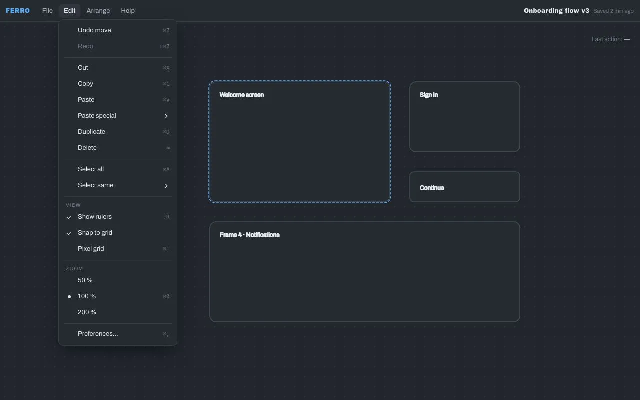
The menubar of a design-tool ("Ferro") over a dotted canvas: File, Edit, Arrange, Help. Menus open on click, 236px wide, 32px items with a 14px check/radio gutter, a label, and a right-aligned shortcut column in the system mono. The Edit menu has three levels: Paste special ▸ Paste properties ▸ Fill only. Submenus open on hover after 120ms; if the pointer is heading diagonally toward an open submenu, other items wait 300ms before stealing it (a safe triangle between the previous pointer position and the submenu's left edge). Check items (Show rulers, Snap to grid, Pixel grid), a radio group (Zoom 50/100/200 %), disabled items and separators are all present. Keyboard does everything: arrows, Home/End, Right/Left for submenus, Esc per level, Enter/Space, Tab to close, and typeahead. Cool graphite, one sky-blue highlight.

## Reference behaviour

1. Initial state: the **Edit** menu is open beneath its menubar button (button highlighted `--panel-2`), showing 20 rows: Undo move ⌘Z · Redo (disabled) ⇧⌘Z · — · Cut · Copy · Paste · Paste special ▸ · Duplicate · Delete ⌫ · — · Select all ⌘A · Select same ▸ · — · VIEW heading · ✓ Show rulers ⇧R · ✓ Snap to grid · Pixel grid ⌘' · — · ZOOM heading · 50 % · ● 100 % ⌘0 · 200 % · — · Preferences… ⌘,. The status line top-right reads "Last action: —".
2. Hover an item: it fills `--accent` with `--accent-ink` text; the shortcut goes 80% opaque dark. Focus follows hover.
3. Hover "Paste special": after 120ms its submenu opens to the right (`left: calc(100% − 4px); top: −6px`) with a 120ms pop (opacity 0 → 1, `scale(.98) translateY(−2px)` → none). The parent item stays highlighted while the submenu is open.
4. Move the pointer diagonally from "Paste special" down-right toward the submenu, crossing "Duplicate": Duplicate does **not** take the highlight for 300ms because the pointer is inside the triangle (previous pointer position, submenu top-left, submenu bottom-left). Moving straight down onto Duplicate (outside the triangle) switches immediately and closes the submenu.
5. Hover "Paste properties" inside the submenu: a third-level menu opens the same way. Hovering another item in the second level closes the third level.
6. Click "Show rulers": its check toggles (`aria-checked`), the status line reads "Edit › Show rulers (off)", and the menu **stays open** (check/radio items don't dismiss). Click "200 %": the radio moves, status "Edit › 200 % (on)", menu stays open.
7. Click "Copy": status "Edit › Copy"; the menu closes and focus returns to the Edit button. Click "Fill only" (third level): status "Edit › Paste special › Paste properties › Fill only" and everything closes.
8. With a menu open, hovering another menubar button (File, Arrange, Help) switches to that menu without a click. Clicking the open menu's button closes it. Clicking anywhere outside the bar closes.
9. Keyboard, on a menubar button: ↓ / Enter / Space opens the menu and focuses its first item; → / ← move between buttons (and switch open menus if one is open).
10. Keyboard, in a menu: ↓ ↑ move with wrap; Home / End; → on an item with a submenu opens it and focuses its first item (→ on a plain item in a top-level menu switches to the next menubar menu); ← closes the current submenu and refocuses its parent item (← in a top-level menu switches to the previous menubar menu); Esc closes one level (submenu → parent item; top-level → menubar button); Enter / Space activate; Tab closes everything and continues; typing letters jumps to the next item whose label starts with the buffered prefix (700ms buffer).
11. Disabled items (Redo, Print) don't highlight on hover and don't activate, but they are still focusable via keyboard so their shortcut can be read.

## Structure

```
1280 × 800
┌──────────────────────────────────────────────────────────────────────────┐
│ FERRO  File [Edit] Arrange Help                Onboarding flow v3 · Saved │ bar 44
├──────────┬─────────────────────┬─────────────────────────────────────────┤
│          │ Undo move       ⌘Z  │                    Last action: —      │ menu 236 wide
│  canvas  │ Redo           ⇧⌘Z  │  (disabled)                            │ items 32
│  dotted  │ ───────────────────  │                                        │ padding 6
│  20px    │ Cut             ⌘X  │                                        │
│  grid    │ Copy            ⌘C  │                                        │
│          │ Paste           ⌘V  │                                        │
│          │ Paste special     ▸ ├───────────────────────┐                 │ submenu: left 100%−4, top −6
│          │ Duplicate       ⌘D  │ Paste to replace ⇧⌘R │                 │
│          │ Delete           ⌫  │ Paste over selection  │                 │

… 173 more lines. Copy or download for the full brief. Loading the source…Brief
213 linesBuild brief for a coding agent. Rebuild this piece in the reader’s stack. If they haven’t said which stack, ask once, then default to semantic HTML + CSS + a little vanilla JS. Match the numbers below; don’t “improve” them.
What it is
The menubar of a design-tool (“Ferro”) over a dotted canvas: File, Edit, Arrange, Help. Menus open on click, 236px wide, 32px items with a 14px check/radio gutter, a label, and a right-aligned shortcut column in the system mono. The Edit menu has three levels: Paste special ▸ Paste properties ▸ Fill only. Submenus open on hover after 120ms; if the pointer is heading diagonally toward an open submenu, other items wait 300ms before stealing it (a safe triangle between the previous pointer position and the submenu’s left edge). Check items (Show rulers, Snap to grid, Pixel grid), a radio group (Zoom 50/100/200 %), disabled items and separators are all present. Keyboard does everything: arrows, Home/End, Right/Left for submenus, Esc per level, Enter/Space, Tab to close, and typeahead. Cool graphite, one sky-blue highlight.
Reference behaviour
- Initial state: the Edit menu is open beneath its menubar button (button highlighted
--panel-2), showing 20 rows: Undo move ⌘Z · Redo (disabled) ⇧⌘Z · — · Cut · Copy · Paste · Paste special ▸ · Duplicate · Delete ⌫ · — · Select all ⌘A · Select same ▸ · — · VIEW heading · ✓ Show rulers ⇧R · ✓ Snap to grid · Pixel grid ⌘’ · — · ZOOM heading · 50 % · ● 100 % ⌘0 · 200 % · — · Preferences… ⌘,. The status line top-right reads “Last action: —”. - Hover an item: it fills
--accentwith--accent-inktext; the shortcut goes 80% opaque dark. Focus follows hover. - Hover “Paste special”: after 120ms its submenu opens to the right (
left: calc(100% − 4px); top: −6px) with a 120ms pop (opacity 0 → 1,scale(.98) translateY(−2px)→ none). The parent item stays highlighted while the submenu is open. - Move the pointer diagonally from “Paste special” down-right toward the submenu, crossing “Duplicate”: Duplicate does not take the highlight for 300ms because the pointer is inside the triangle (previous pointer position, submenu top-left, submenu bottom-left). Moving straight down onto Duplicate (outside the triangle) switches immediately and closes the submenu.
- Hover “Paste properties” inside the submenu: a third-level menu opens the same way. Hovering another item in the second level closes the third level.
- Click “Show rulers”: its check toggles (
aria-checked), the status line reads “Edit › Show rulers (off)”, and the menu stays open (check/radio items don’t dismiss). Click “200 %”: the radio moves, status “Edit › 200 % (on)”, menu stays open. - Click “Copy”: status “Edit › Copy”; the menu closes and focus returns to the Edit button. Click “Fill only” (third level): status “Edit › Paste special › Paste properties › Fill only” and everything closes.
- With a menu open, hovering another menubar button (File, Arrange, Help) switches to that menu without a click. Clicking the open menu’s button closes it. Clicking anywhere outside the bar closes.
- Keyboard, on a menubar button: ↓ / Enter / Space opens the menu and focuses its first item; → / ← move between buttons (and switch open menus if one is open).
- Keyboard, in a menu: ↓ ↑ move with wrap; Home / End; → on an item with a submenu opens it and focuses its first item (→ on a plain item in a top-level menu switches to the next menubar menu); ← closes the current submenu and refocuses its parent item (← in a top-level menu switches to the previous menubar menu); Esc closes one level (submenu → parent item; top-level → menubar button); Enter / Space activate; Tab closes everything and continues; typing letters jumps to the next item whose label starts with the buffered prefix (700ms buffer).
- Disabled items (Redo, Print) don’t highlight on hover and don’t activate, but they are still focusable via keyboard so their shortcut can be read.
Structure
1280 × 800
┌──────────────────────────────────────────────────────────────────────────┐
│ FERRO  File [Edit] Arrange Help                Onboarding flow v3 · Saved │ bar 44
├──────────┬─────────────────────┬─────────────────────────────────────────┤
│          │ Undo move       ⌘Z  │                    Last action: —      │ menu 236 wide
│  canvas  │ Redo           ⇧⌘Z  │  (disabled)                            │ items 32
│  dotted  │ ───────────────────  │                                        │ padding 6
│  20px    │ Cut             ⌘X  │                                        │
│  grid    │ Copy            ⌘C  │                                        │
│          │ Paste           ⌘V  │                                        │
│          │ Paste special     ▸ ├───────────────────────┐                 │ submenu: left 100%−4, top −6
│          │ Duplicate       ⌘D  │ Paste to replace ⇧⌘R │                 │
│          │ Delete           ⌫  │ Paste over selection  │                 │
│          │ ───────────────────  │ Paste as plain … ⇧⌥⌘V│                 │
│          │ Select all      ⌘A  │ ─────────────────────  │                 │
│          │ Select same       ▸ │ Paste properties    ▸ ├──────────────┐  │ third level
│          │ ───────────────────  └───────────────────────┤ Fill only    │  │
│          │ VIEW                                        │ Stroke only  │  │
│          │ ✓ Show rulers   ⇧R                          │ Effects only │  │
│          │ …                                           └──────────────┘  │
└──────────┴─────────────────────────────────────────────────────────────────┘
<div class="bar" role="menubar" aria-label="Application">— 44px,--panel, bottom hairline. Logo “FERRO” (Archivo Black 12px, accent). Then four.mbwrappers and a right-aligned document title..mb(position:relative) →<button class="mb-btn" role="menuitem" aria-haspopup="menu" aria-expanded>(28px tall, 6px radius) +<div class="menu" role="menu" aria-label="Edit">(absolutetop: calc(100% + 4px); left: 0).- Inside a
.menu:<button class="it" role="menuitem|menuitemcheckbox|menuitemradio" aria-checked? aria-disabled? data-group?>with<span class="chk">(14px gutter; contains a check SVG for checkboxes, a CSS dot for radios),<span class="lb">, and either<kbd>or a chevron SVG. Separators<div class="sep" role="separator">(1px,5px 4pxmargin). Group headings<div class="hd">(10px uppercase tracked). - Submenu:
<div class="sub">(position:relative) wrapping the trigger.it[aria-haspopup="menu"][aria-expanded]and its own.menu(absoluteleft: calc(100% − 4px); top: −6px). Nest.subagain for a third level.
.canvas— flex 1,--canvaswith aradial-gradient1px dot every 20px; an inline SVG of four rounded frames (one with a dashed accent selection) and small labels.aria-hidden.<p class="status" aria-live="polite">— absolute top-right.
Tokens
:root {
  /* colour — cool graphite, sky-blue highlight */
  --bg: #1c1f24;
  --canvas: #22262c;
  --panel: #262a31;       /* menubar, menus, frames */
  --panel-2: #30353e;     /* menubar button hover/open */
  --line: #363c46;        /* hairlines, separators, canvas dots, menu ring */
  --line-2: #454c58;      /* frame strokes */
  --ink: #e6e9ee;
  --ink-2: #a5adba;       /* menubar buttons, status */
  --ink-3: #6f7886;       /* shortcuts, headings, disabled */
  --accent: #5ab0ff;      /* highlighted item, logo, selection outline */
  --accent-ink: #06192b;  /* text on highlight */

  /* type */
  --display: "Archivo Black", system-ui, sans-serif;
  --font: "Archivo", system-ui, sans-serif;
  --mono: ui-monospace, "SF Mono", Menlo, monospace;

  /* layout */
  --bar-h: 44px;
  --menu-w: 236px;
  --menu-pad: 6px;
  --item-h: 32px;
  --item-x: 8px;
  --gutter: 14px;         /* check / radio column */
  --sub-offset-x: -4px;   /* submenu overlaps parent by 4px */
  --sub-offset-y: -6px;   /* first submenu item aligns with parent item */
  --r: 8px;               /* menu */
  --r-item: 5px;
  --shadow: 0 0 0 1px var(--line), 0 12px 32px -8px rgba(0,0,0,.6);

  /* motion */
  --t-fast: 120ms;        /* menu pop */
  --sub-delay: 120ms;     /* hover before submenu opens */
  --safe-delay: 300ms;    /* grace while pointer moves toward a submenu */
  --type-buffer: 700ms;   /* typeahead reset */
  --ease: cubic-bezier(.2, .7, .2, 1);
  --ease-out: cubic-bezier(.16, 1, .3, 1);
}
Typography
| Role | Family | Size | Weight | Line-height | Tracking | Notes |
|---|---|---|---|---|---|---|
| Logo | Archivo Black | 12px | 400 | 1 | +0.06em | UPPERCASE --accent |
| Document title | Archivo Black | 12px | 400 | 1 | +0.02em | |
| Menubar button | Archivo | 13px | 500 | 28px height | 0 | --ink-2; hover/open --ink |
| Menu item | Archivo | 13px | 400 | 32px height | 0 | --ink; highlighted --accent-ink |
| Shortcut | system mono | 11px | 400 | 1 | +0.04em | --ink-3 |
| Group heading | Archivo | 10px | 500 | 1.3 | +0.12em | UPPERCASE --ink-3, padding 6px 8px 3px |
| Status | Archivo | 12px | 400 | 1.4 | 0 | --ink-3; value --ink-2 500 |
| Canvas labels | Archivo (SVG) | 12px | 400 | — | 0 | --ink-3 |
Motion
| Element | Trigger | Property | From → To | Duration | Easing | Notes |
|---|---|---|---|---|---|---|
.menu | open (any level) | opacity, transform | 0, scale(.98) translateY(-2px) → 1, none | 120ms | --ease-out | keyframes pop; transform-origin: top left |
.menu | close | display | block → none | 0 | — | no exit animation — menus should vanish on activation |
| submenu | hover parent | open | after 120ms | — | — | cancelled if the pointer leaves before |
| other items | hover while sub open | highlight | after 300ms if inside the safe triangle, else 0 | — | — | re-evaluated on each mouseover |
| item highlight | hover / focus | background, color | instant | 0 | — | never transition menu highlights |
Reduced motion: the pop keyframe runs at 1ms. Delays are interaction logic, not motion, and stay.
States
- Item default:
--inkon transparent. Highlighted (:hover,:focus-visible, or parent of an open submenu.sub.open > .it):--accentbackground,--accent-inktext, shortcut--accent-inkat 80% opacity, 5px radius. - Checkbox item:
role="menuitemcheckbox",aria-checked; the.chkgutter shows a check SVG only when checked (visibility), so labels stay aligned. - Radio item:
role="menuitemradio",data-group="zoom"; a 6pxcurrentColordot when checked. - Submenu trigger:
aria-haspopup="menu",aria-expandedmirrors open state; chevron 14px on the right instead of a shortcut. - Disabled:
aria-disabled="true", text--ink-3, no hover fill, activation ignored. - Menubar button open:
--panel-2background,--inktext,aria-expanded="true". - Menubar button focus-visible: 2px accent box-shadow ring.
- Separator: 1px
--line,5px 4pxmargins. Heading: non-interactive, skipped by keyboard navigation.
Accessibility
- Roles:
menubar›menuitembuttons witharia-haspopup="menu"+aria-expanded›menu(witharia-label) ›menuitem/menuitemcheckbox/menuitemradio/separator. Submenu triggers aremenuitem+aria-haspopup="menu"+aria-expanded, and theirmenuis the next sibling. - Keyboard map is in Reference behaviour 9–10. Handle keys on each
.menuandstopPropagationso a nested menu’s keys never reach the parent handler. - Hover moves focus to the item (
it.focus()), so keyboard and pointer share one notion of “current item”. - Activation of a plain
menuitemcloses all menus and returns focus to the menubar button; check/radio items keep the menu open and updatearia-checked. - Status line is
aria-live="polite"and reports the full path (“Edit › Paste special › Paste properties › Fill only”) plus “(on)/(off)” for toggles. - Disabled items remain focusable (
aria-disabled, notdisabled) so screen readers can discover them. - Contrast:
--inkon--panel12:1;--accent-inkon--accent8.9:1;--ink-3on--panel3.6:1 (shortcuts and headings — non-essential); disabled items intentionally low. - Hit targets: items 32px × full width; menubar buttons 28px (bar is 44px — extend the hit area to the bar height if you need it).
Responsive rules
- ≥ 1280: as specified.
- 1024–1279: unchanged.
- 768–1023: submenus flip to the left (
right: calc(100% − 4px)) whenrect.right + 236 > viewport width; otherwise identical. - < 640: the menubar collapses to a single “Menu” button; each top-level menu becomes a full-height sheet from the left (
position:fixed; inset:0 auto 0 0; width:280px); submenus replace the sheet’s content with a ”‹ Back” row instead of opening beside it; hover logic disabled (tap only).
Acceptance checklist
- Menus are 236px min-width, 8px radius, 6px padding, with a 1px
#363c46ring and0 12px 32px -8px rgba(0,0,0,.6)shadow; items are 32px with 5px radius. - The Edit menu is open on first paint with the 20 rows listed, ✓ on Show rulers and Snap to grid, ● on 100 %.
- Hovering a submenu trigger opens its submenu after 120ms at
left: calc(100% − 4px); top: −6pxwith a 120ms pop. - Moving diagonally toward an open submenu across another item does not switch highlight for 300ms; moving outside the triangle switches at once.
- Three levels open and close correctly; opening a sibling closes any deeper level.
- Check items toggle
aria-checkedand keep the menu open; radio items are exclusive withindata-groupand keep the menu open; plain items close everything and refocus the menubar button. - ↓ ↑ wrap; Home/End; → opens a submenu (or switches menubar menu); ← closes a submenu (or switches menubar menu); Esc closes one level; Tab closes all.
- Typing “pa” focuses “Paste”, typing “pas” again within 700ms keeps the prefix and stays on “Paste”/“Paste special” as appropriate; after 700ms the buffer resets.
- Hovering another menubar button while a menu is open switches menus without a click; clicking outside closes.
- Disabled items (Redo, Print) do not highlight or activate but are focusable.
- The status line announces the full path of the last activated item.
- Highlight colours never transition; menus have no exit animation.
Implementation notes
Safe triangle — keep the last two pointer positions; when a submenu is open, a hover on another item is deferred if the current position lies inside the triangle formed by the previous position and the submenu’s left edge:
const sign = (p, a, b) => (p.x - b.x) * (a.y - b.y) - (a.x - b.x) * (p.y - b.y);
function towardSub(menu) {
  const s = menu.querySelector(':scope > .sub.open > .menu'); if (!s) return false;
  const r = s.getBoundingClientRect(), a = prev, b = { x: r.left, y: r.top }, c = { x: r.left, y: r.bottom };
  const d1 = sign(last, a, b), d2 = sign(last, b, c), d3 = sign(last, c, a);
  return !((d1 < 0 || d2 < 0 || d3 < 0) && (d1 > 0 || d2 > 0 || d3 > 0));
}
addEventListener('mousemove', e => { prev = last; last = { x: e.clientX, y: e.clientY }; });
// in the menu's mouseover handler:
if (towardSub(menu) && !(mySub && mySub.classList.contains('open'))) subT = setTimeout(go, 300); else go();
Direct children only. Every handler must operate on the items of its menu, not descendants of nested menus, or hover in a submenu will close it:
const items = m => [...m.querySelectorAll(':scope > .it, :scope > .sub > .it')];
menu.addEventListener('keydown', e => {
  const list = items(menu), i = list.indexOf(document.activeElement); if (i < 0) return;
  /* handle keys for list[i] … */
  e.preventDefault(); e.stopPropagation();     // parent menus must not also react
});
Activation semantics by role:
if (role === 'menuitemcheckbox') it.setAttribute('aria-checked', String(it.getAttribute('aria-checked') !== 'true'));
else if (role === 'menuitemradio') group.forEach(r => r.setAttribute('aria-checked', String(r === it)));
if (role === 'menuitem') { const b = openButton; closeAll(); b.focus(); }   // toggles keep the menu open
Common mistakes: opening submenus on mouseenter with no delay (flicker when skimming the list); closing a submenu the instant the pointer leaves the trigger (the pointer must cross the 4px overlap); animating the close; letting keydown bubble from a nested menu into the parent (double navigation); using disabled on items (removes them from the accessibility tree).
Details
- Palette
- Type
- Archivo Black · Archivo
- Motion
- Subtle motion
- Build
- Multi-step
- Tags
Studied
Tailwind CSS docsPut each instruction next to its code. Draw the grid with thin lines and let the empty sides carry a faint hatch.
All sourcesOn the shelves