Nº 062 of 520
Sliding segmented control
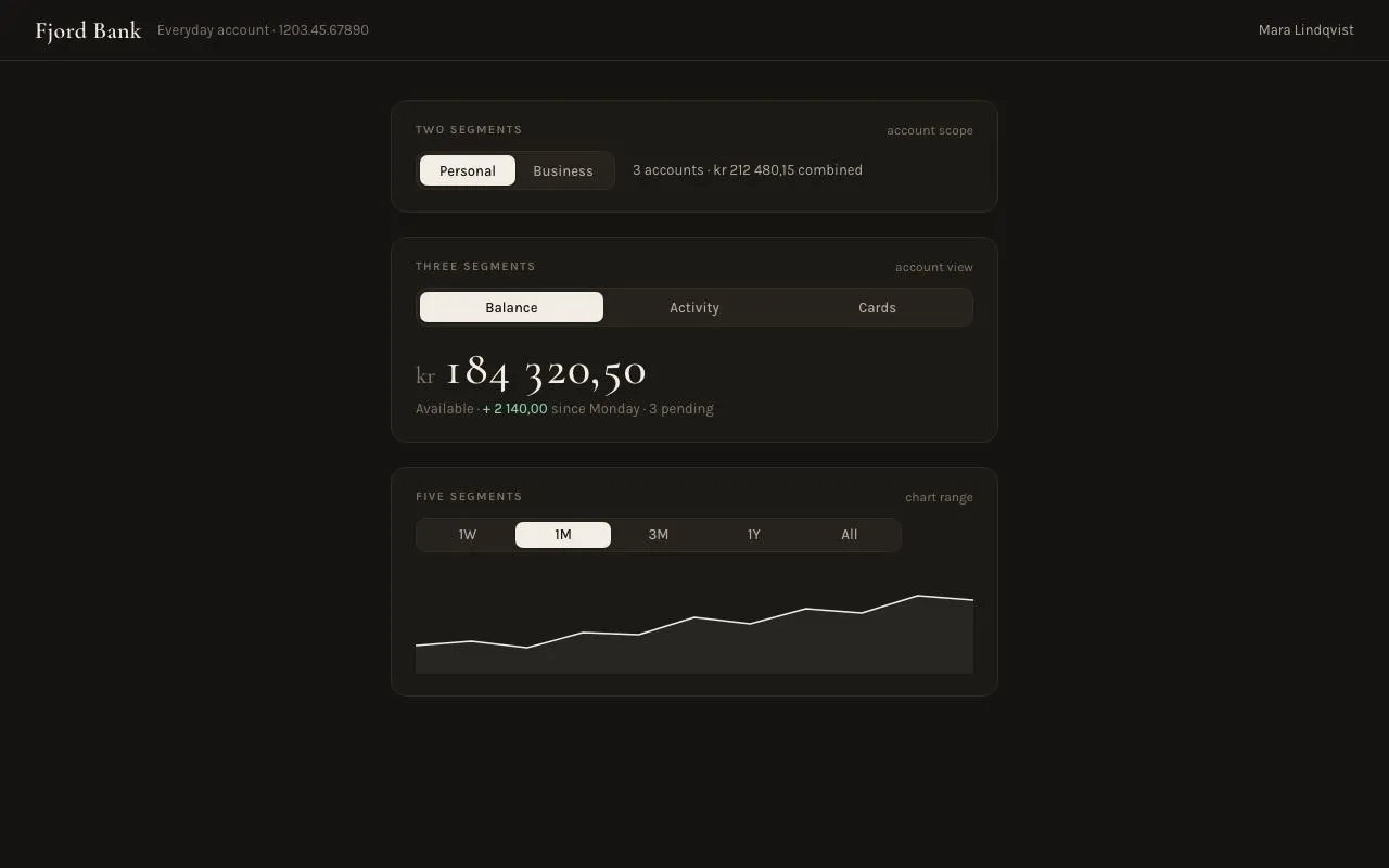
Segmented controls in 2, 3 and 5-segment variants: an ivory pill slides between options over 260ms with a mid-travel squash, arrow keys move selection, and each switches a content panel.
Preview
Use it
Free to use · credit appreciated1 Once, in your project
npx skills add SusanAcharya/Design-Lounge 2 Then ask
Using the Design Lounge skill, build "Sliding segmented control" (piece segmented-control-sliding) in my stack. Match its brief; restyle it onto my product's theme.
No skill? Paste the brief instead. It carries the numbers, tokens and behaviour.
<!-- Design Lounge Nº 062 · "Sliding segmented control" · designlounge.vercel.app -->

# Sliding segmented control

> **Build brief for a coding agent.** Rebuild this piece in the reader's stack. If they haven't said which stack, ask once, then default to semantic HTML + CSS + a little vanilla JS. Match the numbers below; don't "improve" them.

## What it is

A segmented control for a banking account page ("Fjord Bank"): a dark 36px track with 3px inset, and one ivory pill that slides to the chosen option. Three variants are shown in a 560px column — two segments (Personal / Business), three segments stretched to full width (Balance / Activity / Cards) and five compact segments (1W / 1M / 3M / 1Y / All) — each switching a small piece of content beneath it with a 140ms crossfade. The detail worth copying is the pill's travel: `left` and `width` transition over 260ms while a keyframe scales it to 1.08 × 0.9 at 40% of the journey and back, so it reads as a physical object being pushed rather than a highlight being re-drawn. Serif numerals for the money; a humanist grotesk for everything else.

## Reference behaviour

1. Initial state: three cards. Card 1: Personal selected; text "3 accounts · kr 212 480,15 combined" beside the control. Card 2: Balance selected; below, "kr 184 320,50" in Cormorant 44px with a green delta line. Card 3: 1M selected; a filled sparkline for the last month.
2. Click another segment: its label turns `--pill-ink` (dark) and the previous turns `--ink-2`; the pill's `left` and `width` animate to the new button's box over 260ms; simultaneously the squash keyframe runs (scale 1,1 → 1.08,.9 at 40% → 1,1 at 100%). The content pane crossfades: the old pane fades out over 140ms while the new fades in.
3. Hover a non-selected segment: label brightens to `--ink`. No pill movement.
4. Keyboard: Tab lands on the selected segment only (roving tabindex). → / ↓ select the next segment (wrapping), ← / ↑ the previous, Home / End the first / last. Selection follows focus (radio semantics), so the pill slides on every key press.
5. Focus-visible on a segment: a two-ring box-shadow (2px track colour, then 2px `--accent` coral).
6. Card 2's Activity pane lists four transactions with negative amounts in coral; Cards pane shows two card tiles. Card 3's five panes are five different sparklines (the same 520×96 viewBox, different point sets).
7. Resize: the pill is re-measured and re-placed without animation. Fonts loading late also re-place it.

## Structure

```
1280 × 800
┌──────────────────────────────────────────────────────────────────────────┐
│ Fjord Bank  Everyday account · 1203.45.67890              Mara Lindqvist │ 56
├──────────────────────────────────────────────────────────────────────────┤
│                    ┌──────────── 560 ────────────┐                       │
│                    │ TWO SEGMENTS      account scope│ card pad 20/22      │
│                    │ [▐Personal▌ Business]  3 accounts · kr 212 480,15 │ │ seg 36 tall
│                    ├──────────────────────────────┤                       │
│                    │ THREE SEGMENTS      account view│                      │
│                    │ [▐  Balance  ▌  Activity   Cards ]  ← full width     │
│                    │ kr 184 320,50                  │ Cormorant 44        │
│                    │ Available · + 2 140,00 since Monday · 3 pending    │ │
│                    ├──────────────────────────────┤                       │
│                    │ FIVE SEGMENTS       chart range│                      │
│                    │ [ 1W ▐1M▌ 3M  1Y  All ]        │ seg 32 tall         │
│                    │ ╱╲╱‾‾╲╱‾‾‾╱ sparkline 96 tall  │                      │
│                    └──────────────────────────────┘                       │

… 178 more lines. Copy or download for the full brief. Loading the source…Brief
218 linesBuild brief for a coding agent. Rebuild this piece in the reader’s stack. If they haven’t said which stack, ask once, then default to semantic HTML + CSS + a little vanilla JS. Match the numbers below; don’t “improve” them.
What it is
A segmented control for a banking account page (“Fjord Bank”): a dark 36px track with 3px inset, and one ivory pill that slides to the chosen option. Three variants are shown in a 560px column — two segments (Personal / Business), three segments stretched to full width (Balance / Activity / Cards) and five compact segments (1W / 1M / 3M / 1Y / All) — each switching a small piece of content beneath it with a 140ms crossfade. The detail worth copying is the pill’s travel: left and width transition over 260ms while a keyframe scales it to 1.08 × 0.9 at 40% of the journey and back, so it reads as a physical object being pushed rather than a highlight being re-drawn. Serif numerals for the money; a humanist grotesk for everything else.
Reference behaviour
- Initial state: three cards. Card 1: Personal selected; text “3 accounts · kr 212 480,15 combined” beside the control. Card 2: Balance selected; below, “kr 184 320,50” in Cormorant 44px with a green delta line. Card 3: 1M selected; a filled sparkline for the last month.
- Click another segment: its label turns
--pill-ink(dark) and the previous turns--ink-2; the pill’sleftandwidthanimate to the new button’s box over 260ms; simultaneously the squash keyframe runs (scale 1,1 → 1.08,.9 at 40% → 1,1 at 100%). The content pane crossfades: the old pane fades out over 140ms while the new fades in. - Hover a non-selected segment: label brightens to
--ink. No pill movement. - Keyboard: Tab lands on the selected segment only (roving tabindex). → / ↓ select the next segment (wrapping), ← / ↑ the previous, Home / End the first / last. Selection follows focus (radio semantics), so the pill slides on every key press.
- Focus-visible on a segment: a two-ring box-shadow (2px track colour, then 2px
--accentcoral). - Card 2’s Activity pane lists four transactions with negative amounts in coral; Cards pane shows two card tiles. Card 3’s five panes are five different sparklines (the same 520×96 viewBox, different point sets).
- Resize: the pill is re-measured and re-placed without animation. Fonts loading late also re-place it.
Structure
1280 × 800
┌──────────────────────────────────────────────────────────────────────────┐
│ Fjord Bank  Everyday account · 1203.45.67890              Mara Lindqvist │ 56
├──────────────────────────────────────────────────────────────────────────┤
│                    ┌──────────── 560 ────────────┐                       │
│                    │ TWO SEGMENTS      account scope│ card pad 20/22      │
│                    │ [▐Personal▌ Business]  3 accounts · kr 212 480,15 │ │ seg 36 tall
│                    ├──────────────────────────────┤                       │
│                    │ THREE SEGMENTS      account view│                      │
│                    │ [▐  Balance  ▌  Activity   Cards ]  ← full width     │
│                    │ kr 184 320,50                  │ Cormorant 44        │
│                    │ Available · + 2 140,00 since Monday · 3 pending    │ │
│                    ├──────────────────────────────┤                       │
│                    │ FIVE SEGMENTS       chart range│                      │
│                    │ [ 1W ▐1M▌ 3M  1Y  All ]        │ seg 32 tall         │
│                    │ ╱╲╱‾‾╲╱‾‾‾╱ sparkline 96 tall  │                      │
│                    └──────────────────────────────┘                       │
└──────────────────────────────────────────────────────────────────────────┘<main>— 560px column, centred, 36px top padding, 22px gap between.blockcards (--panel, 1px--line, 14px radius, padding20px 22px).- Each card:
<p class="cap">(11px uppercase caption + right-aligned 12px note), then the control, then.panes. .seg—<div role="radiogroup" aria-label data-panes="<id>">,position:relative; display:inline-grid; grid-auto-flow:column; grid-auto-columns:1fr,--trackbackground, 1px--lineborder, 10px radius, 3px padding, height 36px (.fullvariant:display:gridto stretch; the 5-segment variant overrides--seg-h: 32px).<button role="radio" aria-checked tabindex>× n —z-index:1, padding0 16px, min-width 56px, radius 7px (10 − 3).<span class="pill" aria-hidden>— absolute,top/bottom: 3px,left/widthset by JS,--pillfill, radius 7px, shadow0 1px 2px rgba(0,0,0,.35).
.panes— one.paneper segment; the active one isposition:relativeand visible, the rest absolute + hidden.
Pane content
Card 1 (2 segments) — Personal: “3 accounts · kr 212 480,15 combined”. Business: “1 account · Lindqvist Studio AS · kr 58 900,00”. Rendered inline beside the control (13px --ink-2).
Card 2 (3 segments) — Balance: kr (22px --ink-3) 184 320,50 (Cormorant 44/500) and meta “Available · + 2 140,00 since Monday · 3 pending” (delta in --positive). Activity: four rows (date --ink-3 · description · amount right-aligned, negatives in --accent): Mon 28 Sep Kaffebrenneriet Grünerløkka − 64,00 · Mon 28 Sep Salary · Halden Logistics + 41 200,00 · Sun 27 Sep Vy · Bergen–Oslo − 899,00 · Sat 26 Sep Meny Torshov − 1 212,40. Cards: two tiles (1px --line-2, 10px radius, 12px 14px padding): ”•••• 4471 — Debit · expires 09/28 · online payments on” and ”•••• 0182 — Credit · kr 12 000 limit · 0,00 used”.
Card 3 (5 segments) — five sparklines, each an SVG viewBox="0 0 520 96" with preserveAspectRatio="none", 96px tall, a 1.5px --ink polyline and a fill path at rgba(242,237,228,.06) closed to the bottom edge:
| Segment | Polyline points (x y …) |
|---|---|
| 1W | 0 60, 74 58, 148 62, 222 40, 296 44, 370 30, 444 34, 520 26 |
| 1M | 0 70, 52 66, 104 72, 156 58, 208 60, 260 44, 312 50, 364 36, 416 40, 468 24, 520 28 |
| 3M | 0 80, 65 74, 130 78, 195 60, 260 64, 325 46, 390 52, 455 30, 520 22 |
| 1Y | 0 88, 87 80, 174 84, 261 62, 348 66, 435 38, 520 20 |
| All | 0 92, 104 86, 208 76, 312 60, 416 40, 520 18 |
The fill path is the same points followed by V96 H0 Z.
Edge cases
- Clicking the already-selected segment: no-op (no squash replay).
- Keyboard selection calls
select(j, true)which also focuses the new segment; pointer selection does not move focus. - Pane switching toggles
.on; the.panescontainer’s height follows the active pane, so a card may change height between panes — acceptable, no height animation. - Initial placement happens before first paint (script at end of body) and again on
document.fonts.ready, because Karla’s metrics differ from the fallback and shift every button’s width.
Tokens
:root {
  /* colour — warm charcoal, ivory pill, coral accent */
  --bg: #151412;
  --panel: #1c1a17;       /* cards */
  --track: #26231f;       /* control track */
  --line: #2f2b26;        /* hairlines, track border */
  --line-2: #3d382f;      /* card tiles */
  --ink: #f2ede4;
  --ink-2: #b3ab9e;       /* unselected labels */
  --ink-3: #7c766c;       /* captions, meta */
  --pill: #f2ede4;
  --pill-ink: #151412;    /* selected label */
  --accent: #ef6f5e;      /* focus ring, negative amounts */
  --positive: #8cc9a0;

  /* type */
  --serif: "Cormorant Garamond", Georgia, serif;
  --sans: "Karla", system-ui, sans-serif;

  /* layout */
  --seg-h: 36px;          /* 32px on the compact variant */
  --seg-pad: 3px;
  --seg-min: 56px;        /* min segment width */
  --r: 10px;              /* track */
  --r-pill: 7px;          /* --r minus --seg-pad */
  --r-card: 14px;
  --col: 560px;
  --shadow-pill: 0 1px 2px rgba(0,0,0,.35);

  /* motion */
  --t-fast: 140ms;        /* label colour, pane crossfade */
  --t-slide: 260ms;       /* pill travel + squash */
  --ease: cubic-bezier(.2, .7, .2, 1);
  --ease-out: cubic-bezier(.16, 1, .3, 1);
}
Typography
| Role | Family | Size | Weight | Line-height | Tracking | Notes |
|---|---|---|---|---|---|---|
| Brand | Cormorant Garamond | 22px | 600 | 1 | +0.01em | |
| Segment label | Karla | 13px | 500 | 1 | 0 | --ink-2; selected --pill-ink; hover --ink |
| Card caption | Karla | 11px | 600 | 1.3 | +0.12em | UPPERCASE --ink-3; note 12px 400 no tracking |
| Balance amount | Cormorant Garamond | 44px | 500 | 1 | −0.01em | tabular-nums; “kr” 22px --ink-3 |
| Meta / list | Karla | 13px | 400 | 1.5 | 0 | amounts 500 tabular-nums |
| Card tile number | Cormorant Garamond | 16px | 600 | 1.3 | +0.06em | |
| Header meta | Karla | 13px | 400 | 1.5 | 0 | --ink-3 |
Motion
| Element | Trigger | Property | From → To | Duration | Easing | Notes |
|---|---|---|---|---|---|---|
.pill | select | left, width | old button box → new button box | 260ms | --ease | measured with offsetLeft / offsetWidth |
.pill | select | transform (keyframes squash) | scale(1,1) → scale(1.08,.9) @40% → scale(1,1) | 260ms | --ease | restarted by removing/re-adding .go after a reflow |
| segment label | select / hover | color | --ink-2 ↔ --pill-ink / --ink | 140ms | --ease | |
.pane | select | opacity | 1 → 0 (old), 0 → 1 (new) | 140ms | --ease | old pane’s visibility flips after 140ms |
.pill | resize / fonts | left, width | re-measured | 0 | — | no .go; the transition still applies unless you disable it — acceptable |
Reduced motion: all transitions 1ms and the squash animation removed (animation: none).
States
- Segment unselected:
--ink-2, transparent. Hover:--ink. Selected (aria-checked="true"):--pill-inkover the pill. - Focus-visible:
box-shadow: 0 0 0 2px var(--track), 0 0 0 4px var(--accent); the ring is on the button, above the pill (z-index:1). - Pill: always exactly one, always under the selected segment, never hidden.
- Disabled (not shown): if you need it,
--ink-3label withcursor:defaultand skip it in arrow-key traversal. - Negative amount:
--accent. Positive delta:--positive.
Accessibility
- Pattern: a radio group. Container
role="radiogroup" aria-label="Account view"; optionsrole="radio" aria-checked="true|false". - Roving tabindex: the checked option has
tabindex="0", others-1. Arrow keys move and select (matching native radios); Home/End jump. - The pill is
aria-hidden="true"; state is conveyed byaria-checkedonly. - Content panes: inactive panes are
visibility:hiddenso their contents leave the accessibility tree and tab order. If the panes contain focusable content, preferrole="tablist"/role="tab"/role="tabpanel"semantics instead — the visual is identical. - Sparklines have
aria-labels (“Balance, last month”); treat them as decorative if the numbers are stated elsewhere. - Contrast:
--pill-inkon--pill15:1;--ink-2on--track7.4:1;--ink-3on--panel3.9:1 (captions only). - Hit targets: segments 30px tall inside the 36px track (26px in the compact variant) — for touch, bump
--seg-hto 40px.
Responsive rules
- ≥ 1280: as specified.
- 1024–1279: unchanged.
- 768–1023: column
min(560px, calc(100vw − 48px)); the 2-segment card stacks its text under the control. - < 640: all controls
display:grid(full width); the 5-segment variant’s labels drop to 12px;--seg-h: 40pxfor touch.
Acceptance checklist
- Track is 36px tall (32px compact), 3px padding, 10px radius, 1px
#2f2b26border on#26231f. - Pill is
#f2ede4, 7px radius, spans exactly the selected button’soffsetLeft/offsetWidth. - Selecting a segment slides the pill over 260ms
cubic-bezier(.2,.7,.2,1)and the squash reachesscale(1.08,.9)at 40%. - Labels transition colour over 140ms; selected label is dark on the pill.
- Only the selected segment is in the Tab order; → ← ↓ ↑ Home End move selection with wrapping.
- Focus ring is a 2px track-coloured gap plus 2px coral ring.
- Each control switches its own pane group; panes crossfade over 140ms and hidden panes are
visibility:hidden. - Three variants render: 2 segments inline, 3 segments full-width, 5 segments compact.
- Pill is re-measured on
resizeand afterdocument.fonts.ready. - Reduced motion: no squash, no slide; state changes still happen.
Implementation notes
Measure, don’t compute. Segment widths depend on text; place the pill from the button’s box:
function place(btn, animate) {
  pill.style.left = btn.offsetLeft + 'px';
  pill.style.width = btn.offsetWidth + 'px';
  if (animate) { pill.classList.remove('go'); void pill.offsetWidth; pill.classList.add('go'); }  // restart keyframes
}
offsetLeft is relative to the track’s padding box, which is also what left positions against — so the 1px border cancels out. Don’t use getBoundingClientRect differences here; they drift under transforms.
Squash lives on transform, travel on left/width. Keeping them on different properties means the keyframe can’t fight the transition:
.pill { position: absolute; top: 3px; bottom: 3px; transform-origin: center;
        transition: left 260ms var(--ease), width 260ms var(--ease); }
.pill.go { animation: squash 260ms var(--ease); }
@keyframes squash { 0% { transform: scale(1,1) } 40% { transform: scale(1.08,.9) } 100% { transform: scale(1,1) } }
Radio keyboard semantics (selection follows focus):
btn.addEventListener('keydown', e => {
  const n = btns.length; let j = null;
  if (e.key === 'ArrowRight' || e.key === 'ArrowDown') j = (i + 1) % n;
  else if (e.key === 'ArrowLeft' || e.key === 'ArrowUp') j = (i - 1 + n) % n;
  else if (e.key === 'Home') j = 0; else if (e.key === 'End') j = n - 1;
  if (j !== null) { e.preventDefault(); select(j, /*focus*/ true); }
});
Common mistakes: giving the pill transform: translateX() computed from index × width (breaks with unequal labels); animating with all so the initial placement slides in from 0 on load (set it before first paint or temporarily disable transitions); forgetting void pill.offsetWidth so the squash only plays once.
Details
- Palette
- Type
- Cormorant Garamond · Karla
- Motion
- Subtle motion
- Build
- Quick build
- Tags
Studied
Tailwind CSS docsPut each instruction next to its code. Draw the grid with thin lines and let the empty sides carry a faint hatch.
All sourcesOn the shelves