Nº 026 of 520
Lamp pull-cord theme toggle
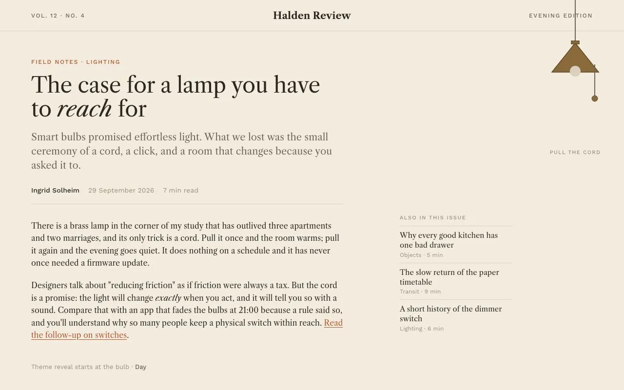
A hanging brass lamp with a pull cord that switches the whole page between day and night with a radial clip-path reveal starting at the bulb; reduced motion crossfades.
Preview
Use it
Free to use · credit appreciated1 Once, in your project
npx skills add SusanAcharya/Design-Lounge 2 Then ask
Using the Design Lounge skill, build "Lamp pull-cord theme toggle" (piece lamp-theme-toggle) in my stack. Match its brief; restyle it onto my product's theme.
No skill? Paste the brief instead. It carries the numbers, tokens and behaviour.
<!-- Design Lounge Nº 026 · "Lamp pull-cord theme toggle" · designlounge.vercel.app -->

# Lamp pull-cord theme toggle

> **Build brief for a coding agent.** Rebuild this piece in the reader's stack. If they haven't said which stack, ask once, then default to semantic HTML + CSS + a little vanilla JS. Match the numbers below; don't "improve" them.

## What it is

A day/night theme switch disguised as a brass reading lamp hanging from the top-right of an editorial article page ("Halden Review"). Clicking anywhere on the lamp tugs its pull cord 14px with a spring, and the new theme spreads out from the bulb as a growing circle (640ms) instead of a global fade. In night mode the bulb lights, an amber glow pools under the shade and the accent colour shifts from rust to lamp-yellow. The reveal is a `clip-path: circle()` animation on the View Transitions root snapshot; browsers without it, and anyone with reduced motion, get a 400ms crossfade of colours. The detail worth copying is that the circle's origin is measured from the bulb's actual bounding box at click time, so it stays correct at any viewport size.

## Reference behaviour

1. Initial state (day): cream page, 64px masthead (volume/number left, "Halden Review" centred, "Evening edition" right), kicker in rust, a 44px serif headline with one italic word, a 20px deck, byline row, two body paragraphs with a rust drop cap, and an "Also in this issue" list to the right. The lamp hangs from the top edge at x = 1080–1280 with a straight cord, an unlit bulb, no glow, and a pull cord with a bead ending at y ≈ 208. A small label under it reads "Pull the cord".
2. Hover the lamp: cursor becomes pointer; no other change.
3. Click (or Enter/Space) on the lamp: the `.pull` group translates down 14px over 140ms with `cubic-bezier(.34,1.56,.64,1)` and springs back over the same time.
4. On the same click the theme flips to night: starting from the bulb centre, a circle of the new page grows from radius 0 to 1500px over 640ms with `cubic-bezier(.16,1,.3,1)`. Inside the circle: background `#14161e`, text `#ece6da`, brass turns lighter, the bulb turns `#ffe9b0`, a 180×72 ellipse glow at 55 % amber appears under the shade, and the accent becomes `#f2b94f`.
5. The lamp's `aria-pressed` becomes `true`, its label becomes "Turn the lamp off and switch to day mode", the small label reads "Pull again for day", and the footer line reads "Night".
6. Clicking again returns to day with the same circle reveal from the bulb (the day theme grows over the night page).
7. Clicks during a running transition are ignored (a `busy` flag guards until `finished` resolves).
8. Without View Transitions support, or with reduced motion, the theme swap is a simultaneous 400ms transition of background, colour, border, fill and stroke on every element.

## Structure

```
1280 × 800
┌──────────────────────────────────────────────────────────────────────────┐
│ Vol. 12 · No. 4            Halden Review            Evening edition │ ┃ │ masthead 64
├─────────────────────────────────────────────────────────────────────┼─┃─┤
│ FIELD NOTES · LIGHTING                                              │ ┃ │ cord x=1180
│ The case for a lamp you have to reach for   (44px, measure 640)     │▲▲▲│ shade y 88–148
│ deck 20px                                                           │ ● │ bulb (1180,146)
│ Ingrid Solheim · 29 September 2026 · 7 min read                     │ │ │ pull cord
│ ─────────────────────────────────────────────                       │ o │ bead y 202
│ T here is a brass lamp …                        ALSO IN THIS ISSUE  │   │
│   …                                             ─────────────       │   │ label y 306
│ Designers talk about …                          Why every good…     │   │
│                                                 The slow return…    │   │
│                                                 A short history…    │   │
│ Theme reveal starts at the bulb · Day                                    │ foot y 760
└──────────────────────────────────────────────────────────────────────────┘

… 159 more lines. Copy or download for the full brief. Loading the source…Brief
199 linesBuild brief for a coding agent. Rebuild this piece in the reader’s stack. If they haven’t said which stack, ask once, then default to semantic HTML + CSS + a little vanilla JS. Match the numbers below; don’t “improve” them.
What it is
A day/night theme switch disguised as a brass reading lamp hanging from the top-right of an editorial article page (“Halden Review”). Clicking anywhere on the lamp tugs its pull cord 14px with a spring, and the new theme spreads out from the bulb as a growing circle (640ms) instead of a global fade. In night mode the bulb lights, an amber glow pools under the shade and the accent colour shifts from rust to lamp-yellow. The reveal is a clip-path: circle() animation on the View Transitions root snapshot; browsers without it, and anyone with reduced motion, get a 400ms crossfade of colours. The detail worth copying is that the circle’s origin is measured from the bulb’s actual bounding box at click time, so it stays correct at any viewport size.
Reference behaviour
- Initial state (day): cream page, 64px masthead (volume/number left, “Halden Review” centred, “Evening edition” right), kicker in rust, a 44px serif headline with one italic word, a 20px deck, byline row, two body paragraphs with a rust drop cap, and an “Also in this issue” list to the right. The lamp hangs from the top edge at x = 1080–1280 with a straight cord, an unlit bulb, no glow, and a pull cord with a bead ending at y ≈ 208. A small label under it reads “Pull the cord”.
- Hover the lamp: cursor becomes pointer; no other change.
- Click (or Enter/Space) on the lamp: the
.pullgroup translates down 14px over 140ms withcubic-bezier(.34,1.56,.64,1)and springs back over the same time. - On the same click the theme flips to night: starting from the bulb centre, a circle of the new page grows from radius 0 to 1500px over 640ms with
cubic-bezier(.16,1,.3,1). Inside the circle: background#14161e, text#ece6da, brass turns lighter, the bulb turns#ffe9b0, a 180×72 ellipse glow at 55 % amber appears under the shade, and the accent becomes#f2b94f. - The lamp’s
aria-pressedbecomestrue, its label becomes “Turn the lamp off and switch to day mode”, the small label reads “Pull again for day”, and the footer line reads “Night”. - Clicking again returns to day with the same circle reveal from the bulb (the day theme grows over the night page).
- Clicks during a running transition are ignored (a
busyflag guards untilfinishedresolves). - Without View Transitions support, or with reduced motion, the theme swap is a simultaneous 400ms transition of background, colour, border, fill and stroke on every element.
Structure
1280 × 800
┌──────────────────────────────────────────────────────────────────────────┐
│ Vol. 12 · No. 4            Halden Review            Evening edition │ ┃ │ masthead 64
├─────────────────────────────────────────────────────────────────────┼─┃─┤
│ FIELD NOTES · LIGHTING                                              │ ┃ │ cord x=1180
│ The case for a lamp you have to reach for   (44px, measure 640)     │▲▲▲│ shade y 88–148
│ deck 20px                                                           │ ● │ bulb (1180,146)
│ Ingrid Solheim · 29 September 2026 · 7 min read                     │ │ │ pull cord
│ ─────────────────────────────────────────────                       │ o │ bead y 202
│ T here is a brass lamp …                        ALSO IN THIS ISSUE  │   │
│   …                                             ─────────────       │   │ label y 306
│ Designers talk about …                          Why every good…     │   │
│                                                 The slow return…    │   │
│                                                 A short history…    │   │
│ Theme reveal starts at the bulb · Day                                    │ foot y 760
└──────────────────────────────────────────────────────────────────────────┘
<html data-theme="day|night">carries the theme; tokens are redefined under[data-theme="night"].<header class="mast">three spans;<article>with.kicker,<h1>,.deck,.byline,<p class="body">×2.<nav class="also">absolutely positioned atleft:820px; top:440px; width:230px.<button class="lamp" aria-pressed>absolutely positionedtop:0; left:1080px; width:200px; height:300px, containing one<svg viewBox="0 0 200 300" aria-hidden>with: cord<line>, glow<ellipse>, shade<path>+ collar, bulb<circle>, and<g class="pull">(cord line + bead circle)..labelunder the lamp;.footbottom-left status line.
Tokens
:root {
  /* day */
  --bg: #f3ebdd;  --surface: #fbf6ec;  --line: #ddd2bf;
  --ink: #2b2620; --ink-2: #6e655a;    --ink-3: #9a8f80;
  --accent: #b4552d;                     /* rust: kicker, links, drop cap */
  --brass: #8a6a3b; --brass-2: #5d4626;  /* shade fill / stroke, bead */
  --bulb: #d9cfbd;                       /* unlit */
  --glow: rgba(242, 185, 79, 0);         /* off */
  --lamp-ink: #3b3128;

  /* type */
  --serif: "Libre Caslon Text", Georgia, serif;
  --sans: "Work Sans", system-ui, sans-serif;

  /* layout */
  --measure: 640px;
  --mast-h: 64px;
  --lamp-w: 200px;  --lamp-h: 300px;  --lamp-x: 1080px;
  --pull-travel: 14px;
  --reveal-radius: 1500px;

  /* motion */
  --t-micro: 160ms;
  --t-pull: 140ms;
  --t-theme: 400ms;     /* crossfade fallback */
  --t-reveal: 640ms;    /* circle */
  --ease: cubic-bezier(.2, .7, .2, 1);
  --ease-out: cubic-bezier(.16, 1, .3, 1);
  --ease-spring: cubic-bezier(.34, 1.56, .64, 1);
  --x: 1180px;  --y: 146px;   /* reveal origin, overwritten by JS */
}
:root[data-theme="night"] {
  --bg: #14161e;  --surface: #1c1f2a;  --line: #2c3040;
  --ink: #ece6da; --ink-2: #a29b8e;    --ink-3: #6f6a60;
  --accent: #f2b94f;
  --brass: #c9a35f; --brass-2: #8a6a3b;
  --bulb: #ffe9b0;
  --glow: rgba(242, 185, 79, .55);
  --lamp-ink: #ece6da;
}
Typography
| Role | Family | Size | Weight | Line-height | Tracking | Case |
|---|---|---|---|---|---|---|
| Body | Libre Caslon Text | 16px | 400 | 1.6 | 0 | sentence; measure 640px |
| Masthead name | Libre Caslon Text | 20px | 700 | 1 | 0 | title |
| Masthead meta | Work Sans | 12px | 500 | 1 | +0.14em | UPPERCASE |
| Kicker | Work Sans | 12px | 500 | 1 | +0.14em | UPPERCASE, --accent |
| Headline | Libre Caslon Text | 44px | 400 | 1.12 | −0.01em | sentence, one italic |
| Deck | Libre Caslon Text | 20px | 400 | 1.45 | 0 | --ink-2 |
| Byline | Work Sans | 14px | 400/500 | 1.5 | 0 | name 500 in --ink |
| Drop cap | Libre Caslon Text | 56px | 400 | .85 | 0 | first letter of first body paragraph, --accent |
| Also-in list | Libre Caslon Text | 15px | 400 | 1.35 | 0 | sub-line Work Sans 12px |
| Lamp label | Work Sans | 11px | 500 | 1 | +0.12em | UPPERCASE --ink-3 |
| Footer | Work Sans | 13px | 400 | 1.5 | 0 | mode word 500 |
Motion
| Element | Trigger | Property | From → To | Duration | Easing | Reduced motion |
|---|---|---|---|---|---|---|
.pull group | click | translateY | 0 → 14px → 0 | 140ms ×2 | --ease-spring | 1ms |
::view-transition-new(root) | theme flip | clip-path | circle(0 at var(--x) var(--y)) → circle(1500px …) | 640ms | --ease-out | replaced by opacity 0 → 1 over 400ms |
::view-transition-old(root) | theme flip | — | no animation; sits beneath the new snapshot | — | — | — |
| every element (fallback) | theme flip | background, color, border, fill, stroke | old → new | 400ms | --ease | same |
.glow ellipse | theme flip | fill alpha | 0 → .55 (inside the reveal) | — | — | — |
.also a | hover | color | --ink → --accent | 0 | — | — |
Both snapshots must have mix-blend-mode: normal and the old one animation: none, otherwise the default cross-fade double-exposes the circle.
States
- Day / Night: full token swap listed above; the lamp’s glow is the only element that is invisible in one theme.
- Lamp hover: cursor pointer only. The lamp is intentionally quiet until pulled.
- Lamp focus-visible: 2px
--accentoutline inset 8px, 12px radius. - Lamp active (pulling):
.pullingclass for 140ms. - Busy: clicks ignored until the transition’s
finishedpromise settles. - Links hover:
--accent; links focus-visible: 2px--accentoutline, 2px offset.
Accessibility
- The lamp is a
<button aria-pressed>(pressed = night) with an explicitaria-labeldescribing the result of the next press (“Turn the lamp on and switch to night mode”). The SVG isaria-hidden. - Keyboard: Tab reaches the mast links (if any), the article link, the lamp, the also-in links. Enter/Space pull the cord.
- The footer’s mode word changes text (“Day”/“Night”); wrap it in
aria-live="polite"if the page has no other announcement of theme change. prefers-reduced-motion: reduceswaps the circle for a 400ms opacity fade of the new snapshot; the cord tug is 1ms.- Contrast: day
--inkon--bg12.6:1,--ink-25.6:1,--accent4.6:1; night--inkon--bg13.9:1,--ink-26.4:1,--accent9.9:1.--ink-3is used only for 11–13px meta. - Hit target: the lamp button is 200×300; the cord and bead alone would be too small.
- Respect the OS preference on first load in production: initialise
data-themefromprefers-color-scheme(the demo starts in day for the hero frame).
Responsive rules
- ≥ 1280: as specified.
- 1024–1279: the also-in column moves under the article; lamp
leftbecomescalc(100% - 200px). - 768–1023: masthead padding 32px; headline 36px; lamp scaled to 150×225 via
transform: scale(.75)withtransform-origin: top right. - < 640: lamp becomes a 48×48 icon button (shade + bulb only) in the masthead’s right slot; the reveal origin is still measured from the bulb; article padding 20px; headline 30px.
Acceptance checklist
- The lamp is one
<button>200×300 attop:0; left:1080pxcontaining the whole SVG. - Clicking tugs
.pull14px down and back over 140ms each way with the spring curve. - The theme change is a circle reveal from the bulb’s measured centre, 0 → 1500px over 640ms with
cubic-bezier(.16,1,.3,1). -
--x/--yare set fromgetBoundingClientRect()of the bulb at click time, not hard-coded. -
::view-transition-old(root)hasanimation:noneand both snapshotsmix-blend-mode:normal. - Without
document.startViewTransition, colours crossfade over 400ms (no flash of unstyled theme). - Under reduced motion the new theme fades in over 400ms; no circle.
- Night mode lights the bulb (
#ffe9b0) and shows the amber glow ellipse at 55 % alpha. -
aria-pressedandaria-labelupdate on every toggle; the footer mode word updates. - Clicks during the transition are ignored.
- Focus ring visible on the lamp and on every link in both themes.
- Body text contrast ≥ 4.5:1 in both themes.
Implementation notes
View Transitions circle. Override the default cross-fade and clip the new snapshot:
::view-transition-old(root), ::view-transition-new(root) { animation: none; mix-blend-mode: normal; }
::view-transition-new(root) { animation: reveal var(--t-reveal) var(--ease-out); }
@keyframes reveal {
  from { clip-path: circle(0px at var(--x) var(--y)); }
  to   { clip-path: circle(var(--reveal-radius) at var(--x) var(--y)); }
}
Measure the origin, then flip. Set the custom properties before starting the transition so the first frame already has them:
const b = lamp.querySelector('.bulb').getBoundingClientRect();
root.style.setProperty('--x', b.left + b.width / 2 + 'px');
root.style.setProperty('--y', b.top + b.height / 2 + 'px');
if (document.startViewTransition && !reduced) {
  busy = true;
  document.startViewTransition(() => apply(next)).finished.then(() => busy = false);
} else {
  document.body.classList.add('theme-fade'); apply(next);
  setTimeout(() => document.body.classList.remove('theme-fade'), 400);
}
Fallback crossfade is a temporary class so colours don’t animate on ordinary hovers: .theme-fade, .theme-fade * { transition: background-color 400ms, color 400ms, border-color 400ms, fill 400ms, stroke 400ms !important; }.
Common mistakes: leaving the default ::view-transition cross-fade on (the circle looks washed out); using a fixed origin so the circle starts from the wrong place after resize; putting the transition on * permanently so every hover lags; toggling the theme on body while the tokens are defined on :root.
Details
- Palette
- Type
- Libre Caslon Text · Work Sans
- Motion
- Rich motion
- Build
- One session
- Tags
On the shelves