Nº 020 of 520
Grouped settings list
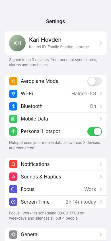
An iOS-style settings screen: inset grouped sections with 44px rows, coloured icon squares, 51×31 spring toggles with a stretching knob, chevron rows with values, footers and a profile row.
Preview
Use it
Free to use · credit appreciated1 Once, in your project
npx skills add SusanAcharya/Design-Lounge 2 Then ask
Using the Design Lounge skill, build "Grouped settings list" (piece ios-grouped-settings) in my stack. Match its brief; restyle it onto my product's theme.
No skill? Paste the brief instead. It carries the numbers, tokens and behaviour.
<!-- Design Lounge Nº 020 · "Grouped settings list" · designlounge.vercel.app -->

# Grouped settings list

> **Build brief for a coding agent.** Rebuild this piece in the reader's stack. If they haven't said which stack, ask once, then default to semantic HTML + CSS + a little vanilla JS. Match the numbers below; don't "improve" them.

## What it is

The Settings screen of "Kestrel", a phone OS-style app, in the iOS grouped-list idiom. Everything is a white 12px-radius group on a `#f2f2f7` page: a profile header row with a 58px avatar, then sections of 44px rows, each with a 29px coloured rounded-square icon, a label, an optional grey value and either a chevron or a switch. Separators are 1px hairlines that start at the label's left edge, not the group's. Switches are 51×31 with a 27px knob that springs 20px across in 280ms and stretches to 32px wide while pressed, mirroring the platform's feel. Each section ends with a 13px footer note. The top bar is a fixed glass strip with a centred "Settings" title that the list scrolls under. The value of the piece is the exactness: get the row height, the inset separator and the switch geometry right and it reads as native.

## Reference behaviour

1. Initial state: "Settings" title in a glass bar; profile row "Kari Hovden / Kestrel ID, Family Sharing, storage" with avatar "KH"; three sections (Connectivity, Notifications & Focus, General) with footers. Toggles: Aeroplane Mode off, Personal Hotspot on, Auto-Brightness on, Raise to Wake off.
2. Scroll: the list slides under the glass top bar (blur 20px, 82% page-colour fill, hairline bottom border). The bar does not change.
3. Tap a switch: `aria-checked` flips; the track colour transitions `#e9e9eb` ↔ `#34c759` over 280ms; the knob translates 0 ↔ 20px over 280ms `cubic-bezier(.32,.72,0,1)`.
4. Press and hold a switch: the knob stretches to 32px wide (from 27) over 160ms; when the switch is on, the stretched knob also shifts left 5px so its right edge stays put. Release completes the flip.
5. Press a link row: the whole row's background becomes `--line` (`#e5e5ea`) while pressed. Rows are links (they would push a detail screen).
6. Space or Enter on a focused switch flips it. Tab moves through the profile row, then each row's link or switch in order.
7. Nothing else animates; the piece is about static precision plus the switch.

## Structure

```
390 × 844
┌────────────────────────────────────────┐
│ (54 status)  glass bar 98 tall         │
│               Settings (17/600)        │
│────────────────────────────────────────│ hairline
│ 110 ┌────────────────────────────────┐ │
│     │ (KH)  Kari Hovden           ›  │ │  profile row 76 min-height
│     │       Kestrel ID, Family…      │ │
│     └────────────────────────────────┘ │
│     Signed in on 3 devices…  (footer)  │
│     ┌────────────────────────────────┐ │
│     │ [◐] Aeroplane Mode        (○ ) │ │  44px rows, icon 29
│     │     ─────────────────────────  │ │  separator inset 57px
│     │ [◐] Wi-Fi         Halden-5G ›  │ │
│     │ [◐] Bluetooth           On  ›  │ │
│     │ [◐] Mobile Data             ›  │ │
│     │ [◐] Personal Hotspot     ( ●)  │ │

… 162 more lines. Copy or download for the full brief. Loading the source…Brief
202 linesBuild brief for a coding agent. Rebuild this piece in the reader’s stack. If they haven’t said which stack, ask once, then default to semantic HTML + CSS + a little vanilla JS. Match the numbers below; don’t “improve” them.
What it is
The Settings screen of “Kestrel”, a phone OS-style app, in the iOS grouped-list idiom. Everything is a white 12px-radius group on a #f2f2f7 page: a profile header row with a 58px avatar, then sections of 44px rows, each with a 29px coloured rounded-square icon, a label, an optional grey value and either a chevron or a switch. Separators are 1px hairlines that start at the label’s left edge, not the group’s. Switches are 51×31 with a 27px knob that springs 20px across in 280ms and stretches to 32px wide while pressed, mirroring the platform’s feel. Each section ends with a 13px footer note. The top bar is a fixed glass strip with a centred “Settings” title that the list scrolls under. The value of the piece is the exactness: get the row height, the inset separator and the switch geometry right and it reads as native.
Reference behaviour
- Initial state: “Settings” title in a glass bar; profile row “Kari Hovden / Kestrel ID, Family Sharing, storage” with avatar “KH”; three sections (Connectivity, Notifications & Focus, General) with footers. Toggles: Aeroplane Mode off, Personal Hotspot on, Auto-Brightness on, Raise to Wake off.
- Scroll: the list slides under the glass top bar (blur 20px, 82% page-colour fill, hairline bottom border). The bar does not change.
- Tap a switch:
aria-checkedflips; the track colour transitions#e9e9eb↔#34c759over 280ms; the knob translates 0 ↔ 20px over 280mscubic-bezier(.32,.72,0,1). - Press and hold a switch: the knob stretches to 32px wide (from 27) over 160ms; when the switch is on, the stretched knob also shifts left 5px so its right edge stays put. Release completes the flip.
- Press a link row: the whole row’s background becomes
--line(#e5e5ea) while pressed. Rows are links (they would push a detail screen). - Space or Enter on a focused switch flips it. Tab moves through the profile row, then each row’s link or switch in order.
- Nothing else animates; the piece is about static precision plus the switch.
Structure
390 × 844
┌────────────────────────────────────────┐
│ (54 status)  glass bar 98 tall         │
│               Settings (17/600)        │
│────────────────────────────────────────│ hairline
│ 110 ┌────────────────────────────────┐ │
│     │ (KH)  Kari Hovden           ›  │ │  profile row 76 min-height
│     │       Kestrel ID, Family…      │ │
│     └────────────────────────────────┘ │
│     Signed in on 3 devices…  (footer)  │
│     ┌────────────────────────────────┐ │
│     │ [◐] Aeroplane Mode        (○ ) │ │  44px rows, icon 29
│     │     ─────────────────────────  │ │  separator inset 57px
│     │ [◐] Wi-Fi         Halden-5G ›  │ │
│     │ [◐] Bluetooth           On  ›  │ │
│     │ [◐] Mobile Data             ›  │ │
│     │ [◐] Personal Hotspot     ( ●)  │ │
│     └────────────────────────────────┘ │
│     Hotspot uses your mobile data…     │
│     ┌────────────────────────────────┐ │
│     │ [◐] Notifications           ›  │ │
│     │ [◐] Sounds & Haptics        ›  │ │
│     │ [◐] Focus              Work ›  │ │
│     │ [◐] Screen Time  2h 14m today ›│ │
│     └────────────────────────────────┘ │
│     …                                  │
└────────────────────────────────────────┘
  16px page gutters; groups are full width inside them
<header class="bar">: fixed,height:98px; padding-top:54px, centred text.<main>: scroller,padding: 110px 16px 40px..group: white, radius 12px,overflow:hidden, 8px below; followed by<p class="foot">with 26px below..row: flex,min-height:44px,padding: 0 16px, gap 12px. Variants:<a class="row link">(chevron) and<div class="row">containing<button class="tog" role="switch" aria-labelledby>.::afterdraws the separator fromleft: 16 + 29 + 12 = 57px; the last row in a group has none..ic: 29px square, radius 7px, white 18px SVG icon, background from the icon palette..profile:min-height:76px,padding:12px 16px, 58px avatar, 20px name, 13px sub-line.
Tokens
:root {
  /* colour — system light grouped palette */
  --bg: #f2f2f7;            /* page */
  --surface: #ffffff;       /* groups */
  --ink: #1c1c1e;
  --ink-2: #6e6e73;         /* values, footers */
  --ink-3: #aeaeb2;
  --line: #e5e5ea;          /* separators, pressed row */
  --chev: #c7c7cc;          /* chevrons */
  --accent: #0a7aff;        /* focus rings */
  --on: #34c759;  --off: #e9e9eb;  --knob: #ffffff;
  --glass: rgba(242,242,247,.82);  --glass-line: rgba(28,28,30,.1);

  /* icon squares */
  --ic-red: #ff3b30;  --ic-orange: #ff9500;  --ic-green: #34c759;  --ic-blue: #0a7aff;
  --ic-indigo: #5856d6;  --ic-teal: #30b0c7;  --ic-gray: #8e8e93;  --ic-pink: #ff2d55;
  --avatar-gradient: linear-gradient(135deg, #b9c8b0, #5f7d63);

  /* type */
  --font: "Inter", system-ui, -apple-system, sans-serif;

  /* geometry */
  --status: 54px;  --bar-h: 44px;  --content-top: 110px;
  --inset: 16px;  --row-h: 44px;  --row-gap: 12px;
  --icon: 29px;  --r-icon: 7px;  --r-group: 12px;
  --sep-inset: 57px;                        /* inset + icon + gap */
  --tog-w: 51px;  --tog-h: 31px;  --knob-d: 27px;  --knob-travel: 20px;  --knob-stretch: 32px;
  --knob-shadow: 0 3px 8px rgba(0,0,0,.15), 0 1px 1px rgba(0,0,0,.16);
  --avatar: 58px;  --profile-h: 76px;
  --chevron: 8px 14px;

  /* motion */
  --t-micro: 160ms;
  --t-toggle: 280ms;
  --spring: cubic-bezier(.32, .72, 0, 1);
  --ease: cubic-bezier(.2, .7, .2, 1);
}
Typography
| Role | Family | Size | Weight | Line-height | Tracking | Case |
|---|---|---|---|---|---|---|
| Row label | Inter | 17px | 400 | 1.3 | 0 | title case (platform convention) |
| Row value | Inter | 17px | 400 | 1.3 | 0 | --ink-2 |
| Bar title | Inter | 17px | 600 | 1 | −0.01em | sentence |
| Profile name | Inter | 20px | 500 | 1.25 | −0.015em | as written |
| Profile sub | Inter | 13px | 400 | 1.3 | 0 | sentence, --ink-2 |
| Footer | Inter | 13px | 400 | 1.4 | 0 | sentence, --ink-2 |
| Avatar | Inter | 20px | 600 | 1 | 0 | initials |
Motion
| Element | Trigger | Property | From → To | Duration | Easing | Notes |
|---|---|---|---|---|---|---|
.tog | flip | background | #e9e9eb ↔ #34c759 | 280ms | --ease | |
.tog::after | flip | transform | translateX(0) ↔ 20px | 280ms | --spring | |
.tog::after | :active | width | 27px → 32px | 160ms | --ease | when on, transform becomes 15px so the right edge holds |
.row | :active | background | white → --line | 160ms | --ease | link rows |
Reduced motion: all transitions 1ms; the switch still flips and the knob still stretches (instantly).
States
- Switch on:
aria-checked="true", green track, knob right. Off: grey track, knob left. - Switch pressed: knob 32px wide. Switch focus-visible: 2px
--accentoutline, 3px offset. - Row pressed:
--linebackground. Row focus-visible: 2px--accentoutline,outline-offset:-2px, 8px radius (inside the group’s clip). - Row with value: value text in
--ink-2immediately left of the chevron. - Disabled (spec only): row text
--ink-3, icon at 50% opacity, switch at 40% opacity andaria-disabled. - Profile row: taller (76px), avatar instead of icon, two-line label.
Accessibility
- Switches are
<button role="switch" aria-checked aria-labelledby="<label id>">; Space and Enter toggle; the visible label is the accessible name. - Link rows are
<a>elements whose text is label + value (“Wi-Fi Halden-5G”); chevrons are decorative SVG. - Icons are decorative (
<span class="ic">with an SVG and no text); the label carries meaning. - Focus order follows the visual order top to bottom.
- Contrast:
--ink-2on white 4.9:1; footers at 13px pass AA;--chevis decorative. - Hit targets: rows 44px tall and full width; switches 51×31 inside a 44px row (the whole row height is the target on touch if you forward row taps to the switch, which the platform does).
Responsive rules
- 360 wide: identical; long values (“2h 14m today”) may truncate the label first (label has
text-overflow:ellipsis), never the value. - ≥ 430 wide: content column
max-width: 430pxcentred, bar title centred over it. - Tablet: two-pane, this list as a 320px sidebar with the selected row highlighted in
--accentat 12% and the detail on the right. - Dark mode (if your product has it): page
#000, groups#1c1c1e, separators#38383a, off-track#39393d; icon colours unchanged.
Acceptance checklist
- Rows are exactly 44px min-height with 16px horizontal padding; the profile row is 76px.
- Separators are 1px
#e5e5ea, start 57px from the group’s left edge, and the last row in a group has none. - Icon squares are 29×29 with a 7px radius and an 18px white stroke icon; colours come from the eight icon tokens.
- Groups are white with a 12px radius, 8px below each group and 26px below each footer.
- Switches are 51×31 with a 27px knob at 2px inset; on-state translates the knob exactly 20px; track colours are
#e9e9eb/#34c759. - Knob travel uses
cubic-bezier(.32,.72,0,1)over 280ms; pressing stretches the knob to 32px in 160ms without moving its outer edge. - Switches use
role="switch"+aria-checkedand respond to Space and Enter. - Chevrons are 8×14 in
#c7c7cc; values sit in#6e6e73immediately left of the chevron. - The top bar is fixed at 98px including the status area, glass-filled, and the list starts at 110px.
- Every row and switch shows a visible focus ring that is not clipped by the group.
- No text uses the pure
#000or#fffoutside the knob and icon glyphs.
Implementation notes
The switch is one button and one pseudo-element. Keep the geometry in tokens; the pressed stretch when “on” shifts the knob left by the stretch amount so its right edge stays fixed:
.tog { position: relative; width: 51px; height: 31px; border-radius: 16px; background: var(--off); border: 0; padding: 0;
       transition: background 280ms var(--ease); }
.tog::after { content: ""; position: absolute; left: 2px; top: 2px; width: 27px; height: 27px; border-radius: 50%;
       background: #fff; box-shadow: 0 3px 8px rgba(0,0,0,.15), 0 1px 1px rgba(0,0,0,.16);
       transition: transform 280ms cubic-bezier(.32,.72,0,1), width 160ms var(--ease); }
.tog[aria-checked="true"] { background: var(--on); }
.tog[aria-checked="true"]::after { transform: translateX(20px); }
.tog:active::after { width: 32px; }
.tog[aria-checked="true"]:active::after { transform: translateX(15px); }document.querySelectorAll('.tog').forEach(t => {
const flip = () => t.setAttribute('aria-checked', String(t.getAttribute('aria-checked') !== 'true'));
t.addEventListener('click', flip);
t.addEventListener('keydown', e => { if (e.key === ' ' || e.key === 'Enter') { e.preventDefault(); flip(); } });
});Inset separators without extra markup — draw them on the row’s ::after and hide the last one:
.row { position: relative; }
.row::after { content: ""; position: absolute; left: 57px; right: 0; bottom: 0; height: 1px; background: var(--line); }
.group .row:last-child::after { display: none; }
Common mistakes: using <input type="checkbox"> with appearance:none but forgetting the label association; separators drawn on the group with full width; border-radius on rows instead of the group; using height:44px (rows with wrapped values overflow) instead of min-height; forgetting -webkit-backdrop-filter.
Details
- Palette
- Type
- Inter
- Motion
- Subtle motion
- Build
- Quick build
- Tags
On the shelves