Nº 498 of 520
M3 collapsing large top app bar
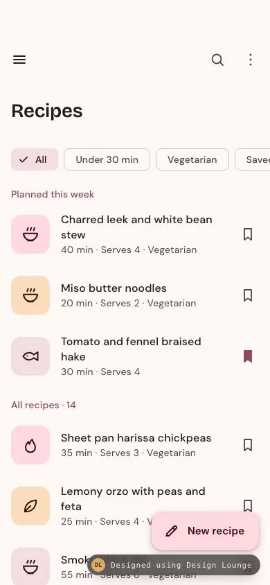
An Android M3 large top app bar that collapses to the small bar as you scroll, its title gliding and shrinking, with an extended FAB that shrinks on scroll down.
Preview
Use it
Free to use · credit appreciated1 Once, in your project
npx skills add SusanAcharya/Design-Lounge 2 Then ask
Using the Design Lounge skill, build "M3 collapsing large top app bar" (piece m3-top-app-bar-scroll) in my stack. Match its brief; restyle it onto my product's theme.
No skill? Paste the brief instead. It carries the numbers, tokens and behaviour.
<!-- Design Lounge Nº 498 · "M3 collapsing large top app bar" · designlounge.vercel.app -->

# M3 collapsing large top app bar

> **Build brief for a coding agent.** Rebuild this piece in the reader's stack. If they haven't said which stack, ask once, then default to semantic HTML + CSS + a little vanilla JS. Match the numbers below; don't "improve" them. This is the Android counterpart of `ios-large-title-collapse`. On Android the title travels into the bar beside the navigation icon; it doesn't cross-fade into a centred title.

## What it is

The **Recipes** list of "Pantrywell", a home-cooking app, in Material 3 on a warm rose scheme. At rest, a **large top app bar** (152dp below the status bar) shows a navigation icon on the left, Search and More on the right, and a 28px "Recipes" headline on its own line. Scrolling the list collapses the bar 1:1 with the scroll into the **small top app bar** (64dp). The single title element glides from (16, 142) to (56, 72), scales from 28px to 22px, and the container blends from `--surface` to `--surface-c`. Bottom right, an **extended FAB** "New recipe" shrinks to a 56px square FAB when you scroll down and extends again when you scroll up. Two details make it worth copying. The bar never stops half-collapsed, because a snap pass finishes it. The FAB reacts to scroll direction, not position, so it extends as soon as the user changes their mind.

Language: Material 3 (Compose `LargeTopAppBar` with `exitUntilCollapsedScrollBehavior`, plus `ExtendedFloatingActionButton` with `expanded` bound to scroll direction).

## Reference behaviour

1. **Initial state (hero).** Scroll 0. The bar is 54px safe area plus 152px, coloured `--surface`. The 64px icon row sits at y 54: a hamburger (48px, `--on-surface`) at x 4, and Search and More (48px each, `--on-surface-v`) at the right edge with 4px padding. "Recipes" is Bricolage Grotesque 600, 28/36, with the top of its line box at y 142 and x 16. Below that, the list begins: a row of filter chips, a "Planned this week" header, three recipes, an "All recipes · 14" header, and eleven more. The FAB is extended: 56px tall, 16px radius, pencil icon plus "New recipe", `right:16px; bottom:50px`.
2. **Scroll down 0 to 88px.** Compute `p = clamp(scrollTop / 88, 0, 1)` on every scroll event and set:
   - bar height = `54 + 152 − 88p` px, so the bar shrinks exactly as fast as the content moves and the first chip stays glued under its bottom edge;
   - title transform = `translate(16 + 40p px, 142 − 70p px) scale(1 − 6p/28)`, with `transform-origin: 0 0`;
   - bar background = `color-mix(in srgb, var(--surface-c) p×100%, var(--surface))`.
3. **Past 88px.** The bar stays at the small size (118px including the safe area), with the title at 22px visual size beside the navigation icon and the background at full `--surface-c`. Content scrolls under it.
4. **FAB on scroll down.** Accumulate scroll deltas in the same direction. When downward travel exceeds 12px (and `scrollTop ≥ 8`), the FAB collapses: width animates from the measured extended width (about 155px) to 56px over 300ms `cubic-bezier(.2,0,0,1)`, and the label fades out over 150ms. The FAB's `aria-label` stays "New recipe".
5. **FAB on scroll up.** When upward travel exceeds 12px, or `scrollTop < 8`, it extends again. Width animates back over 300ms, and the label fades in over 150ms after a 60ms delay, so it never shows clipped.
6. **Snap.** 140ms after the last scroll event, if `0 < scrollTop < 88`, scroll smoothly to 0 (when below 44) or to 88 (when at or above 44). The bar is never left half-collapsed.
7. **Filter chips** (All, Under 30 min, Vegetarian, Saved) are single-select. The selected chip gets `--secondary-c`, a leading 18px check, and 8px less left padding. The list re-renders with a count header such as "6 recipes". "All" restores the two-section layout.
8. **Bookmark** buttons on each row toggle `aria-pressed`. Pressed is a filled bookmark in `--primary`. Under the Saved filter, un-saving a recipe removes its row immediately.
9. **Empty state.** Under the Saved filter with nothing saved, the list shows "Nothing saved yet" (Bricolage 22/28) and "Tap the bookmark on any recipe and it will wait for you here." (14/20 `--on-surface-v`), centred with 48px top padding.
10. **Ripples** on every button: icon buttons, list rows, chips, bookmarks and the FAB. Each starts at the pointer, grows over 450ms at 12%, and fades over 300ms on release.

## Structure

```
390 × 844, scroll 0                      scrolled ≥ 88
┌────────────────────────────────────┐   ┌────────────────────────────────────┐
│ (54px safe area)                   │   │ (54px safe area)                   │
│ [≡]                    [⌕]  [⋮]    │   │ [≡]  Recipes           [⌕]  [⋮]    │ 64px, surface-c
│                                    │   ├────────────────────────────────────┤
│                                    │   │ ▢  Tomato and fennel braised hake │
│ Recipes            28/36 at y 142  │   │ ...                                │
│                                    │   │                                    │
├──────────────── bar bottom y 206 ──┤   │                                    │

… 217 more lines. Copy or download for the full brief. Loading the source…Brief
257 linesBuild brief for a coding agent. Rebuild this piece in the reader’s stack. If they haven’t said which stack, ask once, then default to semantic HTML + CSS + a little vanilla JS. Match the numbers below; don’t “improve” them. This is the Android counterpart of
ios-large-title-collapse. On Android the title travels into the bar beside the navigation icon; it doesn’t cross-fade into a centred title.
What it is
The Recipes list of “Pantrywell”, a home-cooking app, in Material 3 on a warm rose scheme. At rest, a large top app bar (152dp below the status bar) shows a navigation icon on the left, Search and More on the right, and a 28px “Recipes” headline on its own line. Scrolling the list collapses the bar 1:1 with the scroll into the small top app bar (64dp). The single title element glides from (16, 142) to (56, 72), scales from 28px to 22px, and the container blends from --surface to --surface-c. Bottom right, an extended FAB “New recipe” shrinks to a 56px square FAB when you scroll down and extends again when you scroll up. Two details make it worth copying. The bar never stops half-collapsed, because a snap pass finishes it. The FAB reacts to scroll direction, not position, so it extends as soon as the user changes their mind.
Language: Material 3 (Compose LargeTopAppBar with exitUntilCollapsedScrollBehavior, plus ExtendedFloatingActionButton with expanded bound to scroll direction).
Reference behaviour
- Initial state (hero). Scroll 0. The bar is 54px safe area plus 152px, coloured
--surface. The 64px icon row sits at y 54: a hamburger (48px,--on-surface) at x 4, and Search and More (48px each,--on-surface-v) at the right edge with 4px padding. “Recipes” is Bricolage Grotesque 600, 28/36, with the top of its line box at y 142 and x 16. Below that, the list begins: a row of filter chips, a “Planned this week” header, three recipes, an “All recipes · 14” header, and eleven more. The FAB is extended: 56px tall, 16px radius, pencil icon plus “New recipe”,right:16px; bottom:50px. - Scroll down 0 to 88px. Compute
p = clamp(scrollTop / 88, 0, 1)on every scroll event and set:- bar height =
54 + 152 − 88ppx, so the bar shrinks exactly as fast as the content moves and the first chip stays glued under its bottom edge; - title transform =
translate(16 + 40p px, 142 − 70p px) scale(1 − 6p/28), withtransform-origin: 0 0; - bar background =
color-mix(in srgb, var(--surface-c) p×100%, var(--surface)).
- bar height =
- Past 88px. The bar stays at the small size (118px including the safe area), with the title at 22px visual size beside the navigation icon and the background at full
--surface-c. Content scrolls under it. - FAB on scroll down. Accumulate scroll deltas in the same direction. When downward travel exceeds 12px (and
scrollTop ≥ 8), the FAB collapses: width animates from the measured extended width (about 155px) to 56px over 300mscubic-bezier(.2,0,0,1), and the label fades out over 150ms. The FAB’saria-labelstays “New recipe”. - FAB on scroll up. When upward travel exceeds 12px, or
scrollTop < 8, it extends again. Width animates back over 300ms, and the label fades in over 150ms after a 60ms delay, so it never shows clipped. - Snap. 140ms after the last scroll event, if
0 < scrollTop < 88, scroll smoothly to 0 (when below 44) or to 88 (when at or above 44). The bar is never left half-collapsed. - Filter chips (All, Under 30 min, Vegetarian, Saved) are single-select. The selected chip gets
--secondary-c, a leading 18px check, and 8px less left padding. The list re-renders with a count header such as “6 recipes”. “All” restores the two-section layout. - Bookmark buttons on each row toggle
aria-pressed. Pressed is a filled bookmark in--primary. Under the Saved filter, un-saving a recipe removes its row immediately. - Empty state. Under the Saved filter with nothing saved, the list shows “Nothing saved yet” (Bricolage 22/28) and “Tap the bookmark on any recipe and it will wait for you here.” (14/20
--on-surface-v), centred with 48px top padding. - Ripples on every button: icon buttons, list rows, chips, bookmarks and the FAB. Each starts at the pointer, grows over 450ms at 12%, and fades over 300ms on release.
Structure
390 × 844, scroll 0                      scrolled ≥ 88
┌────────────────────────────────────┐   ┌────────────────────────────────────┐
│ (54px safe area)                   │   │ (54px safe area)                   │
│ [≡]                    [⌕]  [⋮]    │   │ [≡]  Recipes           [⌕]  [⋮]    │ 64px, surface-c
│                                    │   ├────────────────────────────────────┤
│                                    │   │ ▢  Tomato and fennel braised hake │
│ Recipes            28/36 at y 142  │   │ ...                                │
│                                    │   │                                    │
├──────────────── bar bottom y 206 ──┤   │                                    │
│ [✓ All] [Under 30 min] [Vegetarian]│   │                                    │
│ Planned this week                  │   │                                    │
│ ▢  Charred leek and white bean  ⌑ │   │                                    │
│    40 min · Serves 4 · Vegetarian  │   │                                    │
│ ▢  Miso butter noodles          ⌑ │   │                                    │
│ ▢  Tomato and fennel braised h… ■ │   │                                    │
│ All recipes · 14                   │   │                                    │
│ ▢  Sheet pan harissa chickpeas  ⌑ │   │                              ┌──┐  │
│                ╭───────────────╮   │   │                              │✎ │  │ FAB 56×56
│                │ ✎  New recipe │   │   │                              └──┘  │
│ (34px)         ╰───────────────╯   │   │                                    │
└────────────────────────────────────┘   └────────────────────────────────────┘
<header class="bar">is absolute at the top,z-index: 3,overflow: hidden. Its JS-drivenheightand--pvariable come from the scroll..bar-rowis absolute attop: 54px, 64px tall:<button aria-label="Open navigation drawer">, a flex spacer,<button aria-label="Search recipes">,<button aria-label="More options">.<h1 id="title">is absolute atleft:0; top:0, positioned only bytransform.
<main>is absoluteinset: 0,overflow-y: auto,padding-top: 206px(54 + 152),padding-bottom: 128px(clears the FAB)..chipsis arole="group" aria-label="Filter recipes"with<button aria-pressed>chips: 48px tall buttons around 32px visual chips.<div aria-live="polite">holds the section<h2>s and<ul>lists.- Each row is an
<li class="item">with a full-width<button class="open">(88px minimum, 64px right padding) and an absolutely positioned 48px<button class="save" aria-pressed>.
<button class="fab" aria-label="New recipe">is absolute atright:16px; bottom:50px. Its label<span>isaria-hidden.
Recipes (name, minutes, serves, vegetarian):
| Section | Name | Min | Serves | Veg | Saved |
|---|---|---|---|---|---|
| Planned this week | Charred leek and white bean stew | 40 | 4 | yes | |
| Planned this week | Miso butter noodles | 20 | 2 | yes | |
| Planned this week | Tomato and fennel braised hake | 30 | 4 | no | yes |
| All recipes | Sheet pan harissa chickpeas | 35 | 3 | yes | |
| All recipes | Lemony orzo with peas and feta | 25 | 4 | yes | |
| All recipes | Smoky black dal | 55 | 6 | yes | yes |
| All recipes | Crispy rice with fried eggs | 15 | 2 | yes | |
| All recipes | Squash, sage and brown butter gnocchi | 45 | 4 | yes | |
| All recipes | Ginger scallion chicken rice | 50 | 4 | no | |
| All recipes | Grilled halloumi flatbreads | 20 | 4 | yes | |
| All recipes | Mushroom and barley soup | 60 | 6 | yes | |
| All recipes | Salt-baked sea bream | 40 | 2 | no | |
| All recipes | Coconut green curry with tofu | 30 | 4 | yes | |
| All recipes | Burnt honey almond cake | 70 | 8 | yes |
Supporting line format: 40 min · Serves 4 · Vegetarian (the last part only when vegetarian). Thumbnails are 56px squares with a 14px radius, cycling through --primary-c, --tertiary-c and --secondary-c, each holding a 28px line glyph (bowl, leaf, flame or fish) in the matching on-colour.
Tokens
:root {
  /* primary: rose, seed #8E4957 */
  --primary: #8e4957;          /* section headers, saved bookmark, focus */
  --on-primary: #ffffff;
  --primary-c: #ffd9de;        /* FAB, thumbnail A */
  --on-primary-c: #3b0716;
  --secondary-c: #f3dde0;      /* selected chip, thumbnail C */
  --on-secondary-c: #2b1519;
  --tertiary-c: #fbdcbc;       /* thumbnail B, apricot */
  --on-tertiary-c: #2b1700;

  /* surfaces, warm bias */
  --surface: #fff8f7;          /* page, bar at rest */
  --surface-low: #fff0f1;
  --surface-c: #fbeaeb;        /* bar collapsed */
  --surface-high: #f5e4e5;
  --surface-highest: #efdedf;
  --on-surface: #22191a;
  --on-surface-v: #524345;
  --outline: #847374;
  --outline-v: #d6c2c3;        /* chip border */

  /* type */
  --f-head: "Bricolage Grotesque", system-ui, sans-serif;
  --f-body: "DM Sans", system-ui, sans-serif;

  /* geometry */
  --safe-top: 54px;
  --bar-small: 64px;
  --bar-large: 152px;
  --collapse: 88px;            /* bar-large − bar-small */
  --r-fab: 16px; --r-thumb: 14px; --r-chip: 8px;
  --fab-h: 56px;

  --shadow-3: 0 4px 8px 3px rgba(80,30,40,.14), 0 1px 3px rgba(80,30,40,.28);
  --shadow-fab-press: 0 2px 6px 2px rgba(80,30,40,.15), 0 1px 2px rgba(80,30,40,.3);

  /* motion */
  --ease-emph: cubic-bezier(.2, 0, 0, 1);
  --t-fab: 300ms;
  --t-label: 150ms;
  --t-ripple: 450ms;
  --snap-idle: 140ms;
  --fab-threshold: 12px;
}
Typography
| Role | Family | Size / line | Weight | Tracking | Notes |
|---|---|---|---|---|---|
| Title, expanded (headline-medium) | Bricolage Grotesque | 28 / 36 | 600 | −0.01em | single element, scaled |
| Title, collapsed (title-large) | Bricolage Grotesque | 22 / 28 visual | 600 | −0.01em | scale(.786) of the above |
| Section header (title-small) | DM Sans | 14 / 20 | 500 | 0.1px | --primary |
| Row title (body-large) | DM Sans | 16 / 22 | 500 | 0.1px | wraps to 2 lines |
| Row supporting (body-medium) | DM Sans | 14 / 20 | 400 | 0.2px | --on-surface-v |
| Chip (label-large) | DM Sans | 14 / 20 | 500 | 0.1px | |
| FAB label (label-large) | DM Sans | 15 / 20 | 600 | 0.1px | |
| Empty title | Bricolage Grotesque | 22 / 28 | 600 | 0 |
Bricolage Grotesque’s optical sizing gives the 28px headline tighter, more characterful forms. DM Sans keeps the dense list calm.
Motion
| Element | Trigger | Property | Mapping or from → to | Duration | Easing |
|---|---|---|---|---|---|
| Bar height | scroll 0 to 88 | height | 206 → 118px, linear in scroll | scroll-linked | none |
| Title | scroll 0 to 88 | translate, scale | (16,142) s1 → (56,72) s.786 | scroll-linked | none |
| Bar colour | scroll 0 to 88 | background | surface → surface-c via color-mix | scroll-linked | none |
| Snap | 140ms scroll idle | scrollTop | to 0 if < 44, else 88 | browser smooth | browser |
| FAB collapse | ≥ 12px down | width | extended → 56px | 300ms | --ease-emph |
| FAB label hide | collapse | opacity | 1 → 0 | 150ms | linear |
| FAB extend | ≥ 12px up or top | width | 56px → extended | 300ms | --ease-emph |
| FAB label show | extend | opacity | 0 → 1 | 150ms, 60ms delay | linear |
| Chip select | click | background, padding-left | none, 16 → secondary-c, 8 | 200ms | --ease-emph |
| Ripple | pointerdown / up | scale / opacity | 0 → 1 / .12 → 0 | 450ms / 300ms | emph / linear |
Reduced motion: transitions become 1ms and the snap uses behavior: 'auto'. The scroll-linked title and height still track the scroll, because that motion is caused by the user’s own input. The FAB still changes shape, instantly.
States
- Bar expanded (p = 0):
--surface, large title, 206px tall. - Bar collapsed (p = 1):
--surface-c, small title, 118px tall. - Icon button hover / focus-visible: 8% / 10% state layer, plus a 2px
--primaryoutline offset 2px on focus. - Row hover / focus-visible: 8% / 10% state layer. Focus adds a 2px
--primaryoutline inset by 2px. - Chip selected:
--secondary-c, check icon, no border. Unselected: 1px--outline-vborder,--on-surface-vtext. - Bookmark pressed: filled path in
--primary. Unpressed: outline in--on-surface-v. - FAB extended / collapsed: width only. Pressed lowers the shadow to
--shadow-fab-press. - Empty (Saved, nothing saved): title plus body copy, centred; the FAB stays extended.
- Loading: not shown. A real app would put three 88px skeleton rows under the bar, and the bar would behave the same.
Accessibility
- The title is the page
<h1>. It moves visually only throughtransform, so it is not re-announced. - Icon buttons have labels: “Open navigation drawer”, “Search recipes”, “More options”. Bookmarks are labelled “Save
” with aria-pressed. - Filter chips are toggle buttons (
aria-pressed) in a labelledrole="group". The results region isaria-live="polite", so a filter change announces the new header. - The FAB keeps
aria-label="New recipe"in both widths. Its visible label isaria-hiddenso it isn’t read twice. - Keyboard: Tab moves through the bar actions, chips, each row and its bookmark, then the FAB. Focusing a row lower in the list scrolls it, and the bar collapses with it.
- Contrast: title on surface 16.4:1; supporting text 8.9:1; primary header on surface 6.2:1; FAB label on primary-c 13.2:1; selected chip text 13.3:1. The FAB container against the page is only 1.2:1, so its edge comes from
--shadow-3. Keep that shadow. - Hit targets: icon buttons and bookmarks are 48 × 48; chip buttons are 48px tall with a 32px visual; rows are at least 88px; the FAB is 56px.
Responsive rules
- 360 wide: unchanged. Chips scroll horizontally inside their row, and long recipe names wrap to two lines.
- Largest text size (200%): rows grow (minimum 88px, no fixed height), and titles wrap to three lines at most. The expanded title can need two lines in some languages. Allow
white-space: normalon the expanded bar and raise--bar-largeto 188px if the title is longer than one line at the current size, keeping--collapse = --bar-large − 64. The FAB label must not truncate. If it would pass 60% of the width, keep the FAB collapsed. - Landscape phone or short viewport (< 500px tall): skip the large bar entirely and start with the small bar, as M3 recommends for compact heights.
- Tablet (≥ 840 wide): use a navigation rail instead of the hamburger. Keep the large bar over a 2-column list, and move the FAB into the rail.
Acceptance checklist
Always
- Expanded bar is 152dp plus the safe area; collapsed bar is 64dp plus the safe area. The difference (88) maps 1:1 to scroll distance.
- One title element is moved and scaled with
transformonly (no font-size animation, no second title). - Title ends 56px from the left, vertically centred in the 64px row, at 22px visual size.
- Container colour blends from
--surfaceto--surface-cwith collapse progress, and no shadow is added. - Scroll released between 0 and 88 snaps to the nearer end after 140ms of idle.
- Extended FAB collapses to 56 × 56 after 12px of downward travel and extends after 12px upward or near the top, with a 300ms width transition.
- FAB label fades and is never visible while clipped. The
aria-labelis constant. - Bar has a navigation icon and two action icons, all 48 × 48 with ripples.
- Empty state renders when a filter has no results.
- No horizontal page overflow at 360 wide.
This demo
- Brand “Pantrywell”, title “Recipes”, FAB “New recipe”, 14 recipes with 3 under “Planned this week”.
- Chips are All, Under 30 min, Vegetarian and Saved. Saved starts with Tomato and fennel braised hake and Smoky black dal.
- Primary is
#8E4957, FAB#FFD9DE, collapsed bar#FBEAEB. Fonts are Bricolage Grotesque and DM Sans.
Implementation notes
Scroll-linked collapse in one function. Drive everything from p; don’t use transitions here or the bar lags the finger:
const RANGE = 88;
function frame() {
  const p = Math.min(1, Math.max(0, main.scrollTop / RANGE));
  bar.style.setProperty('--p', p.toFixed(3));
  bar.style.height = (54 + 152 - RANGE * p) + 'px';
  title.style.transform = `translate(${16 + 40 * p}px, ${142 - 70 * p}px) scale(${1 - p * 6 / 28})`;
}
main.addEventListener('scroll', frame, { passive: true });
.bar { background: color-mix(in srgb, var(--surface-c) calc(var(--p) * 100%), var(--surface)); }
.bar h1 { position:absolute; left:0; top:0; transform-origin:0 0; font:600 28px/36px var(--f-head); }Direction-based FAB with hysteresis. Reset the accumulator when the direction flips, so a small jitter doesn’t toggle the FAB:
let last = 0, acc = 0, ext = true;
main.addEventListener('scroll', () => {
  const st = main.scrollTop, d = st - last; last = st;
  acc = Math.sign(d) === Math.sign(acc) ? acc + d : d;
  if (st < 8) setFab(true); else if (acc > 12) setFab(false); else if (acc < -12) setFab(true);
});
function setFab(e) { if (e === ext) return; ext = e;
  fab.classList.toggle('small', !e); fab.style.width = (e ? extW : 56) + 'px'; }
Measure extW (16 + 24 + 12 + label width + 20) after document.fonts.ready. A width measured before the font loads clips the label.
Snap on idle. scrollend isn’t universal, so debounce with a 140ms timeout instead. Snap only inside the collapse range, never in the list body.
Common mistakes: animating font-size (causes layout on every frame and jitter); fading a second small title in (that’s the iOS pattern, not M3’s); leaving the bar half-collapsed; tying the FAB to scrollTop > n instead of direction; and forgetting the padding-top that reserves the expanded bar’s space in the scroller.
Details
- Palette
- Type
- Bricolage Grotesque · DM Sans
- Motion
- Rich motion
- Build
- One session
- Tags
Studied
MindMarketOne path ties the page together. Cards sit beside it, and the numbers pile up as you scroll.
All sourcesOn the shelves