Nº 409 of 520
Sidebar with workspace switcher
A 260px dark app sidebar: workspace switcher popover, ⌘K search, counted inbox items, a collapsing Projects group and a pinned user row with plan badge.
Preview
Use it
Free to use · credit appreciated1 Once, in your project
npx skills add SusanAcharya/Design-Lounge 2 Then ask
Using the Design Lounge skill, build "Sidebar with workspace switcher" (piece sidebar-workspace-switcher) in my stack. Match its brief; restyle it onto my product's theme.
No skill? Paste the brief instead. It carries the numbers, tokens and behaviour.
<!-- Design Lounge Nº 409 · "Sidebar with workspace switcher" · designlounge.vercel.app -->

# Sidebar with workspace switcher

> **Build brief for a coding agent.** Rebuild this piece in the reader's stack. If they haven't said which stack, ask once, then default to semantic HTML + CSS + a little vanilla JS. Match the numbers below; don't "improve" them. When a kit is locked, map colours onto the kit tokens. Keep the widths, the row heights and the keyboard rules.

## What it is

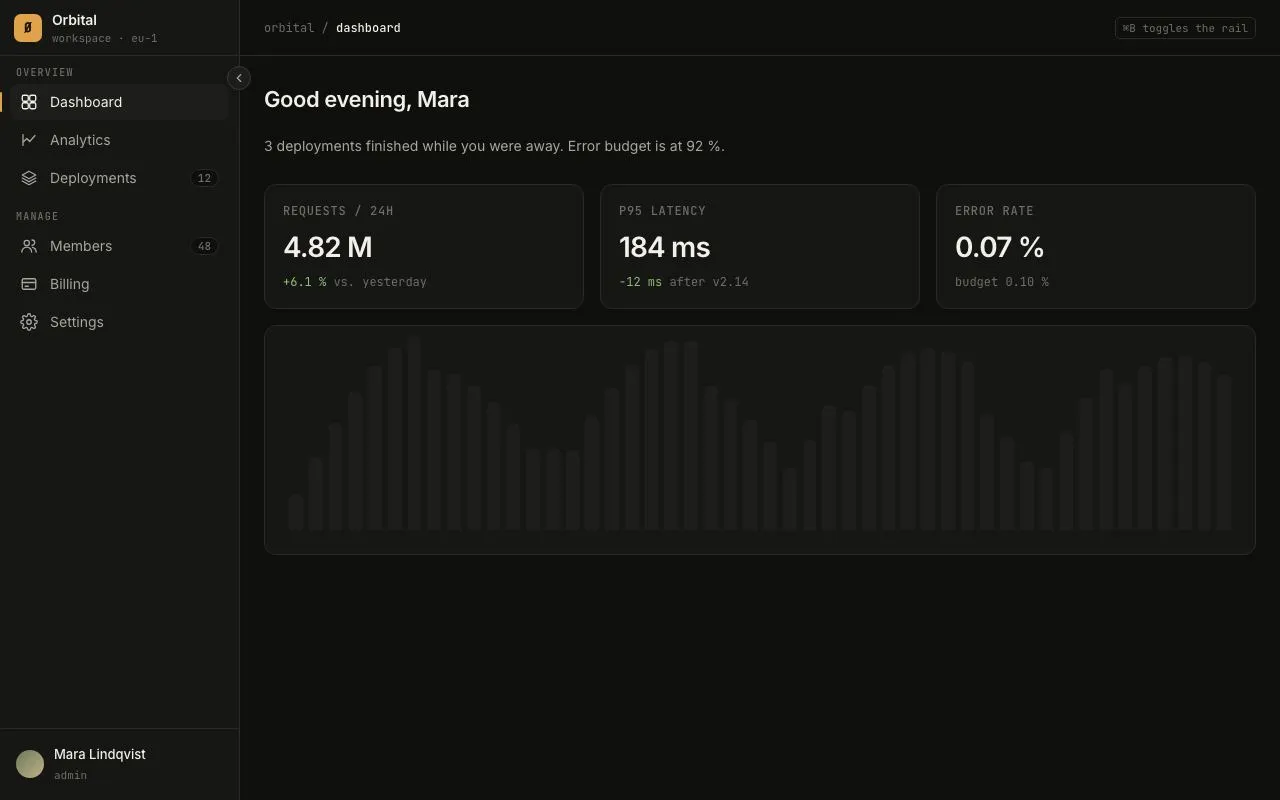
The left sidebar of a fictional issue tracker. The workspace is Tamarind Studio. The sidebar is 260px wide and always open. From top to bottom: a workspace switcher, a search field with a ⌘K hint, five primary items with icons and counts, a Projects group that collapses, an Invite people row, and the signed-in user pinned to the bottom with a plan badge. The switcher opens a 252px popover that lists three workspaces with coloured initials tiles and a check on the current one. The look is quiet and dark: warm greys, one lime accent, 6px radii, counts in mono. The detail worth copying is that the lime appears in only three places: the current workspace tile, the current item's count pill, and the plan badge.

This is not the collapsing rail. That piece shrinks to icons. This sidebar never shrinks on desktop.

## Reference behaviour

1. First frame: popover closed. Inbox is current (`aria-current="page"`). Its count pill is lime with dark text. The main area title reads Inbox. Projects is expanded.
2. Click the switcher (or press Enter, Space or Arrow Down on it): the popover opens under it, 52px from the sidebar top, 8px from its left edge. Focus moves to the checked workspace. The trigger gets `aria-expanded="true"`.
3. In the popover, Arrow Down and Arrow Up move between the four options and wrap. Home and End jump to the first and last.
4. Choose a workspace (click or Enter): the check moves to it, the switcher tile and name change, the breadcrumb in the main area changes, the popover closes, and focus returns to the switcher.
5. Escape closes the popover and returns focus to the switcher. Tab closes it and lets focus move on. A pointer press outside the popover closes it without moving focus.
6. Press ⌘K (Ctrl+K off macOS) anywhere: the search field takes focus and selects its text. Escape in the field blurs it.
7. Click a primary item or a project: it becomes current. The old current item loses `aria-current` and its lime pill. The main title and breadcrumb change to the item's name.
8. Click the Projects heading: the five project rows collapse to zero height over 240ms. The chevron turns -90deg. `aria-expanded` flips to false. The collapsed rows are `inert`, so neither Tab nor arrows reach them. Click again to expand.
9. With focus on any sidebar control, Arrow Down and Arrow Up move focus to the next or previous control in visual order: switcher, search, five items, Projects heading, visible projects, Invite people, account options. They stop at the ends. They do not wrap. Home and End jump to the ends.
10. Hover a row: background `--hover`, text `--ink`. No movement.
11. The user row does not scroll away. It stays at the bottom edge at every height.

## Structure

```
1280 × 800
┌──────────── 260 ─────────────┬─────────────────── 1fr ───────────────────┐
│ [TS] Tamarind Studio      ⇕  │ Tamarind Studio / Inbox   [Mark][Filter]  │ 48
│ [⌕ Search              ⌘K ]  ├───────────────────────────────────────────┤
│ ▣ Inbox               [12]   │  Inbox                       (28px)       │
│ ◎ My issues             4    │  12 unread · 3 mentions                   │
│ ⑂ Reviews               2    │  ───────────────────────────────────────  │
│ ↻ Cycles                     │  IB  Ilse Brandt commented on HAR-214  4m │
│ ▤ Docs                       │  DK  Dev Kapoor asked for review …    18m │
│                              │  AO  …                                 1h │
│ ˅ Projects               +   │  …                                        │

… 239 more lines. Copy or download for the full brief. Loading the source…Brief
279 linesBuild brief for a coding agent. Rebuild this piece in the reader’s stack. If they haven’t said which stack, ask once, then default to semantic HTML + CSS + a little vanilla JS. Match the numbers below; don’t “improve” them. When a kit is locked, map colours onto the kit tokens. Keep the widths, the row heights and the keyboard rules.
What it is
The left sidebar of a fictional issue tracker. The workspace is Tamarind Studio. The sidebar is 260px wide and always open. From top to bottom: a workspace switcher, a search field with a ⌘K hint, five primary items with icons and counts, a Projects group that collapses, an Invite people row, and the signed-in user pinned to the bottom with a plan badge. The switcher opens a 252px popover that lists three workspaces with coloured initials tiles and a check on the current one. The look is quiet and dark: warm greys, one lime accent, 6px radii, counts in mono. The detail worth copying is that the lime appears in only three places: the current workspace tile, the current item’s count pill, and the plan badge.
This is not the collapsing rail. That piece shrinks to icons. This sidebar never shrinks on desktop.
Reference behaviour
- First frame: popover closed. Inbox is current (
aria-current="page"). Its count pill is lime with dark text. The main area title reads Inbox. Projects is expanded. - Click the switcher (or press Enter, Space or Arrow Down on it): the popover opens under it, 52px from the sidebar top, 8px from its left edge. Focus moves to the checked workspace. The trigger gets
aria-expanded="true". - In the popover, Arrow Down and Arrow Up move between the four options and wrap. Home and End jump to the first and last.
- Choose a workspace (click or Enter): the check moves to it, the switcher tile and name change, the breadcrumb in the main area changes, the popover closes, and focus returns to the switcher.
- Escape closes the popover and returns focus to the switcher. Tab closes it and lets focus move on. A pointer press outside the popover closes it without moving focus.
- Press ⌘K (Ctrl+K off macOS) anywhere: the search field takes focus and selects its text. Escape in the field blurs it.
- Click a primary item or a project: it becomes current. The old current item loses
aria-currentand its lime pill. The main title and breadcrumb change to the item’s name. - Click the Projects heading: the five project rows collapse to zero height over 240ms. The chevron turns -90deg.
aria-expandedflips to false. The collapsed rows areinert, so neither Tab nor arrows reach them. Click again to expand. - With focus on any sidebar control, Arrow Down and Arrow Up move focus to the next or previous control in visual order: switcher, search, five items, Projects heading, visible projects, Invite people, account options. They stop at the ends. They do not wrap. Home and End jump to the ends.
- Hover a row: background
--hover, text--ink. No movement. - The user row does not scroll away. It stays at the bottom edge at every height.
Structure
1280 × 800
┌──────────── 260 ─────────────┬─────────────────── 1fr ───────────────────┐
│ [TS] Tamarind Studio      ⇕  │ Tamarind Studio / Inbox   [Mark][Filter]  │ 48
│ [⌕ Search              ⌘K ]  ├───────────────────────────────────────────┤
│ ▣ Inbox               [12]   │  Inbox                       (28px)       │
│ ◎ My issues             4    │  12 unread · 3 mentions                   │
│ ⑂ Reviews               2    │  ───────────────────────────────────────  │
│ ↻ Cycles                     │  IB  Ilse Brandt commented on HAR-214  4m │
│ ▤ Docs                       │  DK  Dev Kapoor asked for review …    18m │
│                              │  AO  …                                 1h │
│ ˅ Projects               +   │  …                                        │
│   ■ Harbor redesign    HAR   │                                           │
│   ■ Billing v2         BIL   │                                           │
│   ■ Onboarding flow    ONB   │                                           │
│   ■ Mobile 3.0         MOB   │                                           │
│   ■ Field research     FLD   │                                           │
│ + Invite people              │                                           │
│                              │                                           │
├──────────────────────────────┤                                           │
│ (MR) Mira Rautio   TEAM  ⋯   │ 60                                        │
└──────────────────────────────┴───────────────────────────────────────────┘

popover (open): top 52, left 8, width 252
┌──────────────────────────┐
│ Workspaces               │
│ [TS] Tamarind Studio   ✓ │ 40
│      14 members · Team   │
│ [HF] Halden Freight      │ 40
│ [OL] Okra Labs           │ 40
│ ──────────────────────── │
│ +  Create workspace      │ 34
└──────────────────────────┘bodyis a grid:grid-template-columns: 260px minmax(0, 1fr),overflow: hidden.- Sidebar is an
asidelabelled “Workspace”. It is a flex column, padding 8px 8px 0,border-right: 1px solid --line. - Switcher is a
buttonwitharia-haspopup="menu",aria-expanded,aria-controls="pop". Height 40px. - Popover is a
div role="menu",aria-labelledbythe switcher. Options arebutton role="menuitemradio"witharia-checked. Create workspace isrole="menuitem". Options havetabindex="-1". - Search is an
input type="search"with a visiblekbdhint. Height 32px. Margin 6px 0 10px. - Primary items and projects sit in one
nav aria-label="Primary". Each is anainside ali. Row height 32px. - Projects header is a row: a toggle
button(aria-expanded,aria-controls="projects") and a 28px New project icon button. - Invite people is a
buttonstyled as a row. - A flex spacer pushes the user row down. The user row is 60px high,
border-top: 1px solid --line, full sidebar width. - Main area: a 48px bar with breadcrumb and two ghost buttons, then a page with padding 40px 48px and max-width 860px.
Tokens
:root {
  --bg: #16171a;          /* sidebar and page ground */
  --main: #1c1d20;        /* main area */
  --hover: #212226;       /* row hover */
  --current: #26272b;     /* current row */
  --raised: #232428;      /* search field, popover */
  --ink: #ecebe7;         /* primary text */
  --ink-2: #aeaba4;       /* row text */
  --ink-3: #8a867e;       /* meta, counts, group labels */
  --line: #2a2a2c;        /* hairlines */
  --line-2: #34343a;      /* popover border, kbd border */
  --accent: #c5e86c;      /* lime: current count, plan badge, focus */
  --accent-ink: #16171a;  /* text on lime */
  --focus: #c5e86c;

  --tile-hf: #e2b26a;     /* second workspace tile */
  --tile-ol: #8fc2b4;     /* third workspace tile */

  --sans: "Inter", system-ui, sans-serif;
  --mono: "JetBrains Mono", ui-monospace, monospace;

  --text-xs: 11px;  --text-s: 11.5px; --text-m: 13px; --text-l: 13.5px; --title: 28px;
  --space-1: 4px; --space-2: 8px; --space-3: 12px; --space-4: 16px; --space-6: 24px;
  --r: 6px; --r-pop: 8px; --r-tile: 5px; --r-kbd: 4px;
  --shadow-pop: 0 12px 32px rgba(0, 0, 0, .45);

  --ease: cubic-bezier(0.2, 0.7, 0.2, 1);
  --fast: 140ms;
  --layout: 240ms;
}
Project dots use five muted hues: #c5e86c, #e2b26a, #8fc2b4, #d98b72, #9aa3c7. They are 8px squares with a 2px radius. They are labels, not accents. Keep them at this saturation.
Typography
| Role | Family | Size | Weight | Tracking | Colour |
|---|---|---|---|---|---|
| Workspace name | Inter | 13.5px | 600 | 0 | --ink |
| Row label | Inter | 13px | 400, current 500 | 0 | --ink-2, current --ink |
| Group label | Inter | 11.5px | 500 | 0.01em | --ink-3 |
| Count | JetBrains Mono | 11px | 500 | 0 | --ink-3, current --accent-ink on --accent |
| Project key | JetBrains Mono | 11px | 500 | 0 | --ink-3 |
| kbd hint | JetBrains Mono | 11px | 500 | 0 | --ink-3 |
| Plan badge | JetBrains Mono | 10.5px | 500 | 0.04em, uppercase | --accent |
| User name | Inter | 13px | 500 | 0 | --ink |
| User email | Inter | 11.5px | 400 | 0 | --ink-3 |
| Page title | Inter | 28px | 600 | -0.02em | --ink |
| Tile initials | Inter | 11px | 600 | 0.02em | dark on the tile colour |
Body line-height is 1.4. Turn on -webkit-font-smoothing: antialiased on dark. Every number in the sidebar is mono. Every word is Inter.
Motion
| Thing | Trigger | Property | From → to | Duration | Easing | Reduced motion |
|---|---|---|---|---|---|---|
| Popover | open / close | opacity, transform | 0, translateY(-4px) scale(.98) → 1, none | 140ms | --ease | instant |
| Projects body | toggle | grid-template-rows | 1fr ↔ 0fr | 240ms | --ease | instant |
| Projects chevron | toggle | transform | 0 ↔ rotate(-90deg) | 240ms | --ease | instant |
| Row | hover | background, color | rest → hover | 140ms | --ease | instant |
| Search border | focus | border-color | --line → --accent | 140ms | --ease | instant |
The popover’s transform origin is top left. Nothing else moves. There is no sliding active marker. Under prefers-reduced-motion: reduce, set every transition duration to 0ms.
States
- Row resting: transparent background,
--ink-2. - Row hover:
--hoverbackground,--inktext. - Row current:
--currentbackground,--inktext, weight 500,aria-current="page". Its count pill becomes--accentwith--accent-inktext, 4px radius, padding 0 5px. - Row focus-visible: 2px
--focusoutline, offset -2px, 6px radius. The ring sits inside the row so it is not clipped by the sidebar. - Switcher open: keeps the hover background while the popover is open.
- Popover option hover and focus:
--hoverbackground. Focus also adds an inset 2px--focusring. - Option checked: lime check icon visible on the right. Unchecked options keep the space so names do not shift.
- Projects collapsed: chevron at -90deg, rows hidden and
inert. - Search focus: border
--accent, no extra glow. - Empty Projects: show one muted row, “No projects yet”, and keep the + button. Do not hide the group.
- Disabled: not used in this frame.
Accessibility
- The sidebar is an
asidelabelled “Workspace”. The item list is anavlabelled “Primary”. - Use
aria-current="page"on exactly one row. - The switcher has
aria-haspopup="menu",aria-expanded, andaria-controlspointing at the popover. - The popover is
role="menu". Workspaces aremenuitemradiowitharia-checked. Only one is checked. - Arrow keys in the popover move focus and wrap. Escape closes and returns focus to the switcher.
- Arrow keys in the sidebar move focus through the visible controls in order and stop at the ends. Skip anything inside an
inertregion. - Tab order is the same as visual order. Arrow keys are an extra, not a replacement for Tab.
- Counts have an
aria-labelwith the noun: “12 unread”, “4 open”, “2 waiting”. The bare number is not enough. - Icons, tiles and project dots are
aria-hidden. The text label is the name. - The search field has
aria-label="Search Tamarind Studio"andaria-keyshortcuts="Meta+K Control+K". Update the label when the workspace changes. - Contrast:
#ecebe7on#16171ais about 15:1.#aeaba4is about 8:1.#8a867eis about 5:1.#16171aon#c5e86cis about 13:1. - Row height is 32px on desktop. Raise rows to 40px on touch layouts.
Responsive rules
- At 1280 and wider: sidebar 260px, always visible. The main page caps at 860px.
- At 1024 to 1279: keep the sidebar at 260px. The main area shrinks. Truncate long names with an ellipsis. Never wrap a row.
- Below 1024: the sidebar becomes a drawer.
- Hide it off-canvas with
transform: translateX(-100%). - Add a 48px top bar to the main area with a 40px menu button on the left. The button has
aria-expandedandaria-controlspointing at the sidebar. - Open: slide the drawer in over 240ms with
--ease, width 280px, above a scrim ofrgba(0, 0, 0, .5). - Move focus to the switcher. Trap Tab inside the drawer. Escape and a scrim tap close it and return focus to the menu button.
- Choosing a row closes the drawer.
- Under reduced motion, show and hide the drawer with no slide.
- Hide it off-canvas with
- Below 640: drawer width is
min(320px, 88vw). Rows grow to 40px. The popover is full drawer width minus 16px. - The user row stays pinned to the drawer bottom at every size.
- Never cause horizontal scroll. Use
minmax(0, 1fr)andmin-width: 0on flex text.
Acceptance checklist
Always
- Sidebar is 260px wide on desktop and never scrolls horizontally.
- Exactly one row has
aria-current="page", and only that row’s count uses the accent. - Switcher has
aria-haspopup,aria-expandedandaria-controls. The popover options usemenuitemradiowith onearia-checked="true". - Opening the popover focuses the checked option. Escape closes it and focus returns to the switcher.
- ⌘K and Ctrl+K focus the search field.
- Arrow Up and Arrow Down move focus through the visible sidebar controls and skip collapsed rows.
- The collapsible group toggles
aria-expandedand makes its hidden rowsinert. - Counts and keys are mono. Labels are sans.
- User row is pinned to the bottom edge with a 1px top rule.
- Focus rings are 2px and visible on every control.
- Below 1024 the sidebar is a drawer with a scrim, focus trap and Escape to close.
- Reduced motion removes all transitions.
This demo
- Workspace is Tamarind Studio with a lime TS tile. The other two are Halden Freight (HF) and Okra Labs (OL).
- Primary items are Inbox 12, My issues 4, Reviews 2, Cycles, Docs. Inbox starts current.
- Projects are Harbor redesign, Billing v2, Onboarding flow, Mobile 3.0, Field research, each with a key.
- User is Mira Rautio with a TEAM badge.
- Background is
#16171a. Accent is#c5e86c. Radii are 6px.
Implementation notes
The lime rule: the accent may appear on the current workspace tile, the current count pill, the plan badge, the check, and the focus ring. Nowhere else. If you add a lime icon, a lime title, or a lime button, the sidebar stops being quiet.
Arrow-key movement through the sidebar. Mark every stop with data-rove. Filter out anything inside an inert region so collapsed rows are skipped.
side.addEventListener('keydown', e => {
  if (!['ArrowDown', 'ArrowUp', 'Home', 'End'].includes(e.key) || !pop.hidden) return;
  const items = [...side.querySelectorAll('[data-rove]')]
    .filter(el => !el.closest('[inert]'));
  const i = items.indexOf(document.activeElement);
  if (i < 0) return;
  e.preventDefault();
  const last = items.length - 1;
  const n = e.key === 'Home' ? 0 : e.key === 'End' ? last
    : Math.min(last, Math.max(0, i + (e.key === 'ArrowDown' ? 1 : -1)));
  items[n].focus();
});
The collapsing group animates with grid rows, not height: auto. The inner list needs min-height: 0 and overflow: hidden, or it will not shrink.
.gbody { display: grid; grid-template-rows: 1fr; transition: grid-template-rows 240ms var(--ease); }
.gbody[data-closed] { grid-template-rows: 0fr; }
.gbody > ul { overflow: hidden; min-height: 0; }
.gtoggle svg { transition: transform 240ms var(--ease); }
.gtoggle[aria-expanded="false"] svg { transform: rotate(-90deg); }
Keep the popover in the layout so it can animate out. Use visibility: hidden with the hidden attribute, so it also leaves the accessibility tree.
.pop { transition: opacity 140ms var(--ease), transform 140ms var(--ease); transform-origin: top left; }
.pop[hidden] { display: block; opacity: 0; visibility: hidden; pointer-events: none;
  transform: translateY(-4px) scale(.98); }
Pinning the user row: make the sidebar a flex column at height: 100% and put a flex: 1 spacer before the user row. Do not use position: absolute; bottom: 0. It overlaps the projects when the window is short.
Common mistakes:
- A lime left bar on the current row as well as the lime pill. Pick the pill.
- Bright saturated project dots. Keep them muted.
- Counts in Inter. They jitter in width as numbers change. Use mono.
- Popover that opens to the right and covers the page title. It opens under the switcher.
- Arrow keys that wrap from the user row back to the switcher. They stop at the ends.
- Forgetting
inerton the collapsed group, so Tab lands on invisible rows. - A drop shadow on the sidebar edge. Use the 1px hairline.
- Pure black
#000background. The ground is#16171a, a warm near-black. - Hiding the search hint on focus. Keep ⌘K visible.
Rebuild order:
- Set the body grid and the 260px sidebar column.
- Place switcher, search, primary list, Projects group, Invite row, spacer, user row.
- Add the tokens and the row states.
- Wire
aria-currenton click. - Add the popover, its keyboard rules and Escape.
- Add the group collapse with
inert. - Add sidebar arrow-key movement and ⌘K.
- Add the drawer below 1024.
- Check reduced motion and focus rings.
Details
- Palette
- Type
- Inter · JetBrains Mono
- Motion
- Subtle motion
- Build
- One session
- Tags
Studied
Tailwind CSS docsPut each instruction next to its code. Draw the grid with thin lines and let the empty sides carry a faint hatch.
All sourcesOn the shelves