Nº 013 of 520
Editorial mega menu
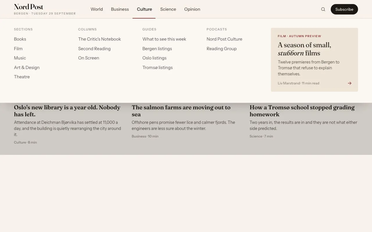
A newspaper-style top nav whose full-width panel animates its height between sections, with a 2px underline that slides between labels and a featured story card.
Preview
Use it
Free to use · credit appreciated1 Once, in your project
npx skills add SusanAcharya/Design-Lounge 2 Then ask
Using the Design Lounge skill, build "Editorial mega menu" (piece editorial-mega-menu) in my stack. Match its brief; restyle it onto my product's theme.
No skill? Paste the brief instead. It carries the numbers, tokens and behaviour.
<!-- Design Lounge Nº 013 · "Editorial mega menu" · designlounge.vercel.app -->

# Editorial mega menu

> **Build brief for a coding agent.** Rebuild this piece in the reader's stack. If they haven't said which stack, ask once, then default to semantic HTML + CSS + a little vanilla JS. Match the numbers below; don't "improve" them.

## What it is

The header of a fictional daily, "Nord Post". Five section labels (World, Business, Culture, Science, Opinion) sit beside a serif masthead. Hovering or focusing a label opens a full-width panel under the 64px bar: four columns of section links plus a 300px featured-story card on a tinted ground. The two details worth copying are (1) the panel does not close and reopen between sections — it stays open and **animates its height** to the next section's content while the columns crossfade — and (2) a 2px oxblood underline slides along the nav to the hovered label instead of appearing under each one. Paper-coloured, hairline-separated, no drop shadows except a soft one under the panel.

## Reference behaviour

1. Initial state: the **Culture** panel is open. Its label is `--ink`, the underline sits beneath it, the front page below is dimmed by an 18% ink scrim. The panel shows Sections / Columns / Guides / Podcasts columns and a card titled "A season of small, *stubborn* films".
2. Hover another label (e.g. **Business**): after 0ms (panel already open) the underline slides to that label over 240ms, the Culture columns fade out over 160ms while the Business columns fade in, and the panel's height animates to the Business content height over 280ms on the expo-out curve. Business has six-link columns so the panel grows by roughly 30px; Opinion is shorter and it shrinks.
3. Hover a label when the panel is closed: an 80ms intent delay, then the panel opens from height 0 to the section height (280ms), fading in over 120ms; the underline fades in (120ms) at the label.
4. Move the mouse from the bar into the panel: nothing changes; the panel is part of the header hover region.
5. Move the mouse off the header entirely: after a 150ms grace period the panel closes (height → 0 over 280ms, opacity → 0 over 120ms), the underline fades out, the scrim clears. Re-entering within 150ms cancels the close.
6. Click a label: toggles its panel (click on the open section closes it).
7. Keyboard: Tab to a label opens its panel (`:focus-visible` only — a mouse click's focus must not trigger this). ← → move between labels (wrapping) and switch panels. ↓ moves focus to the first link of the open section. Tab continues into the panel's links, then the card, then to the Search and Subscribe controls; when focus leaves the header the panel closes. Esc closes and returns focus to the label that was open.
8. Link hover: text `--ink-2` → `--ink` and a 1px underline in `--accent` appears 4px below the baseline (via `text-decoration-color` transition, 120ms). The "Norway votes: live" link carries a 7px accent dot before it.
9. Featured card hover: no motion; the arrow icon in its corner is the only affordance (it's one `<a>`).

## Structure

```
1280 × 800
┌──────────────────────────────────────────────────────────────────────────┐
│ 48│ Nord Post   World  Business  [Culture]  Science  Opinion   ⌕ (Subscribe)│ bar 64
│   │ BERGEN · TUESDAY                ────── 2px underline                   │
├───┴──────────────────────────────────────────────────────────────────────┤
│ 48│ SECTIONS     COLUMNS          GUIDES            PODCASTS   ┌────300──┐│ panel
│   │ Books        The Critic's…    What to see…      Nord Post  │ FILM ·  ││ pad 32/48/40
│   │ Film         Second Reading   Bergen listings   Reading G. │ A season││ 4 cols 1fr + card
│   │ Music        On Screen        Oslo listings                │ of small││ gap 32
│   │ Art & Design                  Tromsø listings              │ stubborn││
│   │ Theatre                                                    │ films → ││ card min-h 200
│   │                                                            └─────────┘│
├──────────────────────────────────────────────────────────────────────────┤ 1px line + soft shadow
│ FRONT PAGE                                        (dimmed by 18% scrim)  │
│ The ferry timetable that became a referendum…  (Fraunces 52)              │

… 198 more lines. Copy or download for the full brief. Loading the source…Brief
238 linesBuild brief for a coding agent. Rebuild this piece in the reader’s stack. If they haven’t said which stack, ask once, then default to semantic HTML + CSS + a little vanilla JS. Match the numbers below; don’t “improve” them.
What it is
The header of a fictional daily, “Nord Post”. Five section labels (World, Business, Culture, Science, Opinion) sit beside a serif masthead. Hovering or focusing a label opens a full-width panel under the 64px bar: four columns of section links plus a 300px featured-story card on a tinted ground. The two details worth copying are (1) the panel does not close and reopen between sections — it stays open and animates its height to the next section’s content while the columns crossfade — and (2) a 2px oxblood underline slides along the nav to the hovered label instead of appearing under each one. Paper-coloured, hairline-separated, no drop shadows except a soft one under the panel.
Reference behaviour
- Initial state: the Culture panel is open. Its label is
--ink, the underline sits beneath it, the front page below is dimmed by an 18% ink scrim. The panel shows Sections / Columns / Guides / Podcasts columns and a card titled “A season of small, stubborn films”. - Hover another label (e.g. Business): after 0ms (panel already open) the underline slides to that label over 240ms, the Culture columns fade out over 160ms while the Business columns fade in, and the panel’s height animates to the Business content height over 280ms on the expo-out curve. Business has six-link columns so the panel grows by roughly 30px; Opinion is shorter and it shrinks.
- Hover a label when the panel is closed: an 80ms intent delay, then the panel opens from height 0 to the section height (280ms), fading in over 120ms; the underline fades in (120ms) at the label.
- Move the mouse from the bar into the panel: nothing changes; the panel is part of the header hover region.
- Move the mouse off the header entirely: after a 150ms grace period the panel closes (height → 0 over 280ms, opacity → 0 over 120ms), the underline fades out, the scrim clears. Re-entering within 150ms cancels the close.
- Click a label: toggles its panel (click on the open section closes it).
- Keyboard: Tab to a label opens its panel (
:focus-visibleonly — a mouse click’s focus must not trigger this). ← → move between labels (wrapping) and switch panels. ↓ moves focus to the first link of the open section. Tab continues into the panel’s links, then the card, then to the Search and Subscribe controls; when focus leaves the header the panel closes. Esc closes and returns focus to the label that was open. - Link hover: text
--ink-2→--inkand a 1px underline in--accentappears 4px below the baseline (viatext-decoration-colortransition, 120ms). The “Norway votes: live” link carries a 7px accent dot before it. - Featured card hover: no motion; the arrow icon in its corner is the only affordance (it’s one
<a>).
Structure
1280 × 800
┌──────────────────────────────────────────────────────────────────────────┐
│ 48│ Nord Post   World  Business  [Culture]  Science  Opinion   ⌕ (Subscribe)│ bar 64
│   │ BERGEN · TUESDAY                ────── 2px underline                   │
├───┴──────────────────────────────────────────────────────────────────────┤
│ 48│ SECTIONS     COLUMNS          GUIDES            PODCASTS   ┌────300──┐│ panel
│   │ Books        The Critic's…    What to see…      Nord Post  │ FILM ·  ││ pad 32/48/40
│   │ Film         Second Reading   Bergen listings   Reading G. │ A season││ 4 cols 1fr + card
│   │ Music        On Screen        Oslo listings                │ of small││ gap 32
│   │ Art & Design                  Tromsø listings              │ stubborn││
│   │ Theatre                                                    │ films → ││ card min-h 200
│   │                                                            └─────────┘│
├──────────────────────────────────────────────────────────────────────────┤ 1px line + soft shadow
│ FRONT PAGE                                        (dimmed by 18% scrim)  │
│ The ferry timetable that became a referendum…  (Fraunces 52)              │
│ deck (Fraunces 19)                                                        │
│ ───────────────────────────────────────────────────────────────────────   │
│ article · article · article                                               │
└──────────────────────────────────────────────────────────────────────────┘
<header id="hdr">—position:relative; z-index:3, background--bg. Everything hover-related is scoped to this element..bar— 64px, flex, 48px side padding, 36px gap, 1px bottom hairline. Contains the masthead<a>(Fraunces 26/600 with a 10px uppercase date line),<ul class="nav" aria-label="Sections">of<li><button aria-expanded aria-controls="s-<key>" data-s="<key>">, the.indunderline<li aria-hidden>(absolute, bottom −1px so it covers the hairline), and.tools(36px round search icon button, 36px pill “Subscribe”)..panel— absolute,left:0; right:0; top:64px, background--panel,overflow:hidden,heightset inline by JS, bottom hairline, shadow0 20px 40px -24px rgba(26,23,20,.35)..sheet—display:grid. Each<section class="sec" aria-label>is placed atgrid-area:1/1so all five overlap and the tallest defines nothing (the panel height is explicit)..sec—grid-template-columns: repeat(4,1fr) 300px; gap:32px; padding:32px 48px 40px. Four.col(<h4>+<ul>of links) and one<a class="card">(tag,<h3>with an<i>phrase, one-line standfirst, byline, corner arrow).
<main>— front page: kicker,<h1>,.deck, a 3-column.gridof teasers.main::afteris the scrim (opacity0 → 1 whenbody.menu).
Section contents (links per column, top to bottom):
| Section | Col 1 (heading: links) | Col 2 | Col 3 | Col 4 | Card |
|---|---|---|---|---|---|
| World | Regions: Europe, Americas, Asia-Pacific, Middle East, Africa | Coverage: Norway votes: live (dot), Climate desk, Migration, Conflict monitor | Series: The Long Read, Dispatches, Fjord Letters | Newsletters: Morning Post, Evening Brief | From Narvik — “The port that stopped waiting for ships” — Sigrid Aune · 14 min read |
| Business | Markets: Stocks, Bonds, Currencies, Commodities, Funds, Crypto | Companies: Energy, Shipping, Retail, Technology, Banks, Aquaculture | Economy: Norges Bank watch, Inflation tracker, Housing, Jobs | Tools: Portfolio, Screener, Earnings calendar | Analysis — “Why the krone won’t sit still” — Henrik Dahl · 9 min |
| Culture | Sections: Books, Film, Music, Art & Design, Theatre | Columns: The Critic’s Notebook, Second Reading, On Screen | Guides: What to see this week, Bergen listings, Oslo listings, Tromsø listings | Podcasts: Nord Post Culture, Reading Group | Film · Autumn preview — “A season of small, stubborn films” — Liv Marstrand · 11 min |
| Science | Fields: Climate, Health, Space, Physics, Biology, Oceans | Desk: Explainers, Data, Field notes | Series: Arctic Journal, The Body, Deep Time | Events: Nord Post Science Live | Arctic Journal — “Counting the cod by ear” — Eirik Solheim · 12 min |
| Opinion | Columnists: Anne Kristin Berg, Oskar Lindgren, Maja Røed, Per Haugland | Editorials: The view from Bergen, Weekend editorial | Letters: Letters to the editor, Write to us | Cartoons: This week’s cartoon | Editorial — “Bergen deserves a quieter harbour” — The Editorial Board · 6 min |
Front page (behind the panel)
- Kicker “Front page” (12px 500, +0.14em, uppercase,
--accent). <h1>“The ferry timetable that became a referendum on the whole coast” — Fraunces 52/1.05, −0.025em,"opsz" 144, max-width 820px.- Deck: “When Fjord Line cut the 06:40 crossing, four municipalities discovered they had been running on it. A story about what a schedule is for.” — Fraunces 19/1.4,
"opsz" 20,--ink-2, max-width 640px, 32px below. - Three teasers in a 3-column grid (32px gap, 1px top hairline, 24px top padding): “Oslo’s new library is a year old. Nobody has left.” (Culture · 8 min) · “The salmon farms are moving out to sea” (Business · 10 min) · “How a Tromsø school stopped grading homework” (Science · 7 min). Teaser h2 Fraunces 20/600; body 14px
--ink-2; meta 12px 500--ink-3.
Timing edge cases
- Skimming across all five labels in 200ms: each
mouseenterclears the pending open timer and sets a new one; with the panel already open the delay is 0, so the underline and height track the pointer continuously and the crossfade restarts each time (the old section’s fade-out is simply overridden). - Leaving the header and re-entering within 150ms: the close timer is cleared; nothing visibly happens.
- Leaving while an open timer is pending (< 80ms hover): the open timer is cleared; the panel never appears.
- Keyboard ← → while a panel is open: the underline moves and the panel height animates exactly as with hover, with no delay.
resize: re-runshow(cur)so the underline is re-measured against the label’s new box and the panel height against the reflowed section.
Tokens
:root {
  /* colour — warm paper, one oxblood accent */
  --bg: #f7f3ec;          /* page + bar */
  --panel: #fbf8f3;       /* mega panel */
  --tint: #efe4d8;        /* featured card, icon hover */
  --line: #e2d9cc;        /* hairlines */
  --line-2: #cdc2b2;      /* reserved: stronger rule */
  --ink: #1a1714;         /* headlines, active label */
  --ink-2: #5c554d;       /* labels, links, deck */
  --ink-3: #8d857a;       /* column headings, meta */
  --accent: #8b2e2e;      /* underline, link hover rule, kicker, card tag, focus */
  --accent-ink: #fff6f0;  /* text on accent */
  --scrim: rgba(26, 23, 20, .18);

  /* type */
  --serif: "Fraunces", Georgia, serif;
  --sans: "Instrument Sans", system-ui, sans-serif;

  /* layout */
  --nav-h: 64px;
  --gutter: 48px;
  --card-w: 300px;
  --panel-pad: 32px 48px 40px;
  --col-gap: 32px;
  --r-card: 4px;
  --shadow-panel: 0 20px 40px -24px rgba(26,23,20,.35);

  /* motion */
  --t-fast: 120ms;        /* opacity of panel/underline, link colour */
  --t-ind: 240ms;         /* underline travel */
  --t-panel: 280ms;       /* panel height */
  --t-xfade: 160ms;       /* section crossfade */
  --delay-open: 80ms;     /* hover intent before opening */
  --delay-close: 150ms;   /* grace after leaving header */
  --ease: cubic-bezier(.2, .7, .2, 1);
  --ease-out: cubic-bezier(.16, 1, .3, 1);
}
Typography
| Role | Family | Size | Weight | Line-height | Tracking | Notes |
|---|---|---|---|---|---|---|
| Masthead | Fraunces | 26px | 600 | 1 | −0.02em | font-variation-settings: "opsz" 144 |
| Masthead dateline | Instrument Sans | 10px | 500 | 1.2 | +0.16em | UPPERCASE, --ink-3 |
| Nav label | Instrument Sans | 15px | 500 | — | −0.005em | --ink-2, active --ink |
| Column heading | Instrument Sans | 11px | 500 | 1 | +0.12em | UPPERCASE, --ink-3 |
| Panel link | Instrument Sans | 15px | 400 | 1.5 | 0 | 5px vertical padding → 32.5px row |
| Card tag | Instrument Sans | 10px | 600 | 1.2 | +0.14em | UPPERCASE, --accent |
| Card headline | Fraunces | 24px | 400 | 1.15 | −0.01em | "opsz" 60; one phrase italic |
| Card standfirst | Instrument Sans | 14px | 400 | 1.45 | 0 | --ink-2 |
| Byline | Instrument Sans | 12px | 500 | 1.3 | 0 | --ink-3 |
| Front-page h1 | Fraunces | 52px | 400 | 1.05 | −0.025em | "opsz" 144, max-width 820px |
| Deck | Fraunces | 19px | 400 | 1.4 | 0 | "opsz" 20, --ink-2, max-width 640px |
| Teaser h2 | Fraunces | 20px | 600 | 1.2 | −0.01em | |
| Subscribe button | Instrument Sans | 13px | 500 | 1 | +0.01em |
Motion
| Element | Trigger | Property | From → To | Duration | Easing | Delay |
|---|---|---|---|---|---|---|
.panel | open | height | 0 → section height | 280ms | --ease-out | 80ms hover intent (0 via keyboard/click) |
.panel | open | opacity | 0 → 1 | 120ms | --ease | with height |
.panel | switch section | height | h(A) → h(B) | 280ms | --ease-out | 0 |
.sec | switch section | opacity | 1 → 0 (old), 0 → 1 (new) | 160ms | --ease | simultaneous; visibility flips after 160ms on the old one |
.ind | switch section | left, width | label A box → label B box | 240ms | --ease | 0 |
.ind | open / close | opacity | 0 ↔ 1 | 120ms | --ease | 0 |
.panel | close | height, opacity | h → 0, 1 → 0 | 280ms / 120ms | --ease-out / --ease | 150ms grace |
main::after | open / close | opacity | 0 ↔ 1 | 280ms | --ease | 0 |
| link | hover | color, text-decoration-color | --ink-2/transparent → --ink/--accent | 120ms | --ease | 0 |
Reduced motion: all transition durations 1ms; the panel’s height transition is removed entirely (transition: none) so no height animation occurs. Hover-intent delays remain.
States
- Label default:
--ink-2. Hover / expanded (aria-expanded="true"):--ink. No background. - Label focus-visible: 2px
--accentoutline,outline-offset:-6px, 4px radius (inset so it sits inside the 64px bar). - Underline: 2px,
--accent, exactly the label’s width, atbottom:-1pxof the nav (overlapping the bar’s hairline). - Panel closed:
height:0; opacity:0; overflow:hidden(stays in DOM). - Link hover:
--ink+ accent underline at 4px offset. Focus-visible: 2px accent outline, 2px offset, 2px radius. - Live link: 7px accent dot inline before the text, 8px gap.
- Search icon hover:
--tintcircular background. Subscribe hover: background--accent. - Page behind:
body.menuadds the 18% scrim over<main>;pointer-events:noneon the scrim.
Accessibility
- Nav labels are
<button aria-expanded aria-controls>— not links — because they open a panel; the section landing pages should be the first link inside each panel if you need them. - Each panel is a
<section aria-label="<Section>">; inactive ones arevisibility:hiddenso they are not in the tab order. - Keyboard map: Tab (open on focus-visible), ← → (move between labels, opens each), ↓ (focus first link in panel), Esc (close + refocus label), Tab through panel then out (closing on
focusoutwhenrelatedTargetis outside the header). - Hover intent: 80ms to open, 150ms grace to close, so diagonal mouse travel toward the card doesn’t collapse the panel.
- Contrast:
--ink-2on--panel7.1:1;--ink-3on--panel3.9:1 — used only for ≥ 10px uppercase tracked headings and 12px bylines (non-body); if your target is strict AA for all text, darken--ink-3to#6f675c. - Hit targets: labels 64px tall × (text + 28px); tool buttons 36px.
- The underline
<li>isaria-hidden="true".
Responsive rules
- ≥ 1280: as specified.
- 1024–1279: gutter 32px; card column 260px; column gap 24px.
- 768–1023: panel becomes 3 columns + card (the fourth column wraps under the first three); h1 40px.
- < 768: no hover panels. Labels become a horizontally scrolling row; tapping a label toggles an accordion beneath the bar showing that section’s links stacked (card last). Underline still slides. Scrim removed.
Acceptance checklist
- Bar is 64px with 48px side padding; masthead is Fraunces 26/600 with
"opsz" 144. - Culture panel is open on first paint with the underline under “Culture” and the page dimmed.
- Hovering another label while open slides the underline over 240ms and animates panel height over 280ms — the panel never collapses in between.
- Section columns crossfade over 160ms; the outgoing section becomes
visibility:hiddenonly after the fade. - Opening from closed waits 80ms of hover; leaving the header waits 150ms before closing; re-entry cancels the close.
- Panel grid is
repeat(4,1fr) 300pxwith 32px gaps and32px 48px 40pxpadding. - Featured card is one
<a>with tinted#efe4d8ground, 4px radius, min-height 200px, arrow icon bottom-right. - Tab onto a label opens it; a mouse click’s focus does not double-fire (click on an open label closes it).
- ← → move between labels and switch panels; ↓ focuses the first panel link; Esc closes and refocuses the label.
- Focus leaving the header closes the panel.
- Link hover shows a 1px accent underline offset 4px, transitioned 120ms.
- With reduced motion, the panel height snaps and the underline jumps; intent delays unchanged.
Implementation notes
Explicit height is the whole trick. Stack all sections in one grid cell so they overlap, then set the panel’s height to the active section’s measured height. Because height goes from one number to another, the panel animates instead of re-opening:
.panel { position: absolute; left: 0; right: 0; top: var(--nav-h); overflow: hidden;
         height: 0; opacity: 0;
         transition: height var(--t-panel) var(--ease-out), opacity var(--t-fast) var(--ease); }
.sheet { display: grid; }
.sec   { grid-area: 1 / 1; opacity: 0; visibility: hidden;
         transition: opacity 160ms var(--ease), visibility 0s 160ms; }
.sec.on { opacity: 1; visibility: visible; transition-delay: 0s, 0s; }
function show(key) {
clearTimeout(closeT); cur = key;
btns.forEach(b => b.setAttribute('aria-expanded', String(b.dataset.s === key)));
const b = btns.find(x => x.dataset.s === key), r = b.getBoundingClientRect(), nr = nav.getBoundingClientRect();
ind.style.left = (r.left - nr.left) + 'px'; ind.style.width = r.width + 'px'; ind.classList.add('on');
sections.forEach(s => s.classList.toggle('on', s.id === 's-' + key));
panel.style.height = document.getElementById('s-' + key).offsetHeight + 'px'; // measured, not auto
panel.classList.add('open'); document.body.classList.add('menu');
}Hover intent with one timer each way — and don’t open on mouse-driven focus:
btn.addEventListener('mouseenter', () => { clearTimeout(closeT); openT = setTimeout(() => show(key), cur ? 0 : 80); });
hdr.addEventListener('mouseleave', () => { clearTimeout(openT); closeT = setTimeout(hide, 150); });
hdr.addEventListener('mouseenter', () => clearTimeout(closeT));
btn.addEventListener('focus', () => { if (btn.matches(':focus-visible')) show(key); });
Common mistakes: animating max-height (wrong curve, wrong duration for short sections); putting mouseleave on the bar instead of the whole header (panel closes as you move into it); forgetting to re-measure on resize; making the underline a ::after on each button (it can’t travel between them).
Details
- Palette
- Type
- Fraunces · Instrument Sans
- Motion
- Subtle motion
- Build
- One session
- Tags
Studied
Lama LamaA tiny nav bar can carry the voice. Change its one line for each section.
All sourcesOn the shelves