Nº 479 of 520
Workspace setup with live preview
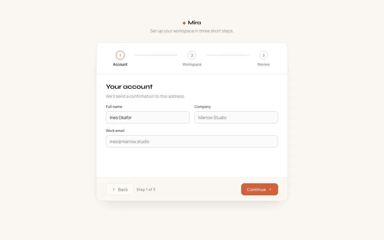
A three-step create-your-workspace flow: name and checked URL, colour and mark, email invites. A live sidebar preview updates as you type, then builds itself.
Preview
Use it
Free to use · credit appreciated1 Once, in your project
npx skills add SusanAcharya/Design-Lounge 2 Then ask
Using the Design Lounge skill, build "Workspace setup with live preview" (piece onboarding-workspace-setup) in my stack. Match its brief; restyle it onto my product's theme.
No skill? Paste the brief instead. It carries the numbers, tokens and behaviour.
<!-- Design Lounge Nº 479 · "Workspace setup with live preview" · designlounge.vercel.app -->

# Workspace setup with live preview

> **Build brief for a coding agent.** Rebuild this piece in the reader's stack. If they haven't said which stack, ask once, then default to semantic HTML + CSS + a little vanilla JS. Match the numbers below; don't "improve" them. When a kit is locked, the primary button uses `--primary` and the yellow becomes the kit's one accent. Keep it to one shape of yellow.

## What it is

The first screen after sign-up in a team tool called Plover. The left half is a three-step form: name the workspace and claim its address, pick a colour and a mark, invite teammates. The right half is a live preview of the workspace sidebar. Every keystroke and every pick shows up there at once. The last button, "Open workspace", runs a short build: four lines tick off on the left while the preview assembles itself part by part on the right. The look is Bauhaus kept light: white, black, one blue for the primary action, one yellow circle. The detail worth copying is the preview. It turns a dull form into something people want to finish.

This is not `onboarding-checklist`. That piece is a task card on a home page after setup. This is not `multi-step-form-stepper`. That piece is a generic stepper. This screen is the setup itself, with a mirror of the result.

## Reference behaviour

1. First frame: step 1 is current. The name field holds "Lumbini Studio". The address field holds "lumbini-studio" after a grey "plover.app/" prefix. A green line says "plover.app/lumbini-studio is available". Continue is enabled.
2. The preview shows a black 36px tile with a white arch mark, "Lumbini Studio", "plover.app/lumbini-studio", nav (Home current, Inbox with 2, Docs), three projects, and one member, Rhea Shrestha, Owner. The main area says "Welcome to Lumbini Studio" above three starter project cards.
3. Typing in the name rewrites the address until the user edits the address by hand. Lowercase, accents removed, anything else becomes one dash, dashes trimmed, 32 characters at most.
4. Each address change shows a 14px spinner and "Checking plover.app/…". After 550ms it shows available (green tick) or taken (red mark). Taken offers a one-click fix: "That address is taken. Use lumbini-hq".
5. Taken addresses in the demo: lumbini, studio, design, team, acme, admin, plover, home, app.
6. Continue is disabled until the name has 2 or more characters and the address is available.
7. Step 2, "Give it a look": 6 colour swatches (Black, Blue, Red, Yellow, Green, Orange), 44px circles. 8 marks (Arch, Circle, Square, Triangle, Half, Quarter, Cross, Initial), 52px tiles. Picking one updates the preview tile at once. The tile background fades over 250ms. Yellow and Orange tiles use a black mark. The others use white.
8. Step 3, "Invite your team": an email field with chips. Enter, comma, space or semicolon adds the typed email. Pasting a list adds them all. Blur adds what is left. Backspace in an empty field removes the last chip.
9. A bad email stays in the field with "bad@ is not a full email address." A duplicate says "… is already on the list." The cap is 8. A good add says "2 people will get an invite."
10. Each new chip appears in the preview under Members with initials, the email, and "Invited". The member count updates.
11. Step 3 shows "Skip for now" and the primary reads "Open workspace". Skip clears invites and builds.
12. The progress steps at the top show done steps as black circles with a tick, the current step as a blue circle, future steps as outlines. Done steps are buttons that go back. Back also goes back. Values are kept.
13. Open workspace: the form swaps to "Building your workspace" with four lines: "Reserving plover.app/lumbini-studio", "Setting up Home, Inbox and Docs", "Adding 3 starter projects", "Sending 2 invites" (or "Keeping it just you for now"). One line ticks every 420ms.
14. While it builds, the preview empties and refills in step: line 1 shows the workspace header, line 2 the nav and welcome text, line 3 the projects and cards, line 4 the members. Each part fades up 8px over 300 to 400ms.
15. 120ms after the last tick: the heading becomes "Lumbini Studio is ready". Two buttons appear: "Set up another" (resets to step 1) and "Go to Lumbini Studio" (primary, takes focus).

## Structure

```
1280 × 800
┌──────────────────────────────────────────────────────────────────────────────┐
│ ●■ Plover        (1) Name ──── (2) Look ──── (3) Team    Signed in as rhea@ │ 64px, 2px black rule
├────────────────────────────────┬─────────────────────────────────────────────┤
│ STEP 1 OF 3                    │ LIVE PREVIEW                       (yellow  │
│ Name your workspace     40px   │                                     circle) │
│ lede                           │   ┌──────────────┬──────────────────────┐   │

… 228 more lines. Copy or download for the full brief. Loading the source…Brief
268 linesBuild brief for a coding agent. Rebuild this piece in the reader’s stack. If they haven’t said which stack, ask once, then default to semantic HTML + CSS + a little vanilla JS. Match the numbers below; don’t “improve” them. When a kit is locked, the primary button uses
--primaryand the yellow becomes the kit’s one accent. Keep it to one shape of yellow.
What it is
The first screen after sign-up in a team tool called Plover. The left half is a three-step form: name the workspace and claim its address, pick a colour and a mark, invite teammates. The right half is a live preview of the workspace sidebar. Every keystroke and every pick shows up there at once. The last button, “Open workspace”, runs a short build: four lines tick off on the left while the preview assembles itself part by part on the right. The look is Bauhaus kept light: white, black, one blue for the primary action, one yellow circle. The detail worth copying is the preview. It turns a dull form into something people want to finish.
This is not onboarding-checklist. That piece is a task card on a home page after setup. This is not multi-step-form-stepper. That piece is a generic stepper. This screen is the setup itself, with a mirror of the result.
Reference behaviour
- First frame: step 1 is current. The name field holds “Lumbini Studio”. The address field holds “lumbini-studio” after a grey “plover.app/” prefix. A green line says “plover.app/lumbini-studio is available”. Continue is enabled.
- The preview shows a black 36px tile with a white arch mark, “Lumbini Studio”, “plover.app/lumbini-studio”, nav (Home current, Inbox with 2, Docs), three projects, and one member, Rhea Shrestha, Owner. The main area says “Welcome to Lumbini Studio” above three starter project cards.
- Typing in the name rewrites the address until the user edits the address by hand. Lowercase, accents removed, anything else becomes one dash, dashes trimmed, 32 characters at most.
- Each address change shows a 14px spinner and “Checking plover.app/…”. After 550ms it shows available (green tick) or taken (red mark). Taken offers a one-click fix: “That address is taken. Use lumbini-hq”.
- Taken addresses in the demo: lumbini, studio, design, team, acme, admin, plover, home, app.
- Continue is disabled until the name has 2 or more characters and the address is available.
- Step 2, “Give it a look”: 6 colour swatches (Black, Blue, Red, Yellow, Green, Orange), 44px circles. 8 marks (Arch, Circle, Square, Triangle, Half, Quarter, Cross, Initial), 52px tiles. Picking one updates the preview tile at once. The tile background fades over 250ms. Yellow and Orange tiles use a black mark. The others use white.
- Step 3, “Invite your team”: an email field with chips. Enter, comma, space or semicolon adds the typed email. Pasting a list adds them all. Blur adds what is left. Backspace in an empty field removes the last chip.
- A bad email stays in the field with “bad@ is not a full email address.” A duplicate says ”… is already on the list.” The cap is 8. A good add says “2 people will get an invite.”
- Each new chip appears in the preview under Members with initials, the email, and “Invited”. The member count updates.
- Step 3 shows “Skip for now” and the primary reads “Open workspace”. Skip clears invites and builds.
- The progress steps at the top show done steps as black circles with a tick, the current step as a blue circle, future steps as outlines. Done steps are buttons that go back. Back also goes back. Values are kept.
- Open workspace: the form swaps to “Building your workspace” with four lines: “Reserving plover.app/lumbini-studio”, “Setting up Home, Inbox and Docs”, “Adding 3 starter projects”, “Sending 2 invites” (or “Keeping it just you for now”). One line ticks every 420ms.
- While it builds, the preview empties and refills in step: line 1 shows the workspace header, line 2 the nav and welcome text, line 3 the projects and cards, line 4 the members. Each part fades up 8px over 300 to 400ms.
- 120ms after the last tick: the heading becomes “Lumbini Studio is ready”. Two buttons appear: “Set up another” (resets to step 1) and “Go to Lumbini Studio” (primary, takes focus).
Structure
1280 × 800
┌──────────────────────────────────────────────────────────────────────────────┐
│ ●■ Plover        (1) Name ──── (2) Look ──── (3) Team    Signed in as rhea@ │ 64px, 2px black rule
├────────────────────────────────┬─────────────────────────────────────────────┤
│ STEP 1 OF 3                    │ LIVE PREVIEW                       (yellow  │
│ Name your workspace     40px   │                                     circle) │
│ lede                           │   ┌──────────────┬──────────────────────┐   │
│                                │   │ [∩] Lumbini  │ Welcome to Lumbini … │   │
│ Workspace name                 │   │ plover.app/ │ [■ Spring catalogue] │   │
│ [Lumbini Studio          ] 52px│   │ ▌Home        │ [■ Brand refresh   ] │   │
│ Workspace address              │   │  Inbox    2  │ [■ Client intake   ] │   │
│ [plover.app/lumbini-studio]   │   │  Docs        │                      │   │
│ ✓ available                    │   │ PROJECTS     │                      │   │
│                                │   │ MEMBERS   1  │                      │   │
│                                │   └──────────────┴──────────────────────┘   │
│ ────────────────────────────── │       560 × 520, 2px border, 10px shadow    │
│ [Back]  Skip      [Continue →] │ ▬▬◠                                         │
└────────────────────────────────┴─────────────────────────────────────────────┘
minmax(0,1fr) minmax(0,1.12fr), #f4f4f1, 2px left rule.appis a grid with rows64px minmax(0,1fr)and height 100%.- The header is a 3-column grid: logo, steps
ollabelled “Setup progress”, signed-in text. mainis a grid:minmax(0,1fr) minmax(0,1.12fr).- The left side is one
formwith foursectionpanels (steps 1 to 3 and build). Only one is shown. A footer row holds Back, Skip and the primary. The footer is pushed to the bottom withmargin-top: autoand has a 1px top rule. - The right side is a
sectionlabelled “Live preview”. The window inside is a 2-column grid: a 232pxasidesidebar and a main area. - The member list, tile, name and address in the preview are the only parts that change with input.
- The three Bauhaus shapes are decorative spans: a 260px yellow circle at top right (cut off by the panel), a 120 × 14px black bar and a 72 × 36px outlined half circle at bottom left.
Tokens
:root {
  --white: #ffffff;       /* page and form */
  --ink: #141414;         /* text, borders, done steps, window shadow */
  --ink-2: #4b4b4b;       /* lede, secondary */
  --ink-3: #6e6e6e;       /* prefix, kicker, muted */
  --line: #e4e4e0;        /* hairlines, idle tiles */
  --wash: #f4f4f1;        /* preview panel, chip fill, chosen tile */
  --blue: #1f4fe0;        /* primary action and current step only */
  --blue-dark: #173db3;   /* primary hover */
  --yellow: #ffc629;      /* one circle, one project colour */
  --ok: #1e7a4f;
  --err: #c8321f;
  --focus: #1f4fe0;

  --sans: "Jost", system-ui, sans-serif;
  --r: 10px;              /* inputs, buttons, tiles, window */

  --space-2: 8px; --space-3: 12px; --space-4: 16px; --space-5: 20px;
  --space-6: 24px; --space-8: 32px; --space-12: 48px; --space-16: 64px;

  --shadow-window: 10px 10px 0 var(--ink);   /* hard, no blur */

  --ease: cubic-bezier(.2,.7,.2,1);
  --expo: cubic-bezier(.16,1,.3,1);
  --dur-step: 320ms;
  --dur-tick: 420ms;
}
The preview window sets --wc (workspace colour) and --wk (mark colour) from the chosen swatch. The tile and the current nav item read them.
Swatches: Black #141414, Blue #1f4fe0, Red #d93a26, Yellow #ffc629, Green #1e7a4f, Orange #f07a22.
Typography
One family, Jost, a geometric sans.
| Role | Size | Weight | Line height | Tracking | Case |
|---|---|---|---|---|---|
| Logo | 20px | 700 | 1.2 | -0.01em | as written |
| Step label | 15px | 500 | 1.2 | 0 | as written |
| Step number | 13px | 600 | 28px circle | 0 | — |
| Kicker | 13px | 600 | 1.2 | 0.12em | upper |
| h1 | 40px | 600 | 1.05 | -0.025em | sentence |
| Lede | 16px | 400 | 1.45 | 0 | sentence, max 40ch |
| Field label, legend | 14px | 600 | 1.3 | 0 | sentence |
| Input text | 18px | 400 | 52px box | 0 | — |
| Field message | 14px | 400 | 1.4 | 0 | sentence |
| Buttons | 16px | 600 | 48px box | 0 | sentence |
| Build line | 17px | 400 | 48px row | 0 | sentence |
| Preview name | 15px | 600 | 1.2 | 0 | as written |
| Preview nav | 14px | 400, current 600 | 32px row | 0 | as written |
| Preview section | 11px | 600 | 1.2 | 0.1em | upper |
| Preview welcome | 22px | 600 | 1.2 | -0.02em | sentence |
Motion
| Thing | Trigger | Property | From → to | Duration | Easing | Reduced motion |
|---|---|---|---|---|---|---|
| Step panel | step change | opacity, translateX | 0, 12px → 1, 0 | 320ms | --expo | none |
| Preview tile | colour pick | background | old → new | 250ms | --ease | none |
| Email chip | added | scale, opacity | 0.8, 0 → 1, 1 | 200ms | --expo | none |
| Preview member | added | opacity, translateX | 0, 12px → 1, 0 | 300ms | --expo | none |
| Address check | address change | spinner rotate | 0 → 1 turn | 700ms loop, only while checking | linear | static ring |
| Build line | every 420ms | circle fill, text colour | line → ink | 200ms | --ease | all lines tick at once |
| Preview part | same tick as its line | opacity, translateY | 0, 8px → 1, 0 | 300ms / 400ms | --ease / --expo | appears |
| Window | ready | translateY | 0 → -6px | 500ms | --expo | none |
With reduced motion, the build shows all four ticks and the ready state at once. The spinner is the only linear easing and it only runs during the 550ms check.
States
- Input resting: 2px ink border, radius 10px, white fill.
- Input focus: 2px blue outline, offset 2px, on the wrapper with
:focus-within. - Address checking: grey spinner and “Checking plover.app/…”.
- Address available: green tick and “plover.app/x is available”.
- Address taken: red mark, message, and an underlined blue button with a free suggestion.
- Address empty: red “Add an address with letters or numbers.” Continue disabled.
- Primary: blue fill, white text, 48px tall. Hover
--blue-dark. Disabled#c9c9c4fill and#555text, cursornot-allowed. - Secondary (Back, Set up another): white, 2px ink border. Hover
--wash. - Skip: underlined text button,
--ink-2. - Swatch chosen: 3px white gap then 2px ink ring (
box-shadow: 0 0 0 3px #fff, 0 0 0 5px #141414). - Mark tile idle: 2px
--lineborder. Hover--ink-3border. Chosen: ink border and--washfill. - Chip:
--washfill, 1px line border, 34px tall, 17px radius, a 26px remove button. - Step current: blue circle with white number. Done: black circle with a white tick, and the joining line turns black. Future: outline circle,
--ink-3. - Preview nav current: white fill, 1px line ring, 3px left bar in the workspace colour.
Accessibility
- The steps
olis labelled “Setup progress”. The current item hasaria-current="step". Each step button has a label like “Step 1, Name, done”. Future steps are disabled. - On step change, focus moves to that step’s
h1(tabindex="-1"). After the build, focus moves to “Go to Lumbini Studio”. - The address message is
aria-live="polite"and is linked to the input witharia-describedby. - Colours and marks are radio groups inside a
fieldsetwith alegend. Each radio has anaria-labelwith the colour or mark name. Arrow keys move within each group by default. - The email field has a visible label,
aria-describedbyon the message, and the message line isaria-live="polite". Each chip’s remove button is labelled “Remove name@domain”. - Adding colour, mark and removing a chip is announced in a hidden live region.
- The build list is
aria-live="polite", so each line is read as it ticks. - The preview section is labelled “Live preview”. It is not focusable and has no controls.
- Contrast:
#141414on white is about 18:1. White on#1f4fe0is about 6.3:1.#6e6e6eon white is about 5.1:1. Green#1e7a4fand red#c8321fon white both pass 4.5:1. - Hit targets: inputs 52px, buttons 48px, swatches 44px, mark tiles 52px, chip remove 26px inside a 34px chip.
Responsive rules
- At 1280 and wider: two columns, form padding 48px 64px, preview window 560 × 520.
- At 1024 (below 1100): form padding 40px, marks wrap to 4 per row, preview sidebar 200px.
- At 768 (below 900): one column. The page grows and scrolls. The form comes first with its buttons right under the fields. The preview panel follows with a 2px top rule and a 440px window. The signed-in text hides.
- Below 640: the header stacks logo over steps. Step labels hide except the current one. The form padding is 20px and the h1 is 32px. Marks are 4 per row at full width. The preview shows the sidebar only, full width, with a 6px hard shadow. The yellow circle shrinks to 160px. The bar and half circle hide.
- The page never scrolls sideways. Long names and emails truncate with ellipsis in the preview.
Acceptance checklist
Always
- Three steps plus a build state. The progress row shows done, current and future clearly.
- The preview updates on every keystroke and pick, with no Save button.
- The address auto-fills from the name until edited by hand, then stops.
- The address check shows checking, available and taken. Taken offers a free alternative in one click.
- Continue is disabled until step 1 is valid.
- Emails become chips on Enter, comma, space, semicolon, paste and blur. Bad entries stay in the field with a message.
- Invite step has a visible skip.
- Back keeps all entered values.
- The final build ties each checklist line to a part of the preview appearing.
- Focus moves to the new step heading on each step, and to the main action after the build.
- Blue is used only for the primary action, the current step and focus. Yellow appears as one shape.
- Reduced motion shows the finished build at once.
This demo
- The product is Plover. The first frame shows “Lumbini Studio” and “plover.app/lumbini-studio is available”.
- Typing “Lumbini” alone shows taken and offers “lumbini-hq”.
- 6 swatches and 8 marks. Default is Black with the Arch mark.
- The owner in the preview is Rhea Shrestha.
- Build lines tick every 420ms. The ready heading reads “Lumbini Studio is ready”.
- Radius is 10px on inputs, buttons, tiles and the window.
Implementation notes
1. Auto slug that stops when edited. Keep an edited flag. The name writes the slug only while it is false. Typing in the address sets it to true. Keep a trailing dash while typing so “lumbini-” can become “lumbini-hq”.
const slugify = s => s.normalize('NFD').replace(/[\u0300-\u036f]/g, '')
  .toLowerCase().replace(/[^a-z0-9]+/g, '-').replace(/^-+|-+$/g, '').slice(0, 32);
name.oninput = e => { S.name = e.target.value; if (!S.edited) { S.slug = slugify(S.name); slug.value = S.slug; check(); } preview(); };
slug.oninput = e => {
  const raw = e.target.value, v = slugify(raw.replace(/\s/g, '-')) + (/[-\s]$/.test(raw) ? '-' : '');
  S.slug = v.replace(/-+$/, ''); S.edited = true; e.target.value = v; check();
};
let t;
function check() {
  clearTimeout(t); S.avail = S.slug ? 'wait' : 'none'; render();
  if (S.slug) t = setTimeout(async () => { S.avail = (await isFree(S.slug)) ? 'ok' : 'taken'; render(); }, 550);
}
Common mistakes: checking on every keystroke without a debounce. Letting a slow old response overwrite a newer one. Compare the slug when the answer comes back.
2. Email chips. Treat the field as a buffer. Split on spaces, commas and semicolons. Add good ones. Leave the first bad one in the field so the user can fix it.
function add(raw) {
  let bad = '';
  for (const p of raw.split(/[\s,;]+/).filter(Boolean)) {
    const e = p.toLowerCase();
    if (!/^[^\s@,]+@[^\s@,]+\.[a-z]{2,}$/i.test(e)) { bad = p; continue; }
    if (S.inv.includes(e) || S.inv.length >= 8) continue;
    S.inv.push(e);
  }
  em.value = bad; renderChips(); preview();
}
em.onkeydown = e => { if ([',', ' ', ';', 'Enter'].includes(e.key) && em.value.trim()) { e.preventDefault(); add(em.value); } };
3. Build that matches the preview. Give each preview part a data-at number. Hide all of them when the build starts. On each tick, mark the checklist line and reveal the parts with the same number.
.win [data-at] { transition: opacity .3s var(--ease), transform .4s var(--expo); }
.win.building [data-at] { opacity: 0; transform: translateY(8px); }
.win.building [data-at].in { opacity: 1; transform: none; }lines.forEach((li, i) => setTimeout(() => {
li.classList.add('on');
win.querySelectorAll(`[data-at="${i + 1}"]`).forEach(x => x.classList.add('in'));
}, 420 * (i + 1)));Common mistakes: a progress bar with no link to what is built. A confetti burst. A build that takes more than 2 seconds. Blue on every button. Yellow on more than one shape.
Rebuild order:
- Lay out the header, the steps, and the two halves.
- Build the preview window from one state object.
- Build step 1 with slug and check. Wire it to the preview.
- Build step 2 radios. Wire the tile.
- Build step 3 chips. Wire the members list.
- Add Back, Continue, Skip and step buttons with focus moves.
- Add the build and the ready state.
- Check 1024, 768 and 390 widths and reduced motion.
Details
- Palette
- Type
- Jost
- Motion
- Subtle motion
- Build
- Multi-step
- Tags
On the shelves