Nº 061 of 520
Skeleton to content swap
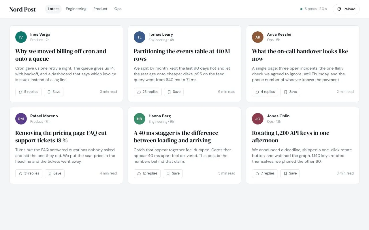
A six-card feed shows shimmering skeletons whose bars match the final content geometry exactly, then content fades and rises in with a 40ms stagger; Reload replays.
Preview
Use it
Free to use · credit appreciated1 Once, in your project
npx skills add SusanAcharya/Design-Lounge 2 Then ask
Using the Design Lounge skill, build "Skeleton to content swap" (piece skeleton-to-content-swap) in my stack. Match its brief; restyle it onto my product's theme.
No skill? Paste the brief instead. It carries the numbers, tokens and behaviour.
<!-- Design Lounge Nº 061 · "Skeleton to content swap" · designlounge.vercel.app -->

# Skeleton to content swap

> **Build brief for a coding agent.** Rebuild this piece in the reader's stack. If they haven't said which stack, ask once, then default to semantic HTML + CSS + a little vanilla JS. Match the numbers below; don't "improve" them.

## What it is

A three-column feed of six post cards for an internal publication ("Nord Post"). On load every card shows a skeleton: grey bars with a slow shimmer, laid out with the exact same padding, heights and margins as the content they stand in for. After 1.4s the skeleton fades out (160ms) and the content rises 10px and fades in (360ms, expo-out), one card after another at 40ms intervals. A "Reload" button in the header replays the whole sequence and the status pill reports the load time. The detail worth copying is that nothing shifts by a pixel when the swap happens — the skeleton is an overlay drawn on top of the real content, not a substitute for it.

## Reference behaviour

1. Initial state: header (64px, white, 1px bottom hairline) with the masthead "Nord Post", four feed tabs ("Latest" current), a status pill reading "Loading feed…" with a grey dot, and a "Reload" button (disabled while loading). Below, a 3 × 2 grid of cards, each showing its skeleton with a shimmer sweeping left → right every 1.6s. `<main aria-busy="true">`.
2. At t = 1400ms all cards receive the `on` class simultaneously. Per card `i` (0–5): the skeleton layer's opacity goes 1 → 0 over 160ms starting at `i × 40ms`; the content layer's opacity goes 0 → 1 and `translateY(10px)` → 0 over 360ms starting at `i × 40ms + 80ms`. Card 5's content therefore lands at 1400 + 200 + 80 + 360 = 2040ms.
3. `aria-busy` flips to `false` when the swap starts. 600ms after that (all cards done) the status pill reads "6 posts · 1.4 s" (measured from the click), its dot turns teal, and the Reload button re-enables.
4. Each loaded card shows: a 40px coloured initials avatar, author name and "Team · age" line, a two-line serif title (clamped to exactly two lines), a three-line excerpt (clamped to three), and a footer with a "replies" chip, a "Save" chip and a read-time on the right.
5. Hover a footer chip: text becomes primary ink and the border darkens. No motion.
6. Click Reload: the icon rotates 180° while pressed (600ms); all cards drop `on` at once (skeleton reappears instantly, content hides instantly), status returns to "Loading feed…", button disables, and the sequence in steps 2–3 runs again after 1400ms.
7. Clicking Reload while a load is running is impossible (button disabled); pending timers are cleared defensively anyway.
8. With `prefers-reduced-motion: reduce`: no shimmer; the swap is a 1ms opacity change with the same stagger timing and no translate.

## Structure

```
1280 × 800
┌─────────────────────────────────────────────────────────────────────────┐
│ Nord Post   Latest Engineering Product Ops       ● 6 posts · 1.4 s  ↻ Reload │ header 64
├─────────────────────────────────────────────────────────────────────────┤
│  ┌────────────────────┐ ┌────────────────────┐ ┌────────────────────┐   │ pad 24/32
│  │ (av) name          │ │ (av) name          │ │ (av) name          │   │
│  │      team · 2h     │ │      team · 4h     │ │      team · 5h     │   │
│  │ Title line one     │ │ Title line one     │ │ Title line one     │   │ card = 394 wide
│  │ title line two     │ │ title line two     │ │ title line two     │   │ 266 tall
│  │ excerpt ×3 lines   │ │ excerpt ×3 lines   │ │ excerpt ×3 lines   │   │
│  │ [9 replies][Save] 3 min│ …                │ │ …                  │   │
│  └────────────────────┘ └────────────────────┘ └────────────────────┘   │ gap 16
│  ┌────────────────────┐ ┌────────────────────┐ ┌────────────────────┐   │
│  │ card 4             │ │ card 5             │ │ card 6             │   │
│  └────────────────────┘ └────────────────────┘ └────────────────────┘   │
└─────────────────────────────────────────────────────────────────────────┘

… 194 more lines. Copy or download for the full brief. Loading the source…Brief
234 linesBuild brief for a coding agent. Rebuild this piece in the reader’s stack. If they haven’t said which stack, ask once, then default to semantic HTML + CSS + a little vanilla JS. Match the numbers below; don’t “improve” them.
What it is
A three-column feed of six post cards for an internal publication (“Nord Post”). On load every card shows a skeleton: grey bars with a slow shimmer, laid out with the exact same padding, heights and margins as the content they stand in for. After 1.4s the skeleton fades out (160ms) and the content rises 10px and fades in (360ms, expo-out), one card after another at 40ms intervals. A “Reload” button in the header replays the whole sequence and the status pill reports the load time. The detail worth copying is that nothing shifts by a pixel when the swap happens — the skeleton is an overlay drawn on top of the real content, not a substitute for it.
Reference behaviour
- Initial state: header (64px, white, 1px bottom hairline) with the masthead “Nord Post”, four feed tabs (“Latest” current), a status pill reading “Loading feed…” with a grey dot, and a “Reload” button (disabled while loading). Below, a 3 × 2 grid of cards, each showing its skeleton with a shimmer sweeping left → right every 1.6s.
<main aria-busy="true">. - At t = 1400ms all cards receive the
onclass simultaneously. Per cardi(0–5): the skeleton layer’s opacity goes 1 → 0 over 160ms starting ati × 40ms; the content layer’s opacity goes 0 → 1 andtranslateY(10px)→ 0 over 360ms starting ati × 40ms + 80ms. Card 5’s content therefore lands at 1400 + 200 + 80 + 360 = 2040ms. aria-busyflips tofalsewhen the swap starts. 600ms after that (all cards done) the status pill reads “6 posts · 1.4 s” (measured from the click), its dot turns teal, and the Reload button re-enables.- Each loaded card shows: a 40px coloured initials avatar, author name and “Team · age” line, a two-line serif title (clamped to exactly two lines), a three-line excerpt (clamped to three), and a footer with a “replies” chip, a “Save” chip and a read-time on the right.
- Hover a footer chip: text becomes primary ink and the border darkens. No motion.
- Click Reload: the icon rotates 180° while pressed (600ms); all cards drop
onat once (skeleton reappears instantly, content hides instantly), status returns to “Loading feed…”, button disables, and the sequence in steps 2–3 runs again after 1400ms. - Clicking Reload while a load is running is impossible (button disabled); pending timers are cleared defensively anyway.
- With
prefers-reduced-motion: reduce: no shimmer; the swap is a 1ms opacity change with the same stagger timing and no translate.
Structure
1280 × 800
┌─────────────────────────────────────────────────────────────────────────┐
│ Nord Post   Latest Engineering Product Ops       ● 6 posts · 1.4 s  ↻ Reload │ header 64
├─────────────────────────────────────────────────────────────────────────┤
│  ┌────────────────────┐ ┌────────────────────┐ ┌────────────────────┐   │ pad 24/32
│  │ (av) name          │ │ (av) name          │ │ (av) name          │   │
│  │      team · 2h     │ │      team · 4h     │ │      team · 5h     │   │
│  │ Title line one     │ │ Title line one     │ │ Title line one     │   │ card = 394 wide
│  │ title line two     │ │ title line two     │ │ title line two     │   │ 266 tall
│  │ excerpt ×3 lines   │ │ excerpt ×3 lines   │ │ excerpt ×3 lines   │   │
│  │ [9 replies][Save] 3 min│ …                │ │ …                  │   │
│  └────────────────────┘ └────────────────────┘ └────────────────────┘   │ gap 16
│  ┌────────────────────┐ ┌────────────────────┐ ┌────────────────────┐   │
│  │ card 4             │ │ card 5             │ │ card 6             │   │
│  └────────────────────┘ └────────────────────┘ └────────────────────┘   │
└─────────────────────────────────────────────────────────────────────────┘<header>— flex row, 32px side padding.<h1>masthead (serif 22px).<nav class="tabs" aria-label="Feed">with four<a>pills; current hasaria-current="page".<span class="status" aria-live="polite">with a 7px dot and text.<button class="reload">with a 15px inline SVG.<main class="feed" aria-busy>— CSS grid,repeat(3, 1fr), gap 16px, padding 24px 32px,align-content: start.<article class="card" style="--i: n">× 6,position: relative, padding 20px, radius 12px, 1px border..sk(skeleton,aria-hidden="true") —position: absolute; inset: 0; padding: 20px; display: flex; flex-direction: column— a stack of.bbars mirroring every content block..ct(content) —.top(avatar +.whoname/meta) →<h2>→<p>→.foot(two<a>chips + read-time).
Card copy (author · meta · title · excerpt · replies · read time):
- Ines Varga · Product · 2h · “Why we moved billing off cron and onto a queue” · 9 replies · 3 min
- Tomas Leary · Engineering · 4h · “Partitioning the events table at 410 M rows” · 23 replies · 6 min
- Anya Kessler · Ops · 5h · “What the on-call handover looks like now” · 4 replies · 2 min
- Rafael Moreno · Product · 7h · “Removing the pricing page FAQ cut support tickets 18 %” · 31 replies · 4 min
- Hanna Berg · Engineering · 9h · “A 40 ms stagger is the difference between loading and arriving” · 12 replies · 5 min
- Jonas Ohlin · Ops · 12h · “Rotating 1,200 API keys in one afternoon” · 7 replies · 3 min
Avatar fills, in order: #0f766e, #3b5b8c, #8c5a3b, #5b3b8c, #3b8c6b, #8c3b4d, white initials.
Tokens
:root {
  /* colour — cool light neutrals, one teal accent */
  --bg: #f3f5f7;        /* page */
  --card: #ffffff;      /* cards, header */
  --line: #e2e6ea;      /* hairlines, chip borders */
  --bone: #e9edf0;      /* skeleton bars */
  --bone-hi: #f6f8fa;   /* shimmer highlight */
  --ink: #151a20;       /* primary text */
  --ink-2: #5b6570;     /* excerpt, chips */
  --ink-3: #8a939c;     /* meta, read time, status */
  --accent: #0f766e;    /* focus rings, loaded dot, avatar 1 */
  --accent-ink: #ffffff;

  /* type */
  --serif: "DM Serif Display", Georgia, serif;
  --sans: "DM Sans", system-ui, sans-serif;

  /* geometry shared by content and skeleton */
  --avatar: 40px;
  --lh-meta: 18px;      /* name and meta line boxes */
  --lh-title: 26px;     /* h2 line-height; h2 height = 2 lines */
  --lh-body: 20px;      /* p line-height; p height = 3 lines */
  --card-pad: 20px;
  --r: 12px;            /* card */
  --r-s: 6px;           /* chips */
  --grid-gap: 16px;

  /* motion */
  --t-out: 160ms;       /* skeleton fade */
  --t-in: 360ms;        /* content rise */
  --t-shimmer: 1.6s;
  --stagger: 40ms;
  --delay-in: 80ms;     /* content starts after skeleton begins fading */
  --load-ms: 1400ms;    /* simulated fetch */
  --ease-out: cubic-bezier(.16, 1, .3, 1);
  --ease: cubic-bezier(.2, .7, .2, 1);
}
Typography
| Role | Family | Size | Weight | Line-height | Tracking | Case |
|---|---|---|---|---|---|---|
| Masthead | DM Serif Display | 22px | 400 | 1 | −0.01em | sentence |
| Tab | DM Sans | 13px | 500 | 1.45 | 0 | sentence |
| Author name | DM Sans | 14px | 600 | 18px | 0 | sentence |
| Author meta | DM Sans | 12px | 400 | 18px | 0 | sentence |
| Card title | DM Serif Display | 21px | 400 | 26px | −0.01em | sentence |
| Excerpt | DM Sans | 14px | 400 | 20px | 0 | sentence |
| Chip | DM Sans | 12px | 500 | 30px box | 0 | sentence |
| Read time / status | DM Sans | 12px | 400 | 1.45 | 0 | sentence |
| Avatar initials | DM Sans | 13px | 600 | 1 | 0 | UPPERCASE |
| Status pill | DM Sans | 12px | 400 | 1.45 | 0 | sentence |
| Reload button | DM Sans | 13px | 500 | 36px box | 0 | sentence |
Motion
| Element | Trigger | Property | From → To | Duration | Easing | Delay |
|---|---|---|---|---|---|---|
.b::after | while skeleton | translateX | −100% → 100% | 1600ms | linear, infinite | 0 |
.sk | .on added | opacity | 1 → 0 | 160ms | --ease | i × 40ms |
.ct | .on added | opacity, translateY | 0, 10px → 1, 0 | 360ms | --ease-out | i × 40ms + 80ms |
.sk / .ct | .on removed | opacity | back to 1 / 0 | 0 | — | none: transition-delay is only set under .on |
.reload svg | :active | rotate | 0 → 180° | 600ms | --ease | 0 |
.status i | load complete | background | --ink-3 → --accent | 160ms | — | 0 |
The shimmer is a linear-gradient(90deg, transparent, var(--bone-hi) 50%, transparent) pseudo-element clipped by overflow: hidden on each bar. Bars in one card share one clock so the sweep reads as a single light passing over the card.
Per-card timeline from the click (or first paint):
| Card | Skeleton fade starts | Content starts | Content lands |
|---|---|---|---|
| 0 | 1400ms | 1480ms | 1840ms |
| 1 | 1440ms | 1520ms | 1880ms |
| 2 | 1480ms | 1560ms | 1920ms |
| 3 | 1520ms | 1600ms | 1960ms |
| 4 | 1560ms | 1640ms | 2000ms |
| 5 | 1600ms | 1680ms | 2040ms |
Status flips to “done” and Reload re-enables at 1400 + (6 × 40) + 360 = 2000ms — within a frame of the last card landing.
Reduced motion: .b::after { animation: none }, .ct { transform: none; transition-duration: 1ms }, .sk { transition-duration: 1ms }. The 40ms stagger still applies via transition-delay, which is fine — it is a sequence, not a movement.
States
- Loading:
main[aria-busy="true"], skeletons visible, status “Loading feed…” with grey dot, Reload disabled (text--ink-3,cursor: default). - Loaded:
aria-busy="false", status “6 posts · 1.4 s” with teal dot, Reload enabled. - Hover (chip): colour
--ink, border--ink-3. - Hover (Reload): border
--ink-3. - Active (Reload): icon rotates 180°.
- Focus-visible (tabs, chips, Reload):
outline: 2px solid var(--accent); outline-offset: 2px. - Current tab: background
--bg, colour--ink. - Reload disabled: text
--ink-3, border unchanged, cursordefault; hover has no effect. - Status dot:
--ink-3while loading,--accentwhen done; 160ms colour transition. - Empty / error: not part of this piece. If you need them, keep the header and show a single centred card-sized message; never leave skeletons shimmering indefinitely — cap at 8s and show the error.
Accessibility
<main aria-busy="true">while loading so assistive tech announces the region as busy and can defer reading; set tofalsethe moment the swap begins.- The status pill has
aria-live="polite"and its text changes exactly twice per cycle (“Loading feed…” → “6 posts · 1.4 s”); do not announce per-card arrivals. - Skeleton layers are
aria-hidden="true"— they carry no information. The content layer is always in the DOM (opacity 0), so nothing is announced twice and nothing reflows. - Reload is a real
<button type="button">;disabledwhile loading, which also removes it from the tab order during that window. - Keyboard: Tab order is tabs (4) → Reload → card 1 chips → … → card 6 chips. Enter/Space activate. No custom key handling.
- Contrast:
--ink-2on white 6.9:1;--ink-3on white 3.4:1 — used only for 12px meta/read time; raise to#6b7580(4.6:1) if AA is required for that text. - Avatar initials on the six fills are all ≥ 4.5:1 against white text.
Responsive rules
- ≥ 1280: 3 columns, as specified.
- 1024–1279: 2 columns; cards get wider, title still clamps to 2 lines and excerpt to 3 (heights are fixed by line-height × lines, so the skeleton still matches).
- 768–1023: 2 columns, header tabs collapse to a
<select>-style dropdown or scroll horizontally; padding 20px. - < 640: 1 column, card padding 16px, avatar stays 40px, title 19px/24px (update
--lh-titleand the skeleton uses it automatically), status pill hidden, Reload becomes icon-only 40 × 40 witharia-label="Reload".
Acceptance checklist
- With the skeleton visible and with content visible, every card has the identical height (measure: 266px at 1280 wide); toggling
.onchanges no card’s bounding box. - Skeleton bars replicate: 40px circle; 118px and 84px name/meta bars; two 16px title bars (second at 62% width); three 12px excerpt bars (100%, 92%, 74%); two 30px chip bars (78px, 64px) and a 40px read-time bar.
- The skeleton layer is a flex column (or otherwise prevents margin collapsing) so its total height equals the content’s.
- Shimmer sweeps left → right every 1.6s, linear, on every bar.
- Skeleton fades over 160ms; content rises 10px → 0 and fades over 360ms with
cubic-bezier(.16,1,.3,1). - Per-card stagger is 40ms; content starts 80ms after its own skeleton starts fading.
-
aria-busyistrueduring loading andfalseonce the swap starts. - Reload is disabled during loading and re-enables after the last card lands; clicking it resets all cards instantly and replays.
- Status text updates through an
aria-live="polite"region, twice per cycle. - Titles clamp to exactly 2 lines and excerpts to exactly 3 (
height= line-height × n,overflow: hidden). - Focus rings visible on tabs, chips and Reload.
- With
prefers-reduced-motion: reducethe shimmer stops and the swap has no translate. - Reload re-enables at 2000ms after the click (1400 + 6 × 40 + 360), never earlier.
- The card count (6), column count (3) and card height (266px) are unchanged between skeleton and loaded states.
Implementation notes
Overlay, don’t replace. Render the content and the skeleton in the same card; the skeleton is absolutely positioned with the same padding, and the content sets the card’s height. This is what guarantees zero layout shift:
.card { position: relative; padding: var(--card-pad); }
.sk   { position: absolute; inset: 0; padding: var(--card-pad);
        display: flex; flex-direction: column;   /* no margin collapse */
        background: var(--card); transition: opacity var(--t-out) var(--ease); }
.ct   { opacity: 0; transform: translateY(10px);
        transition: opacity var(--t-in) var(--ease-out), transform var(--t-in) var(--ease-out); }
.card.on .sk { opacity: 0; pointer-events: none; transition-delay: calc(var(--i) * var(--stagger)); }
.card.on .ct { opacity: 1; transform: none;   transition-delay: calc(var(--i) * var(--stagger) + 80ms); }
Derive bar sizes from the same line-height tokens. A 12px bar with 4px margins occupies one 20px body line; a 16px bar with 5px margins occupies one 26px title line. Adjust only the last bar’s bottom margin to absorb the block’s margin:
.card p { line-height: var(--lh-body); height: calc(var(--lh-body) * 3); margin: 0 0 18px; overflow: hidden; }
.sk .l  { height: 12px; margin: 4px 0; }               /* 20px per line */
.sk .l:nth-child(3) { width: 74%; margin-bottom: 22px; } /* 4px + 18px block margin */
Stagger with transition-delay only in the loaded state. Putting the delay on the base rule would make the reset stagger too; the reset should be instant so the skeleton is back before the next fetch.
Verify the geometry in a test, not by eye. Toggle the class and compare every card’s box:
const before = cards.map(c => c.getBoundingClientRect().height);
cards.forEach(c => c.classList.add('on'));
const after = cards.map(c => c.getBoundingClientRect().height);
console.assert(before.every((h, i) => h === after[i]), 'skeleton/content height mismatch');
Run it with the web fonts loaded and again with the fallback font: because heights are fixed by line-height × lines, both must pass.
Common mistakes: using display: none on the content (kills the fade and the height lock); animating height; giving the skeleton its own padding value; a shimmer faster than ~1.2s (reads as an error state in a grid of many pieces); forgetting to clear pending timers on Reload.
Details
- Palette
- Type
- DM Serif Display · DM Sans
- Motion
- Subtle motion
- Build
- One session
- Tags
On the shelves


